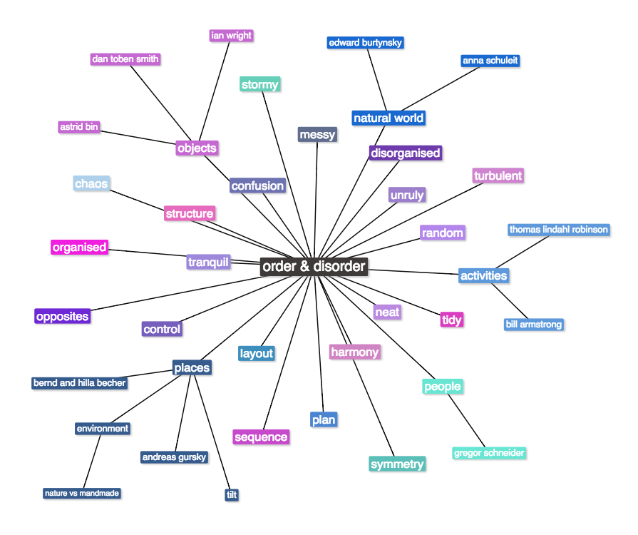
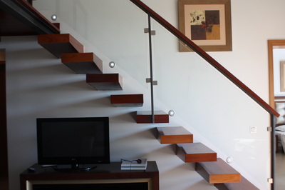
O R D E R & D I S O R D E R
H O L I D A Y W O R K
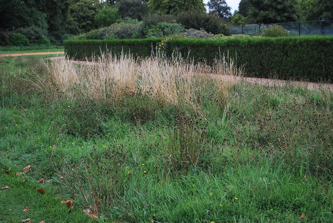
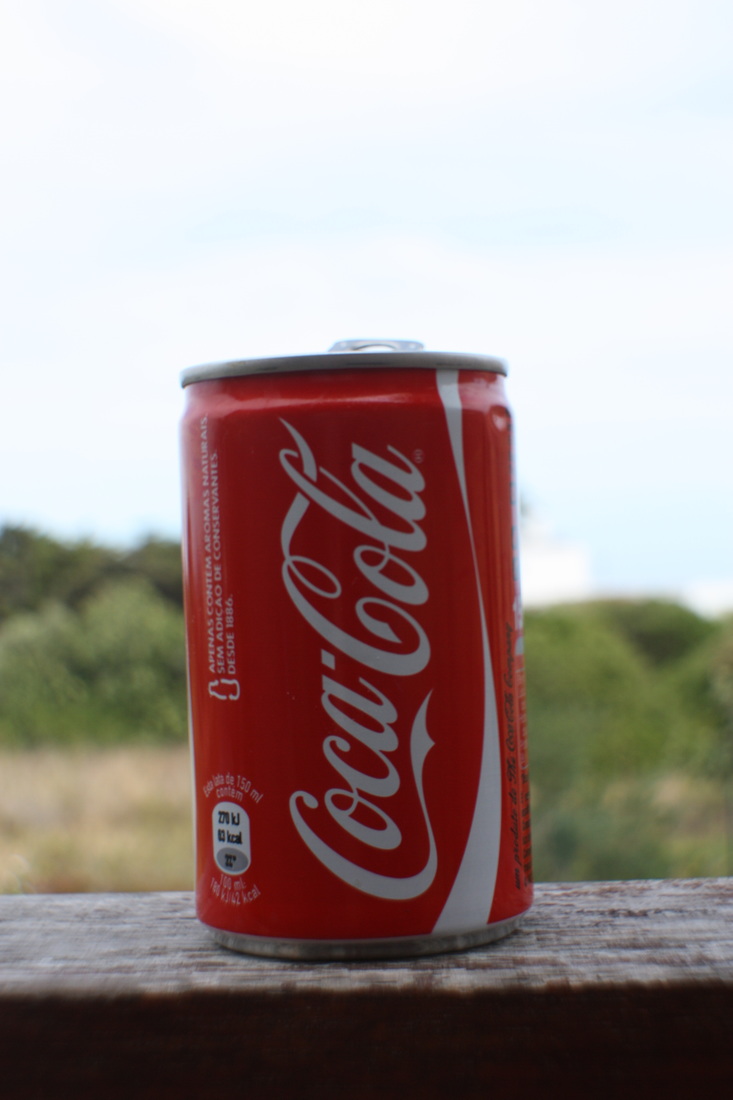
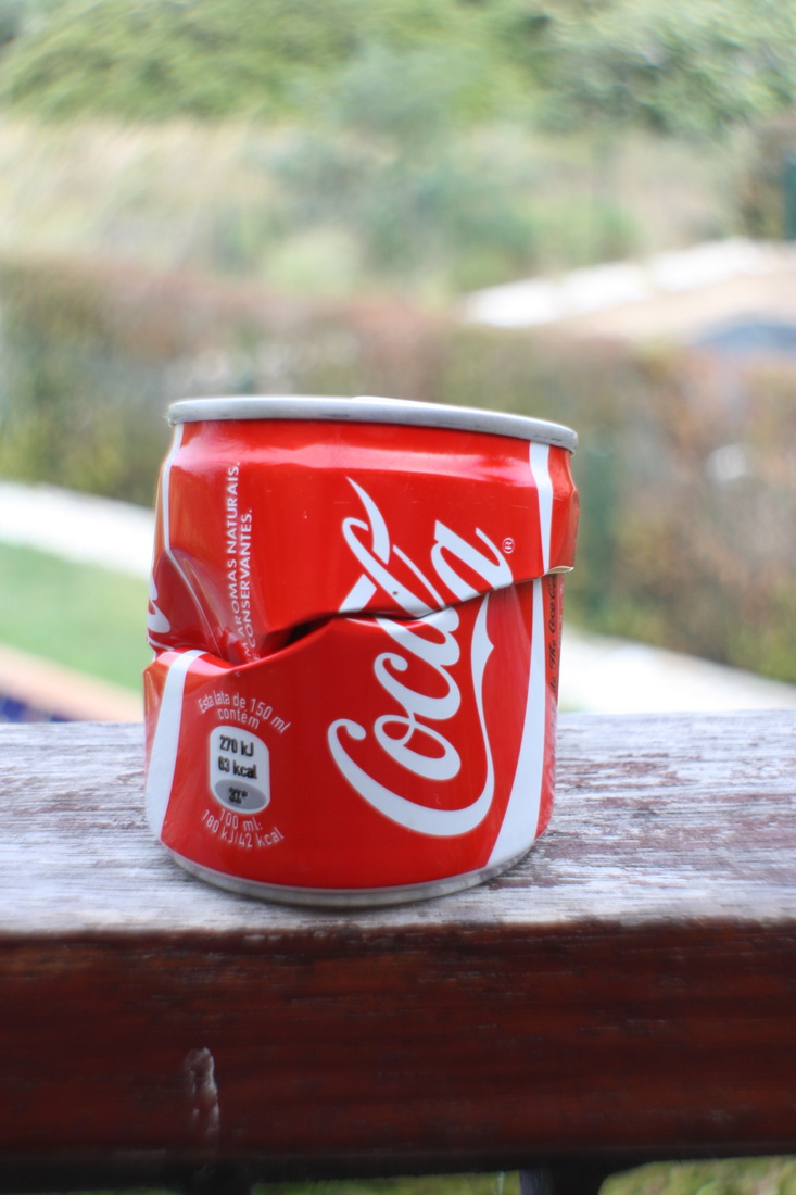
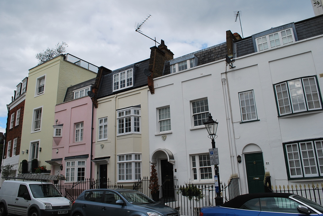
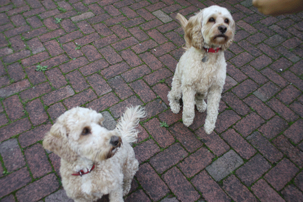
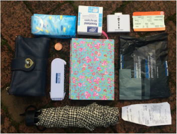
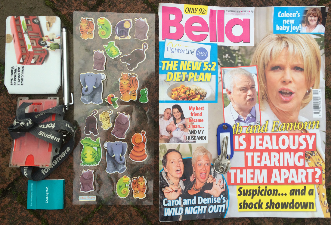
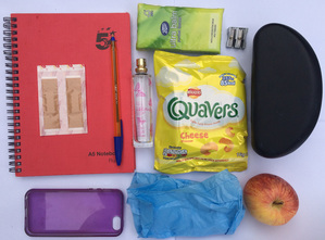
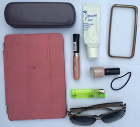
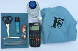
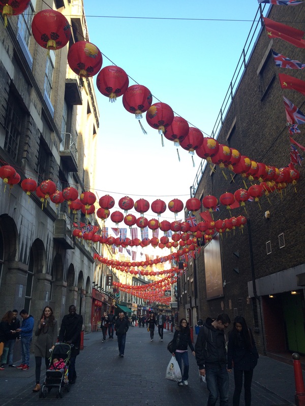
For the holiday work I took pictures of things that I thought represented order and disorder, they were objects, landscapes and people, because I tried to portray a variety of pictures all meaning different things. I also took individual pictures of order and disorder without comparison to each other to show meaning to it separately.
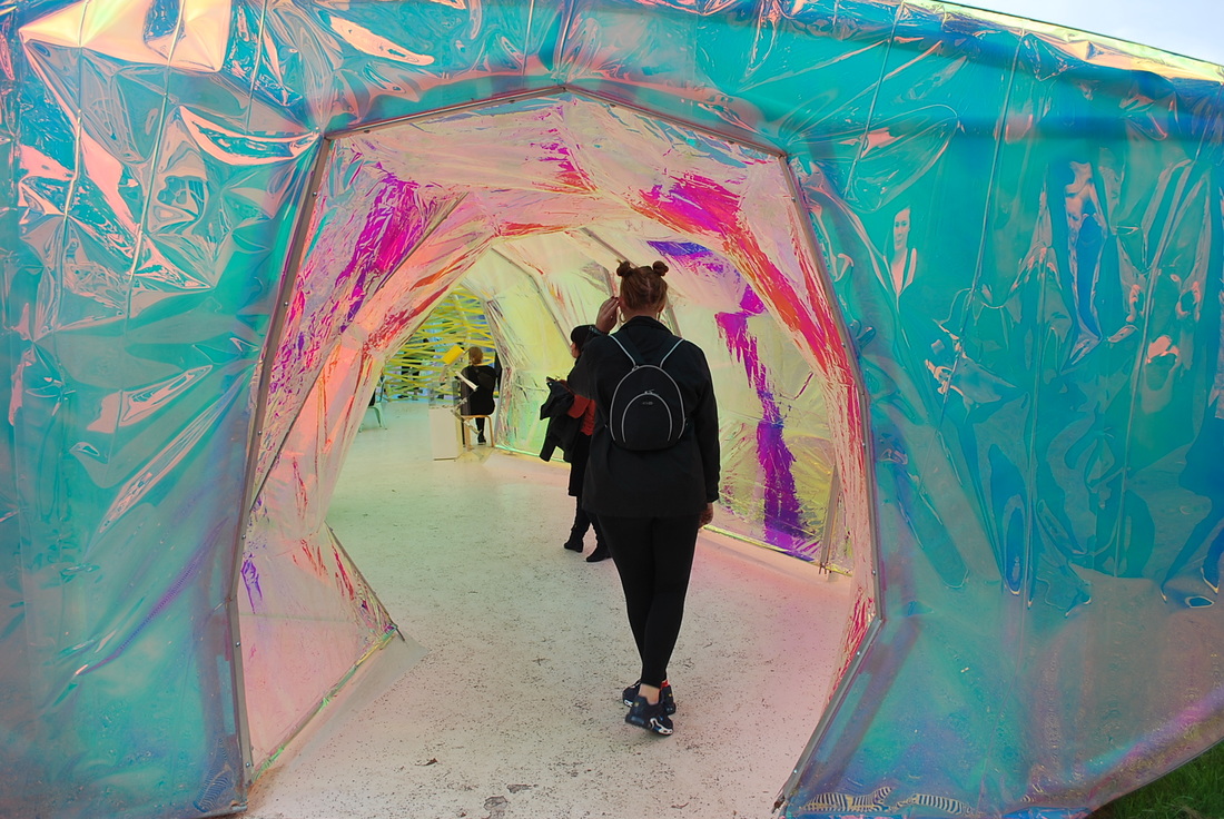
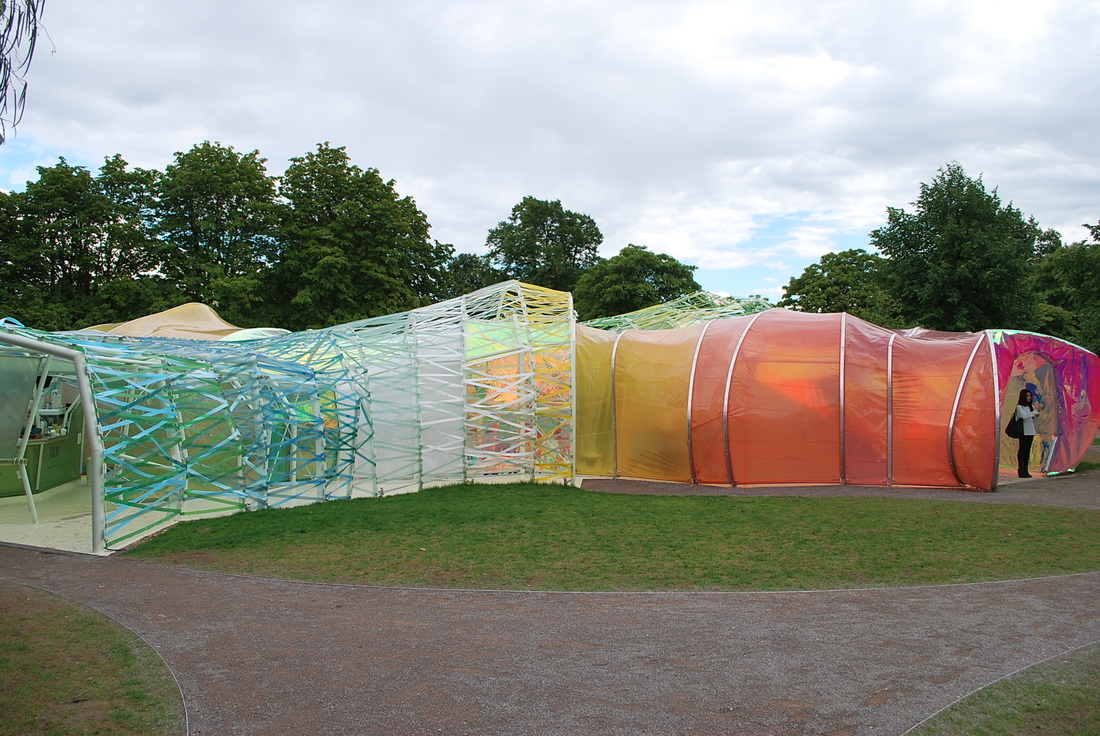
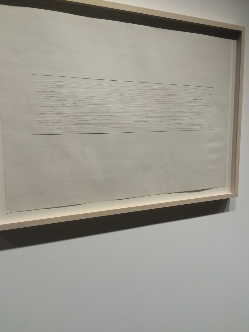
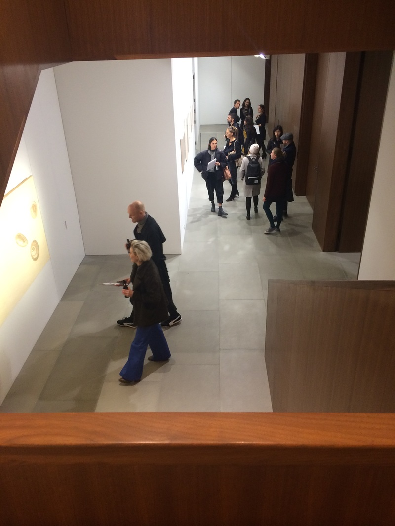
S E R P E N T I N E G A L L E R Y
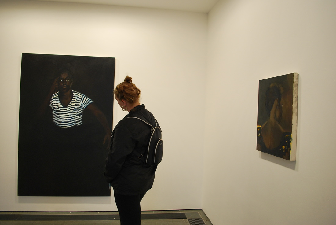
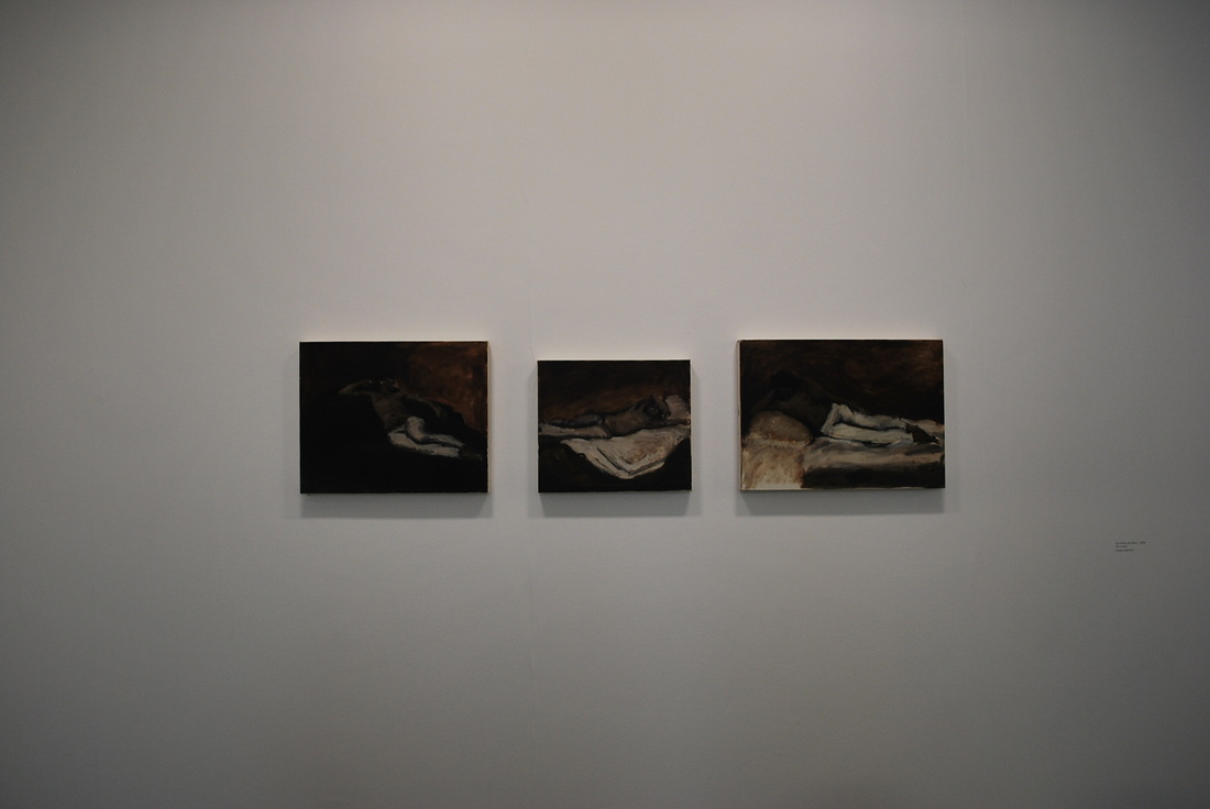
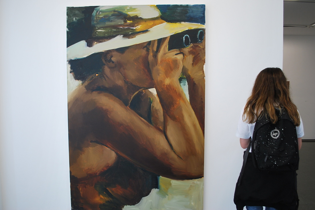
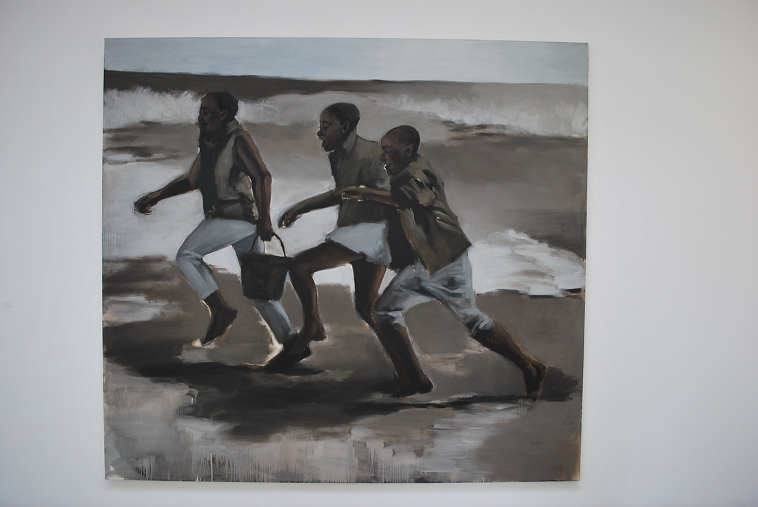
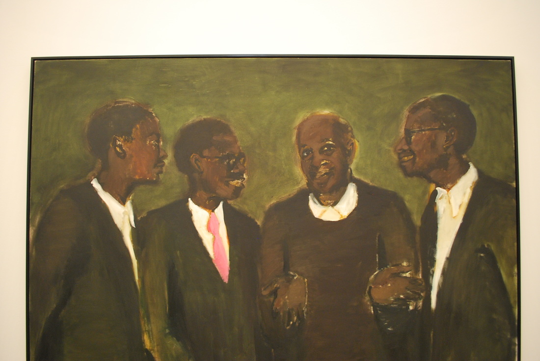
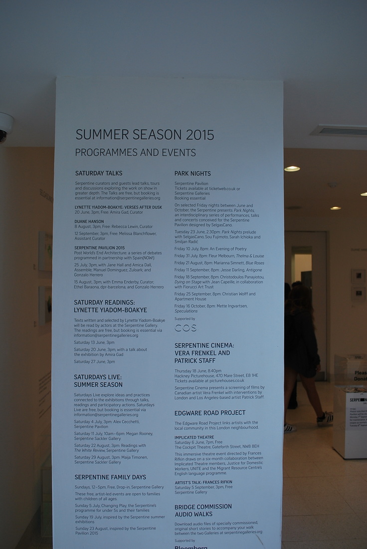
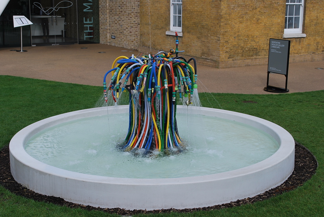
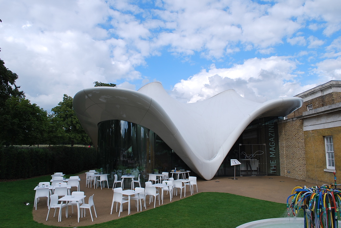
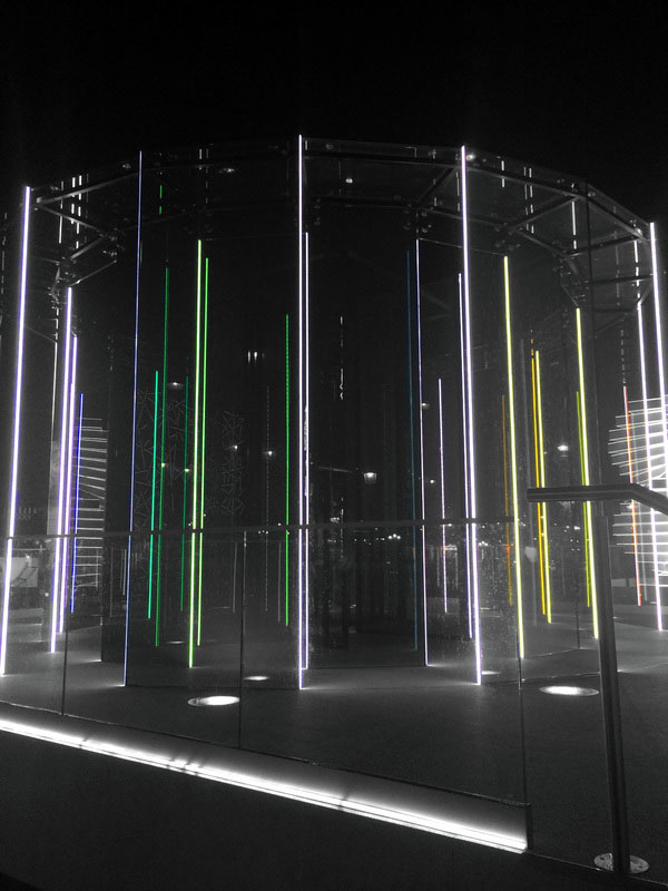
During the holidays I went to the Serpentine Gallery in Hyde Park, there was a Serpentine Pavilion 2015 exhibition designed by Selgascano, and two other exhibitions I visited, one by Lynette Yiadom-Boakye, a figurative oil painter who's paintings focus on figures that exist outside of a specific time and place. The other one I visited was by Duane Hanson, he's been an artist for forty years, and during this time has been making lifelike sculptures portraying working-class Americans.
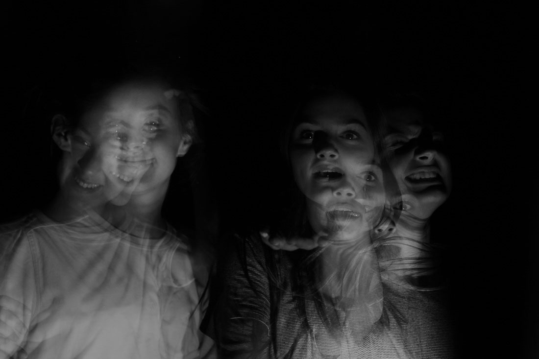
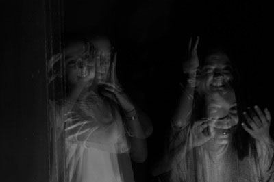
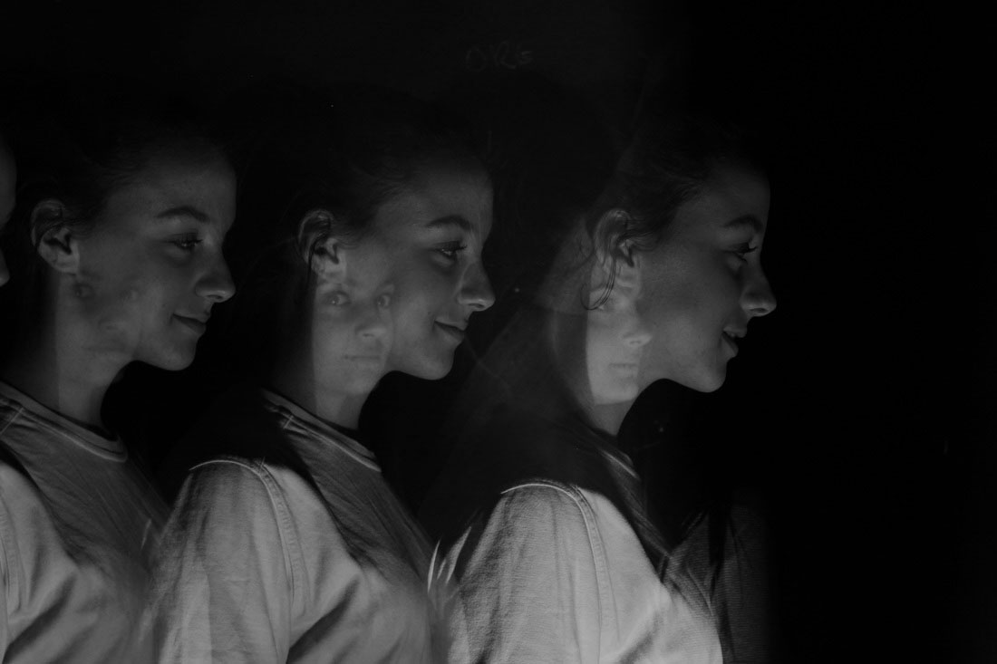
P O R T R A I T D I S O R D E R
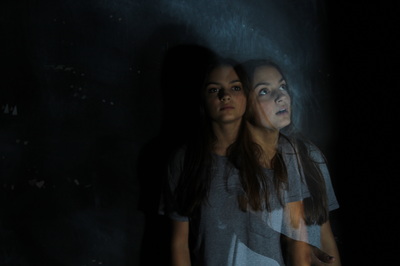
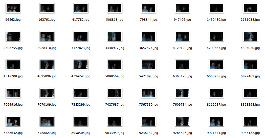
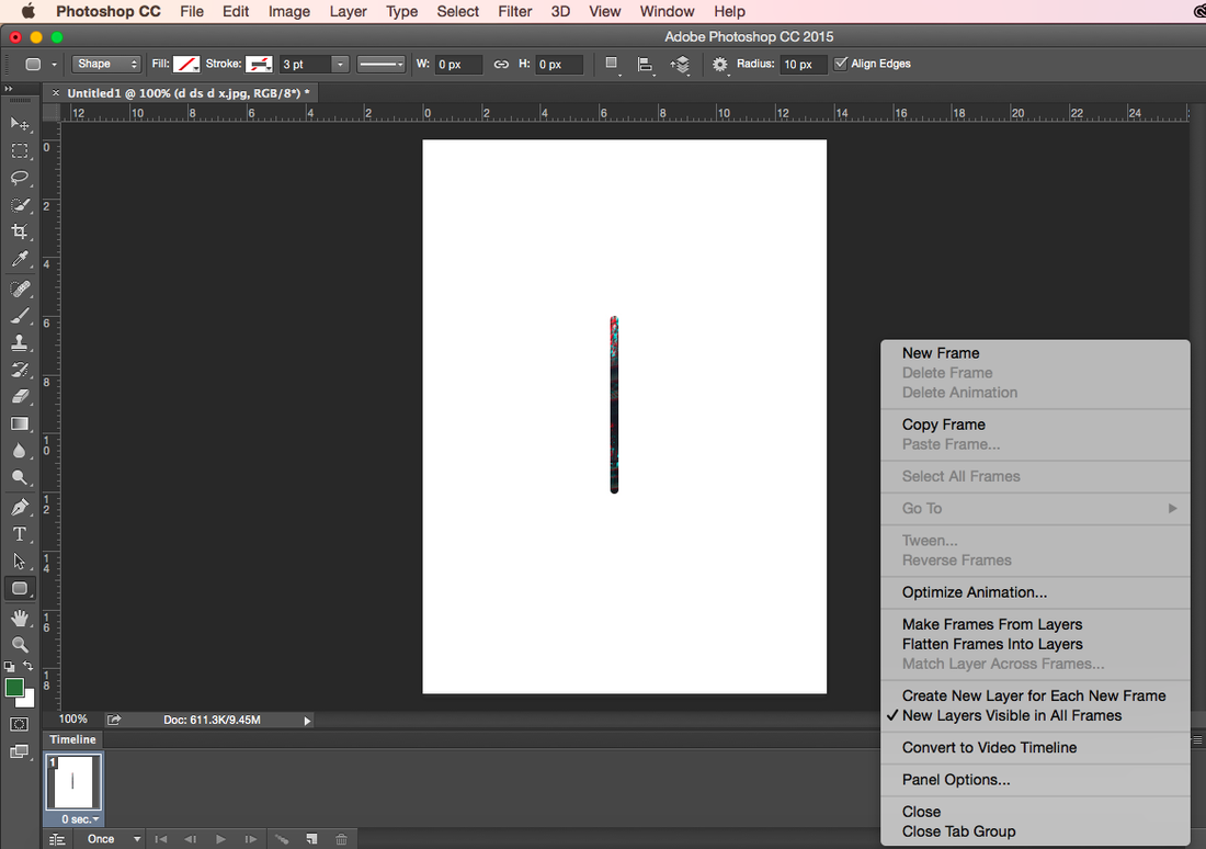
For this concept we had to take several photos and turn them into a gif using photoshop, we had to use sports mode for continuous shooting while the camera stayed in focus.
R E F I N I N G M Y W O R K:
I refined my work from initial to second response by making the lighting more natural, I did this by going outside so that the light was more white than yellow, like the first response. I also took more pictures than the first response so the gif was longer and transitioned more smoothly.
I refined my work from initial to second response by making the lighting more natural, I did this by going outside so that the light was more white than yellow, like the first response. I also took more pictures than the first response so the gif was longer and transitioned more smoothly.
I N I T I A L R E S P O N S E |
S E C O N D R E S P O N S E
|
|
|
R E F I N I N G M Y W O R K:
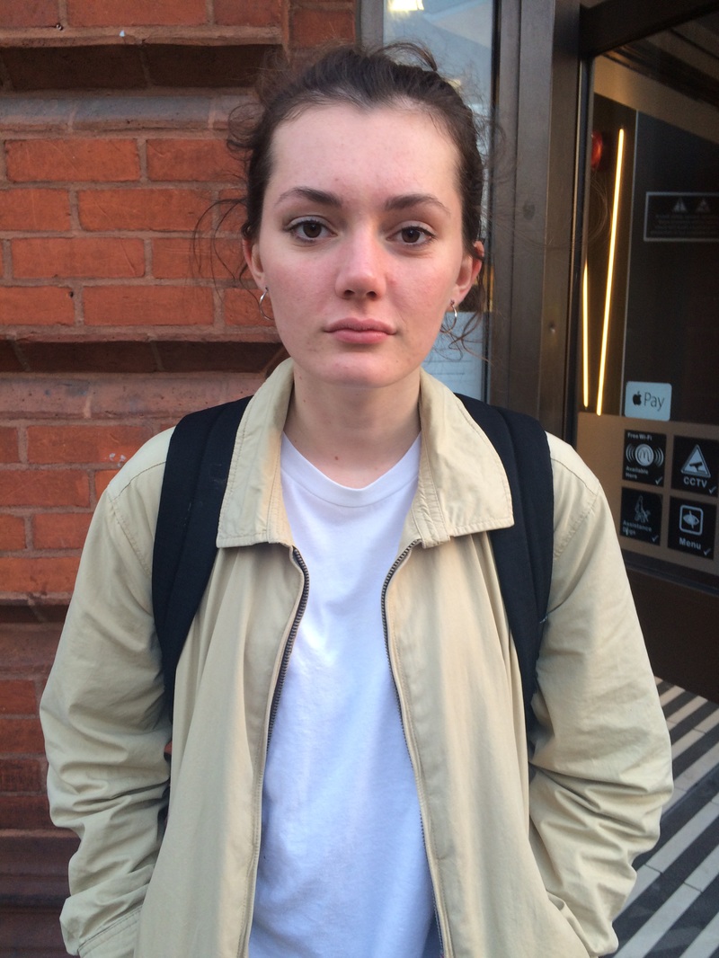
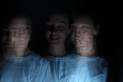
I refined my work from second to third response by using a tripod to make sure every photo was taken in the exact same place, I also used a brick wall because the background is clearer. In my initial response the lighting flashed from white and yellow, so to improve this I took my pictures for my third response outside for more natural lighting. To refine my work further, I took more pictures so each picture transitioned to the next one more smoothly.
T H I R D R E S P O N S E
R O M A I N L A U R E N T
Romain Laurent is a photographer and director, he lives and works in New York, but was raised in the French Alps. He studied Product Design at the National School of Applied Arts in Paris - but later realised photography was a better way for him to express his ideas. Laurent went to study photography at Gobelins in Paris, since then he has been working on advertising and personal projects.
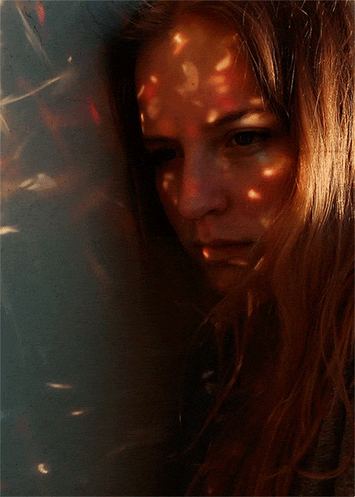
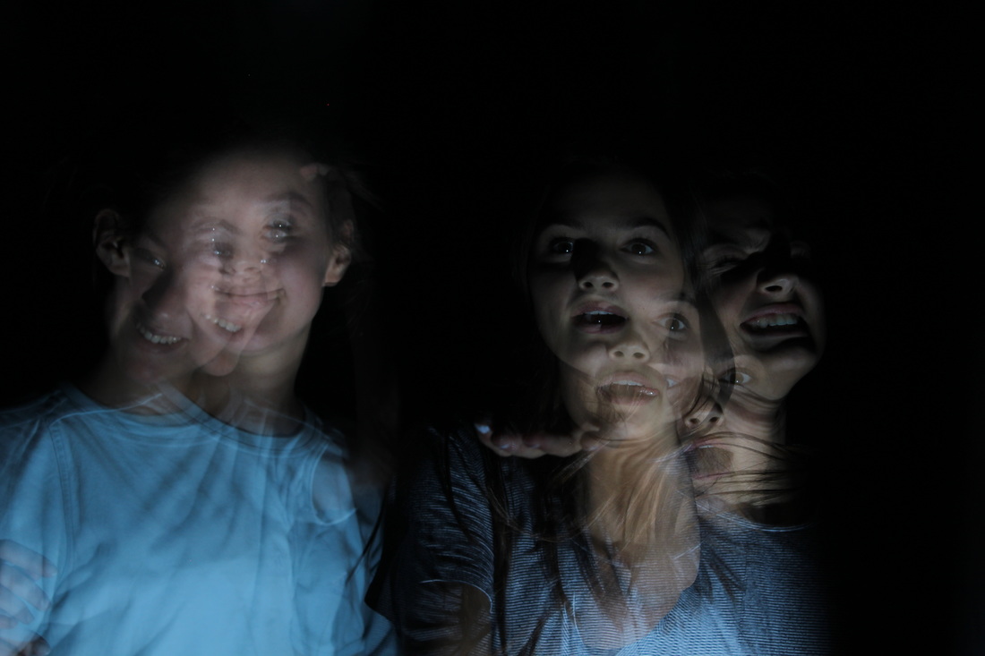
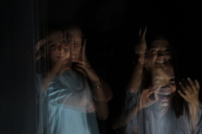
In this image there is a girl with the side of her head on a wall looking down, there are white red and blue specs of light flashing across her face and onto the wall. The image is quite dark and this contrasts with the lights on the girls forehead because they're brighter. The lights are associated with parties and fun, however in the photo she is looking down and looks quite miserable, these two moods contrast to create quite a captivating image. The image is very close up to her face, this makes us look at her in detail, the natural light is very dark, so when the light hits her face and hair, we focus on her expression and facial features more.
|
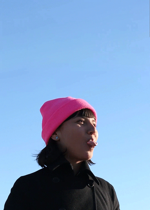
This image is of a girl with a pink hat on blowing bubblegum, she is outside and the gif captures the wind going through her hair. The colours of the image are bold as the hat corresponds with the bubblegum, both the girls' hair and coat are back and the background of the picture is a perfect blue sky. In the composition the subject is nearer the bottom of the image meaning there is more space for the sky to take up, this block of colour compliments the lighting of her face, and also contrasts with the black coat. All three of these images were taken with a tripod as they don't move or blur, and with a fast shutter speed as every slight movement was captured.
|
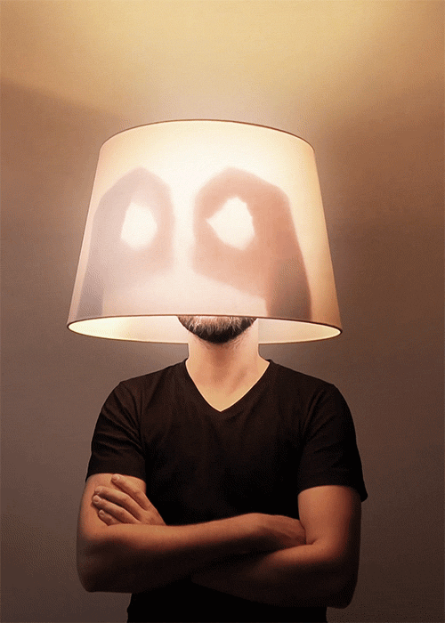
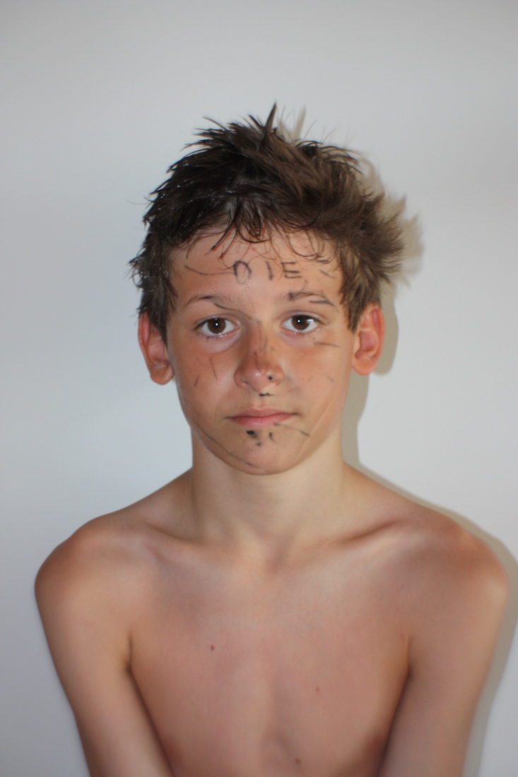
This photo is of a man with a lamp on his head, it's turned on and there are shadows of two hands making O's - although his arms are crossed. He's in the center of the composition and the man is wearing a dark top, this contrast with the white light coming from the lamp. The gestures of the man contrast as the hands making O shapes in the light seem playful, whereas the body language of crossed arms looks more sincere, this can also be associated with the dark top and arms creating a negative mood, and the bright white light, and making playful shapes with shadows creating a more positive mood.
|
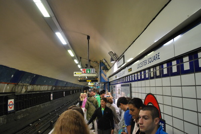
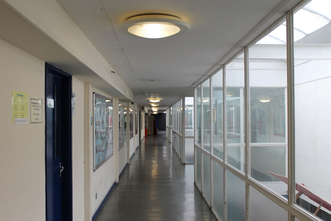
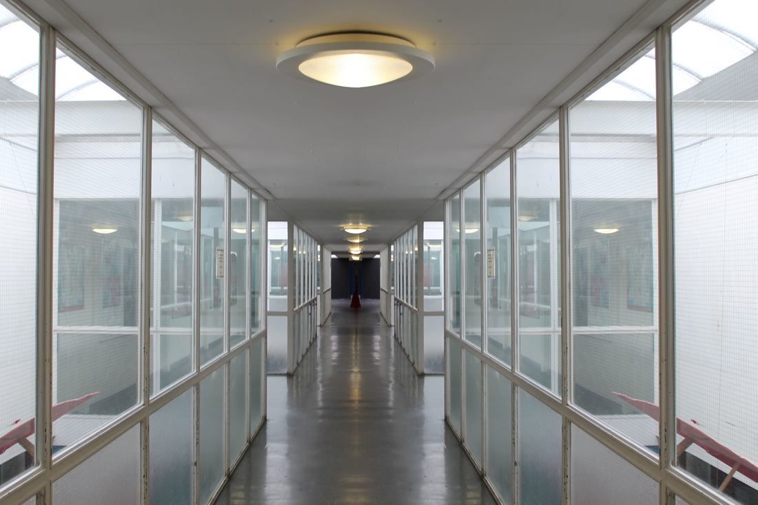
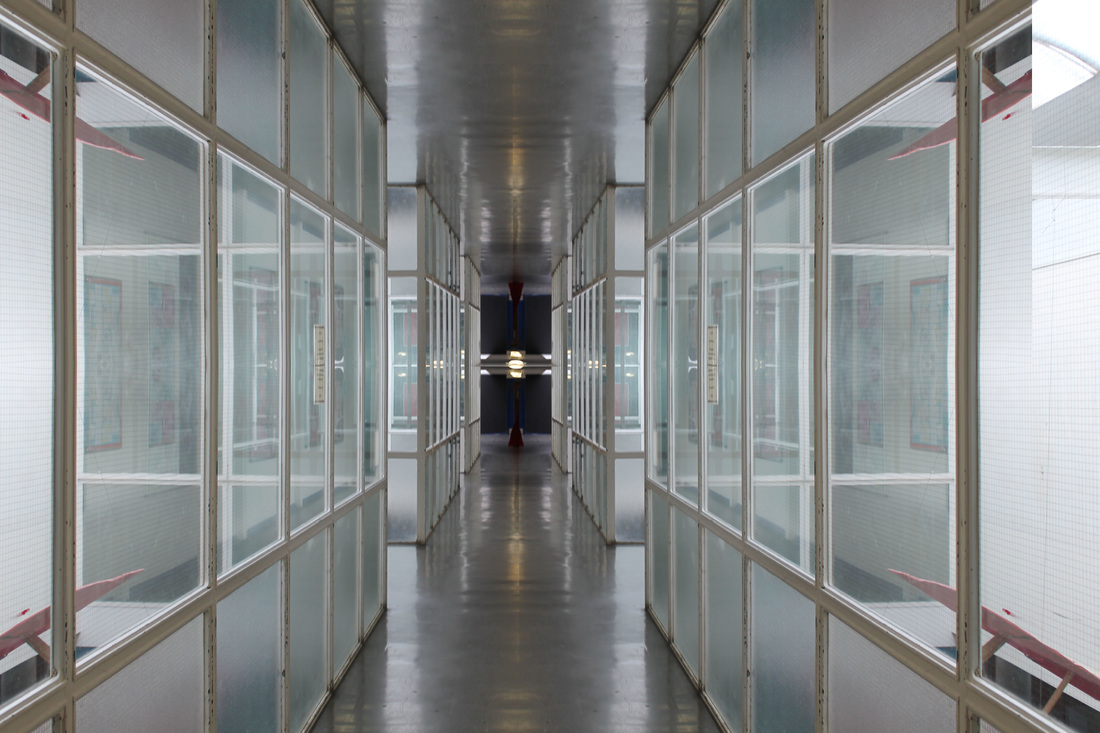
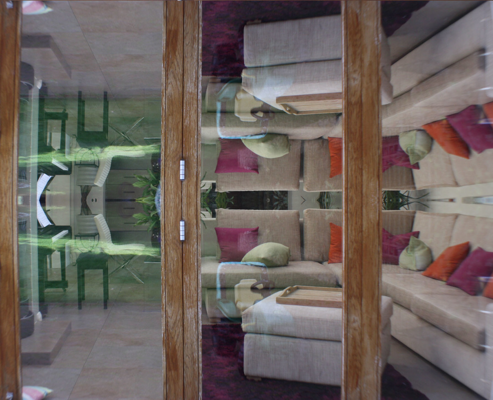
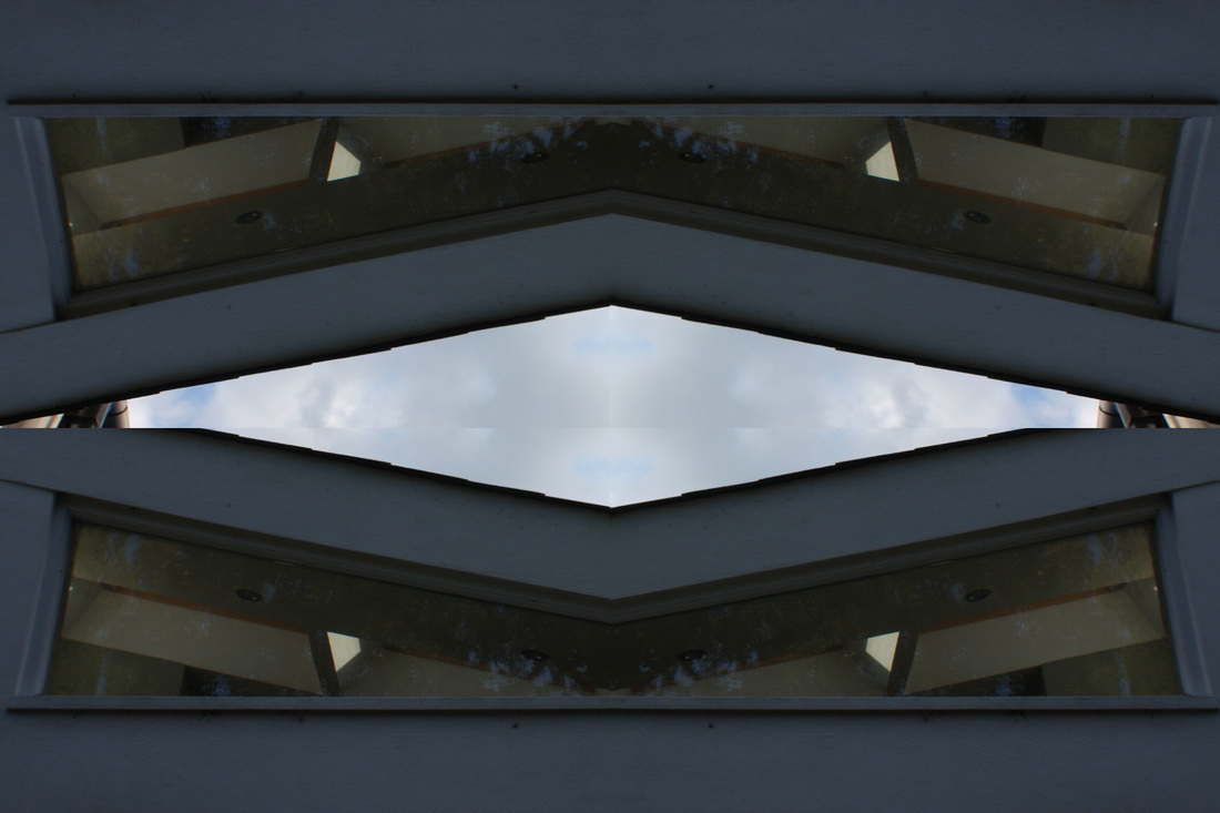
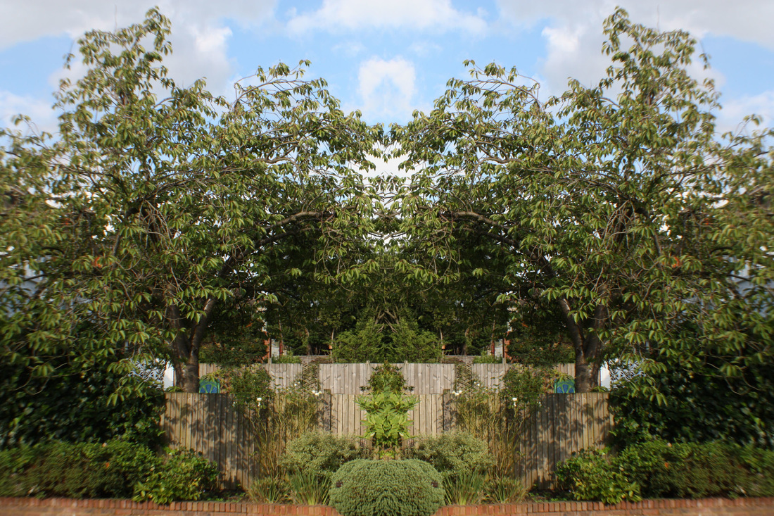
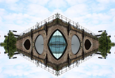
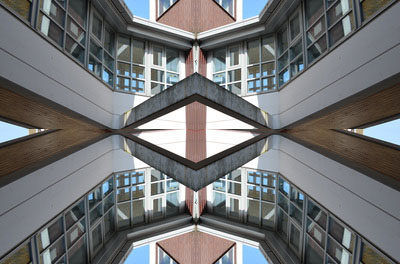
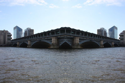
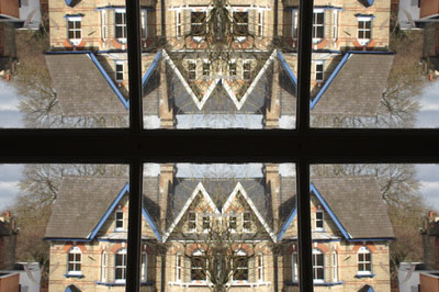
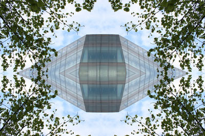
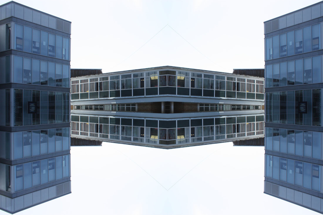
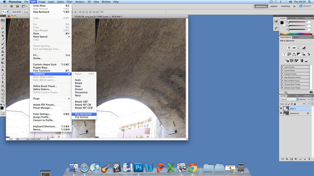
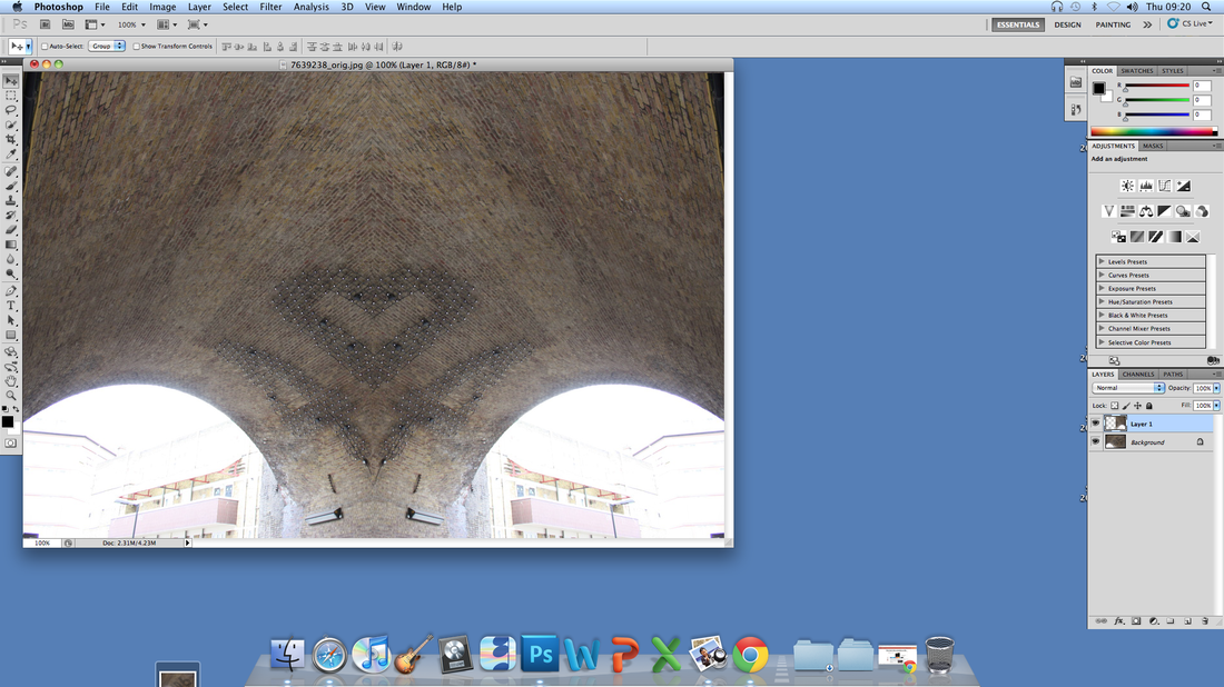
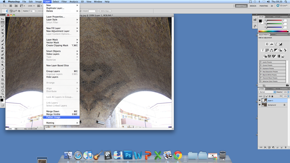
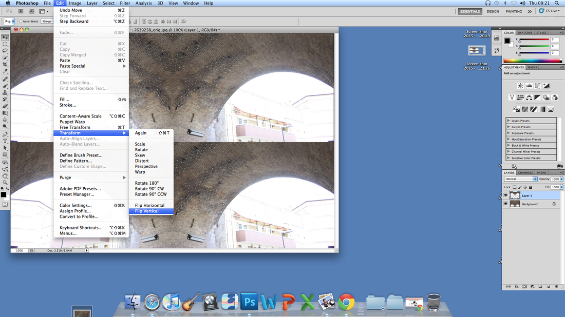
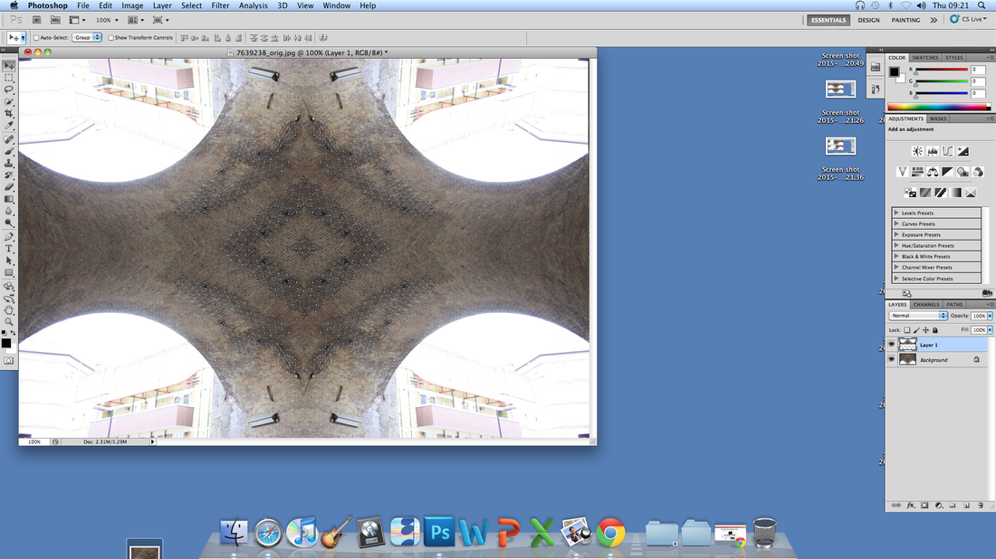
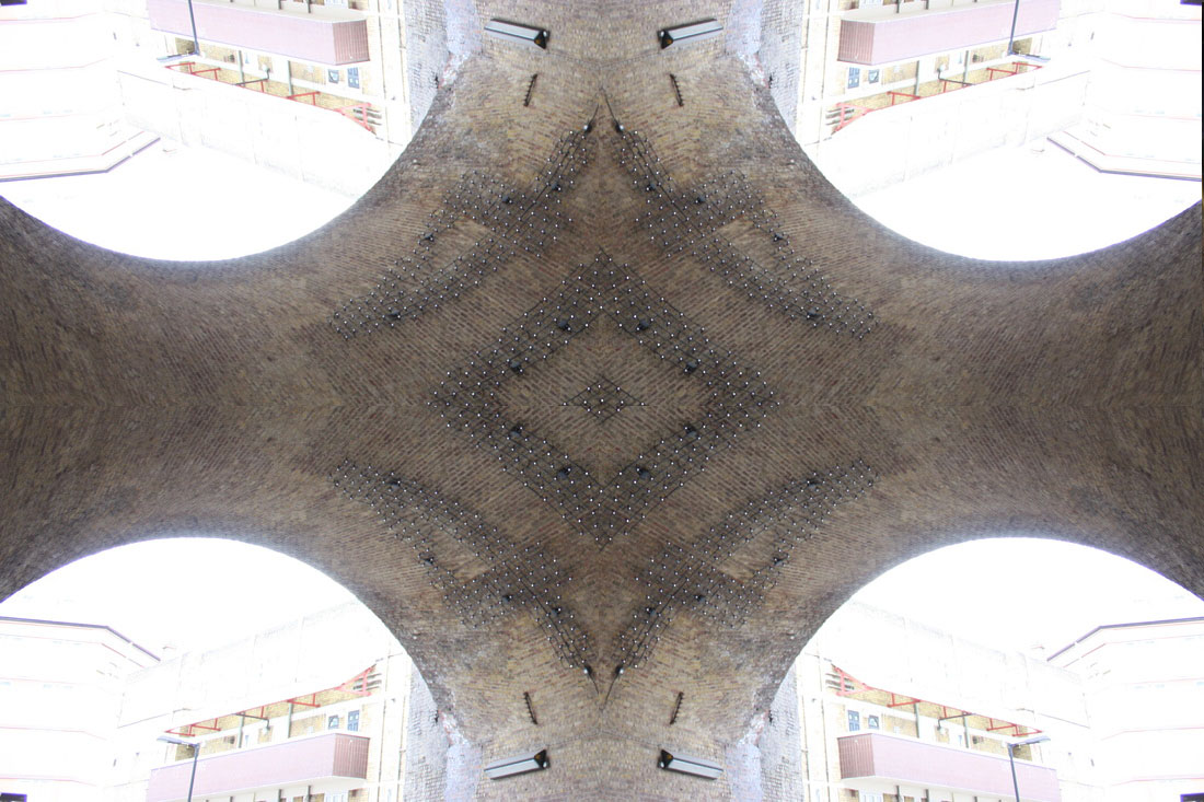
S Y M M E T R I C A L O R D E R
Strong lines and symmetry are often key themes in modern day architecture. I made these photos on Photoshop by selecting half of the image, copied and pasted it onto the other side, and used free transform to flip it horizontally. I then flattened the image, and to make it even more symmetrical, I did the same thing but flipped it vertically.
I N I T I A L R E S P O N S E
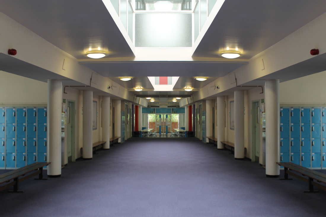
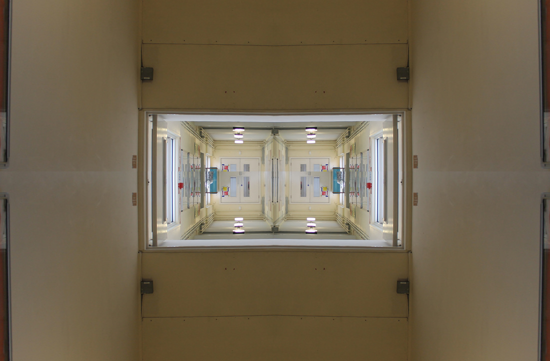
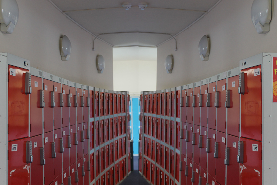
For our first response we photographed different areas of the school that showed symmetry and used Photoshop to show symmetrical disorder.
S E C O N D R E S P O N S E
For my second response I took images in different places for a variety of colour and pattern, I then used Photoshop to either have one line of symmetry or two.
R E F I N I N G M Y W O R K:
I refined my work from initial to second response by using different colours and photoshopping lines of symmetry in different ways, I also took more images for a large variety.
R E F I N I N G M Y W O R K:
I refined my work from initial to second response by using different colours and photoshopping lines of symmetry in different ways, I also took more images for a large variety.
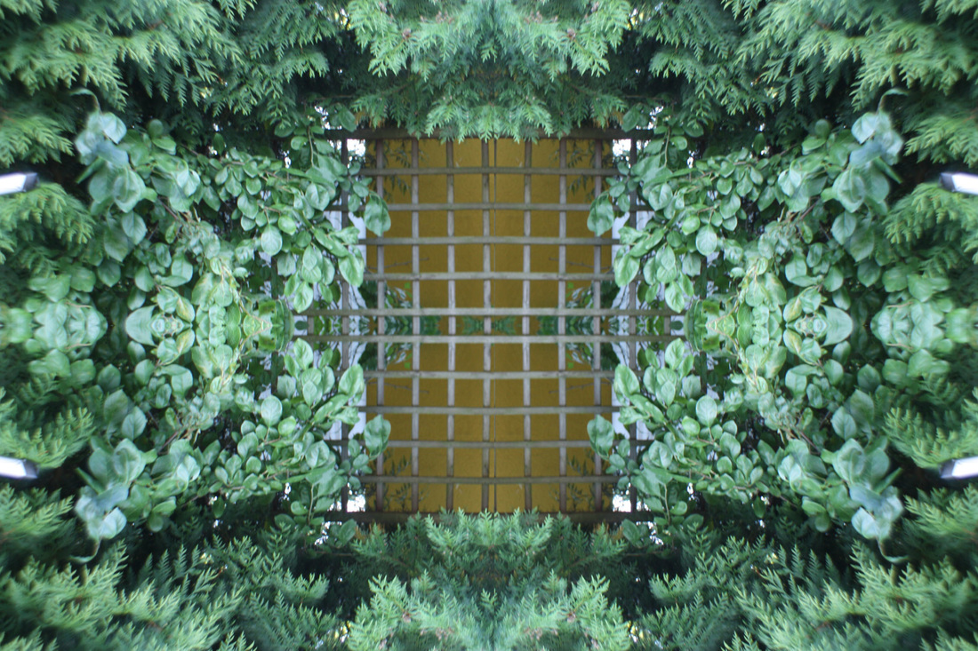
T H I R D R E S P O N S E - B U I L D I N G S
R E F I N I N G M Y W O R K:
I refined my work further by using photos taken in more interesting places to experiment more in my work, the photos I made for my third response are a lot better as I am now more able to use Photoshop after doing the first and second response.
I refined my work further by using photos taken in more interesting places to experiment more in my work, the photos I made for my third response are a lot better as I am now more able to use Photoshop after doing the first and second response.
S T E P S F O R C R E A T I N G S Y M M E T R I C A L O R D E R :

I tried to create gifs out of symmetrical images, at first I didn't do it right so I tried again, these are my results:
|
|
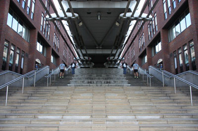
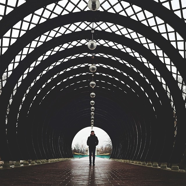
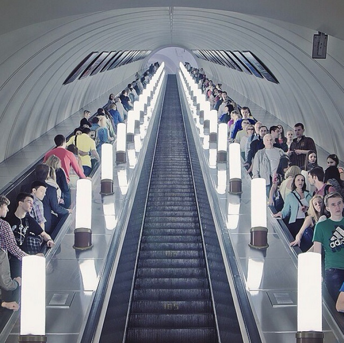
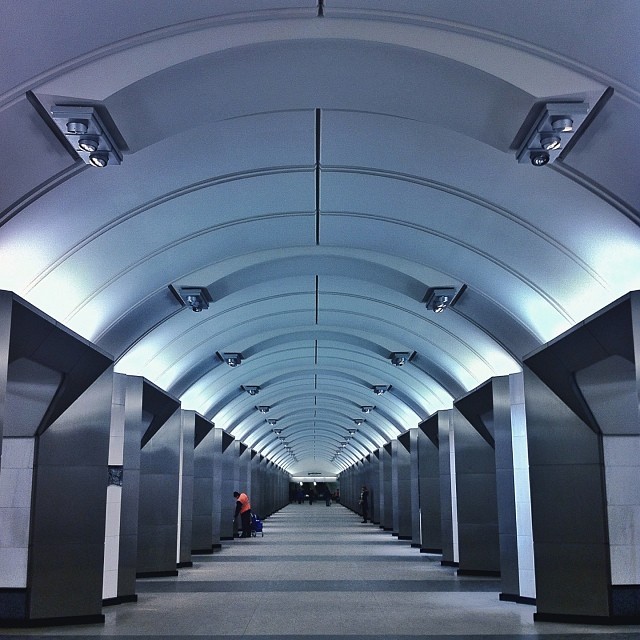
S A S H A L E V I N
Sasha Levin is a Moscow-based photographer, he photographs symmetry based architecture using people as focal points.His use of people in his work is unusual in architectural photography as it makes the pictures more dynamic.
“The symmetry of a shot is an empty canvas for my creativity—I try to highlight a perfect symmetrical angle through the people in the composition. If somebody were ask me, ‘Where is beauty in the world? I would answer that it is in symmetry.”
“The symmetry of a shot is an empty canvas for my creativity—I try to highlight a perfect symmetrical angle through the people in the composition. If somebody were ask me, ‘Where is beauty in the world? I would answer that it is in symmetry.”
|
|
|
|
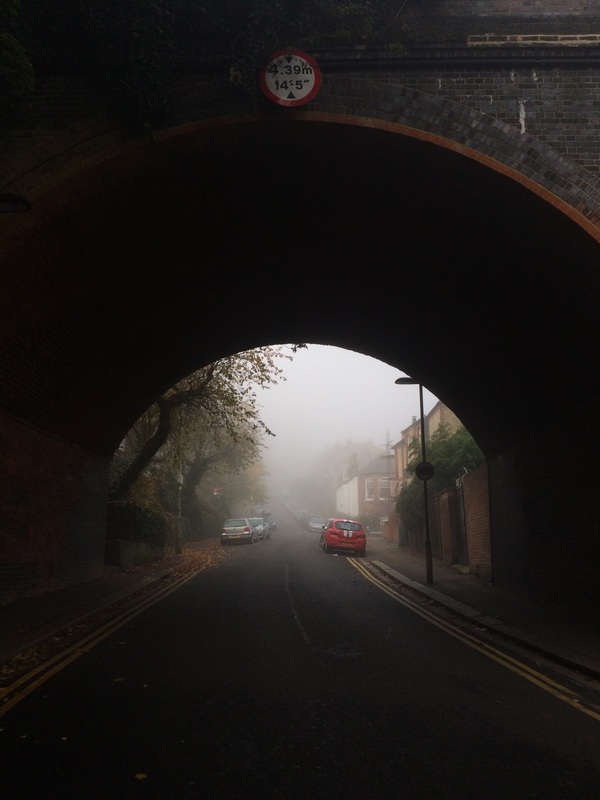
In this image there is a man at the end of the tunnel and he is standing directly in the middle of it, he is the main focal point as his black clothes contrast with the natural light and the end of the tunnel. A sinister and dark mood is created because the main colour is black. The lights that are hung from the top make the image look very symmetrical as you can see a vanishing point. Lots of shapes and patterns can be seen in the image, a series of squares on the roof and the semi circles of the tunnel all add together to make the image seem dynamic.
|
In this composition the stairs are centered, while the escalators on either side are packed with people going up and down. The focal point is the stairs as they are in the middle of the image, it has a vanishing point and creates a very symmetrical look. The colours shown are very bland, there is a mixture of greys whites and blacks, however the bright colours of people's clothes and bright white lights next to the stairs contrast to this. The photograph has been taken with a fast shutter speed, we can tell this as everyone's movements are frozen in the image instead of blurry.
|
This image has a more modern look to is as the building looks more textured and industrial. The main focal point is the man in the red top because he contrasts with the grey in the photo, it also contrasts with the light coming from the middle of the image. This image looks very symmetrical because each section of the arches are identical but decreasing in size until it reaches vanishing point. Unlike our symmetrical order - none of Levin's images have been manipulated, he says "My eyes always spot people in the background. It‘s allowed me to show dynamic life in a static frame”
|
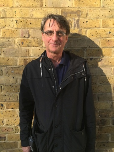
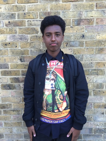
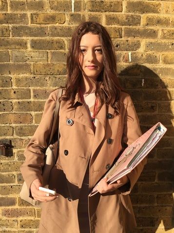
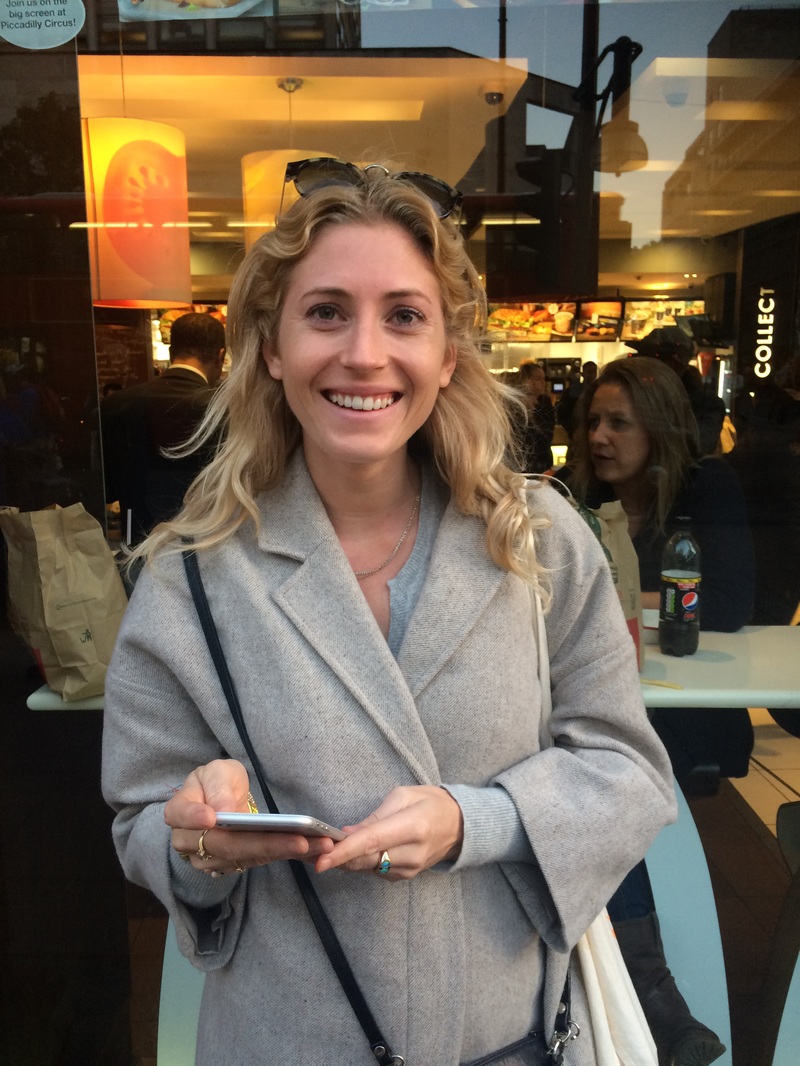
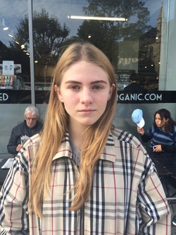
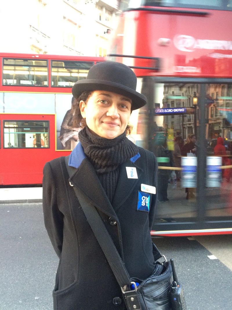
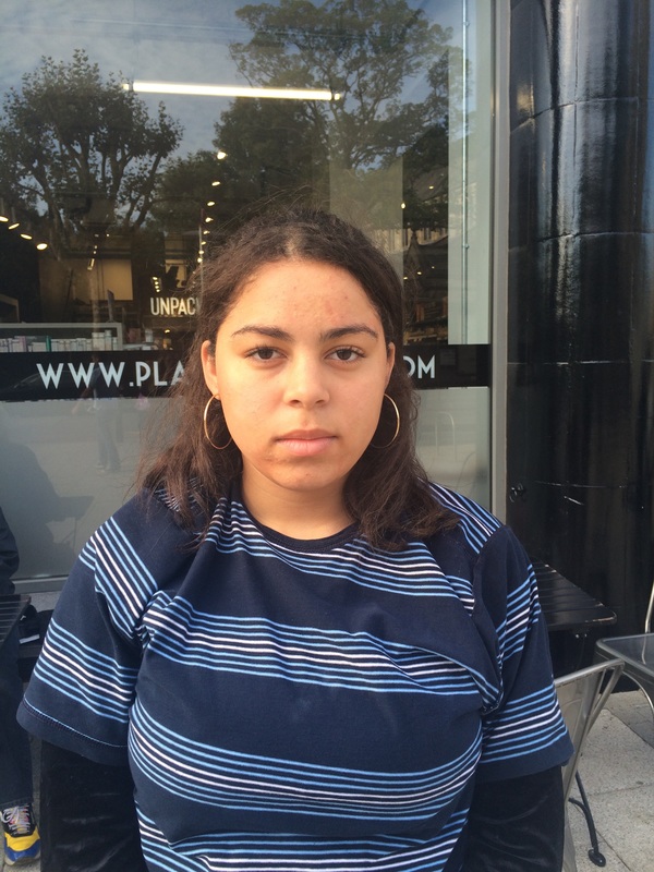
T Y P O L O G Y
Typology is a study or analysis using a classification according to a general type. Typology objects, classification of artifacts according to their characteristics. Typology psychology, a model of personality types. Typology urban planning and architecture, the classification of characteristics common to buildings or urban spaces.
I N I T I A L R E S P O N S E
|
|
|
|
S E CO N D R E S P O N S E - S E L E C T S
R E F I N G M Y W O R K :
I refined my work from initial to second response by taking photos out of school to look at the clothing of a variety of different people, I took these images in Muswell Hill and Oxford Street so that there was diversity between the two places and I used these pictures for my second response as they are different from my initial response, where the images were all taken at school so there weren't any massive changes in styles. However, the backgrounds are all different as I took them all in separate places and I didn't focus on a specific style but the contrast in what males and females wear.
I refined my work from initial to second response by taking photos out of school to look at the clothing of a variety of different people, I took these images in Muswell Hill and Oxford Street so that there was diversity between the two places and I used these pictures for my second response as they are different from my initial response, where the images were all taken at school so there weren't any massive changes in styles. However, the backgrounds are all different as I took them all in separate places and I didn't focus on a specific style but the contrast in what males and females wear.
|
|
|
|
|
|
|
|
|
|
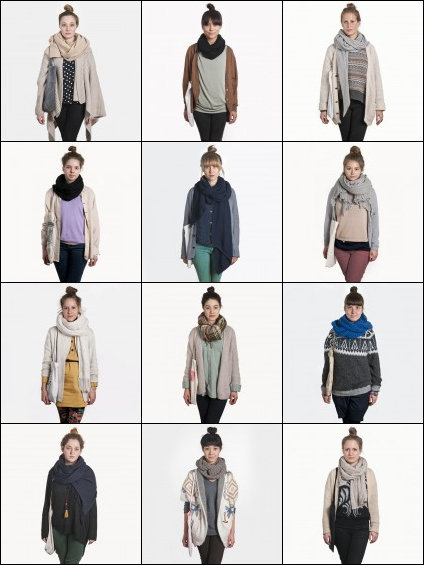
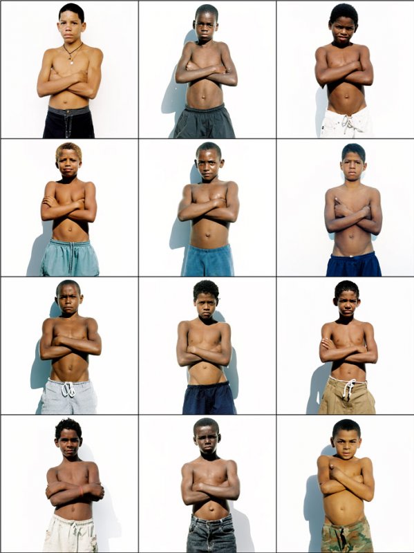
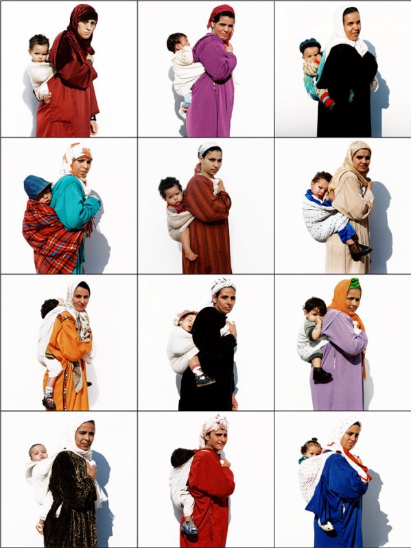
A R I V E R S L U I S & E L L I E U Y T T E N B R O E K
Exactitudes, the photo project started in 1994 by Dutch photographer Ari Versluis and profiler Ellie Uyttenbroek. Inspired by a shared interest in the striking dress codes of various social groups, they have systematically documented numerous identities over the last 20 years. They call their series Exactitudes: a contraction of exact and attitude. By registering their subjects in an identical framework, with similar poses and a strictly observed dress code, Versluis and Uyttenbroek provide an almost scientific, anthropological record of people’s attempts to distinguish themselves from others by assuming a group identity.
|
|
|
"Fashion is a language. It can be a very delicate language, or one that you can shout out loud, and there's always an identity aspect connected to it. We try to find identities rather than trends but, of course, the first thing you see is fashion, clothing and apparel so we try to be very precise with what we portray, because styling is all in the details with these groups."
These images consist of Ari Versluis and Ellie Uyttenbroek taking 12 photos of different people doing the exact same thing. The first displays girls who are all wearing jumpers, scarves and buns, the second is of 12 boys all crossing their arms, topless with the same expression on their faces, and the third photo is of woman who are all wearing headscarves, and are carrying a baby on their back. Versluis and Uyttenbroek have a very strict uniform when grouping these images together so that all the people look extremely similar, it contradicts the idea of individuality as they have taken photos of about every type of person you can imagine, however they aren't all wearing the exact same thing as what they are wearing is part of their identity, so although they may look similar, they're all wearing different things that contribute to who they are. All of the pictures are taken with a white background and the subject's of the images are all centred so that the colours contrast and it's more clear to see the similarities/differences.
These images consist of Ari Versluis and Ellie Uyttenbroek taking 12 photos of different people doing the exact same thing. The first displays girls who are all wearing jumpers, scarves and buns, the second is of 12 boys all crossing their arms, topless with the same expression on their faces, and the third photo is of woman who are all wearing headscarves, and are carrying a baby on their back. Versluis and Uyttenbroek have a very strict uniform when grouping these images together so that all the people look extremely similar, it contradicts the idea of individuality as they have taken photos of about every type of person you can imagine, however they aren't all wearing the exact same thing as what they are wearing is part of their identity, so although they may look similar, they're all wearing different things that contribute to who they are. All of the pictures are taken with a white background and the subject's of the images are all centred so that the colours contrast and it's more clear to see the similarities/differences.
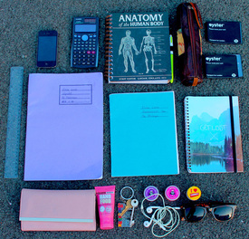
T Y P O L O G Y C O N T I N U E D - O B J E C T S
In this section, typology continued focuses on objects instead of people
I N I T I A L R E S P O N S E
|
|
|
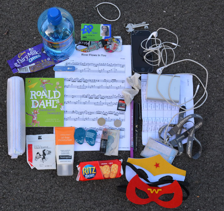
S E C O N D R E S P O N S E
R E F I N I N G M Y W O R K :
I took more images at home which included items that are more personal than the initial response, as they were mainly school related, however they didn't have a white background so I did a third response.
I took more images at home which included items that are more personal than the initial response, as they were mainly school related, however they didn't have a white background so I did a third response.
|
|

|
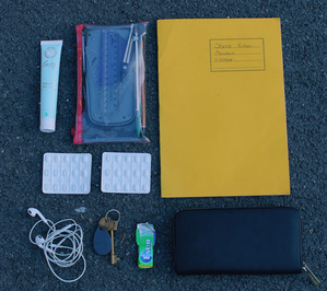
T H I R D R E S P O N S E
R E F I N I N G M Y W O R K :
I used paper as a white background so that the items would contrast against it and stand out more, I used photoshop to crop my pictures.
I used paper as a white background so that the items would contrast against it and stand out more, I used photoshop to crop my pictures.
|
|
|
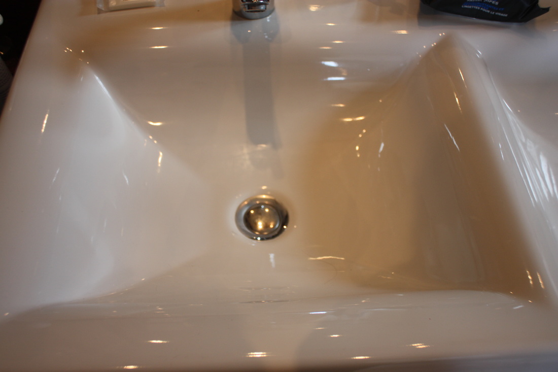
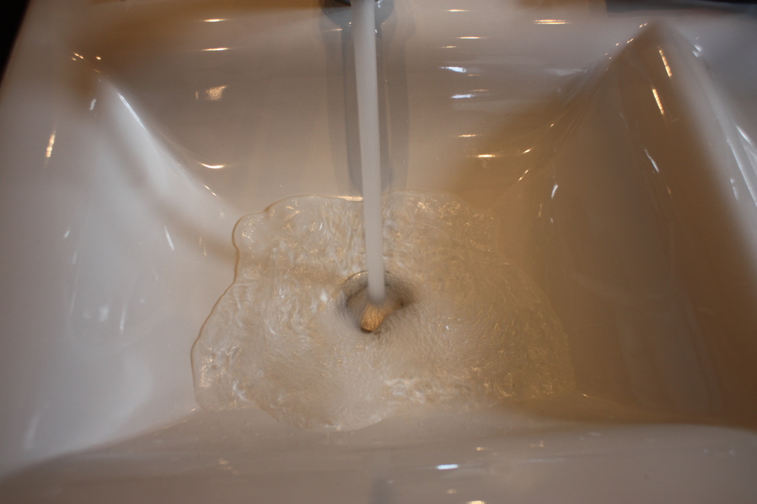
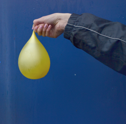
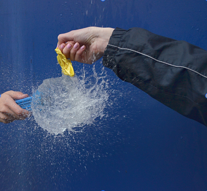
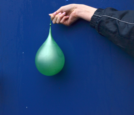
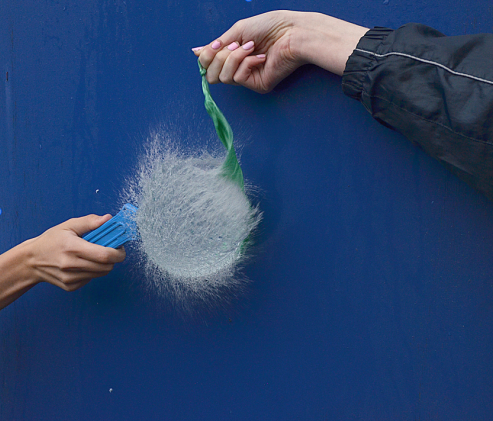
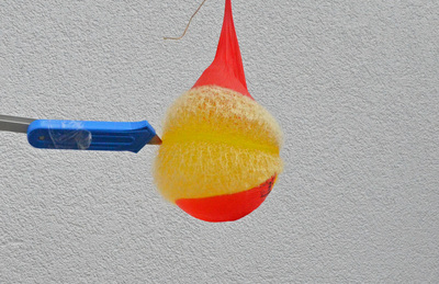
W A T E R B A L L O O N S
For this task we had to take images of the balloons popping, to get a successful outcome we had to capture the exact moment where the water was released. In order to do this we had to use a fast shutter speed, I used 1/1000 and the ISO was 800. To improve my photos I could have used a tripod to make sure my images didn't blur. I sharpened, cropped and brightened them on Photoshop to make the end result look better.
I N I T I A L R E S P O N S E
A F T E R P H O T O S H O P
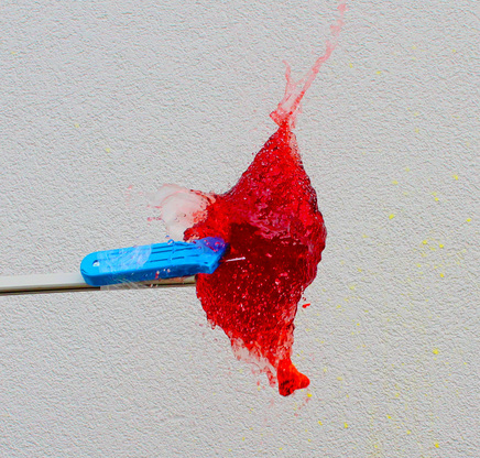
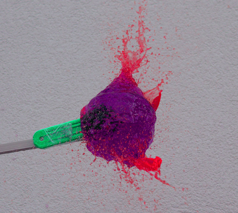
S E C O N D R E S P O N S E
I refined my work by using water balloons with food colouring in to create a bigger effect, the pictures were taken against a white wall to contrast with the colour
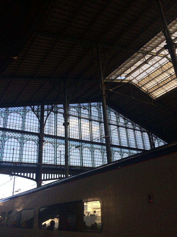
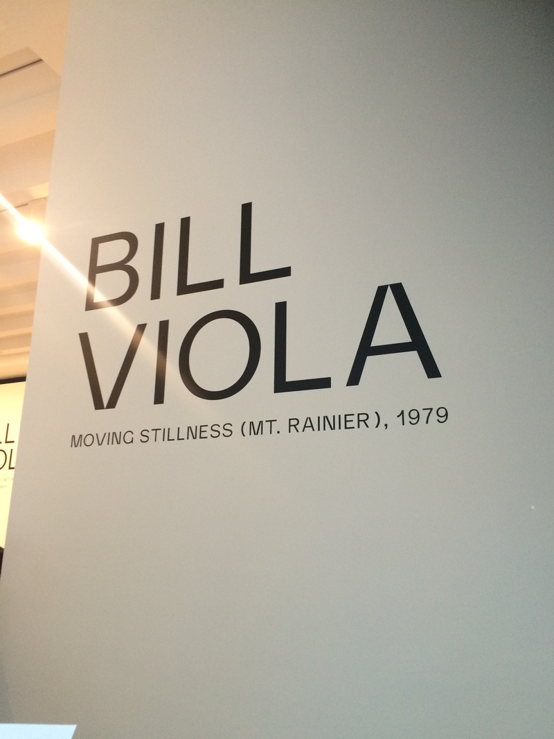
B I L L V I O L A & K I S H I O S U G A
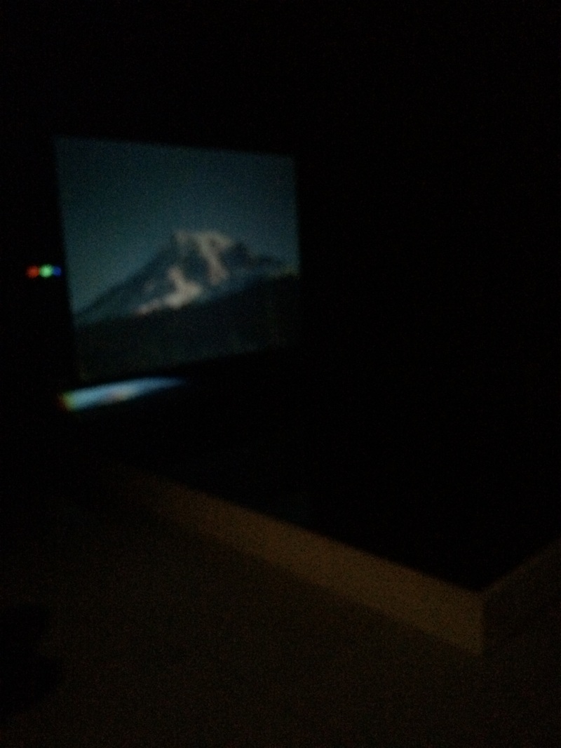
I went to see Bill Viola's 'Moving Stillness [Mt. Rainier], 1979" at Blain|Southern, a screen is suspended from the ceiling above a large shallow pool of water. A projector with three separate beams sends an edit of real-time footage of Mount Rainier to the surface of the water , which then bounces up to reach the rear projection screen. T periodic intervals, the water's surface is disturbed causing the three beams of colour to separate. I didn't get a very good photo as it was pitch black but it was amazing to watch.
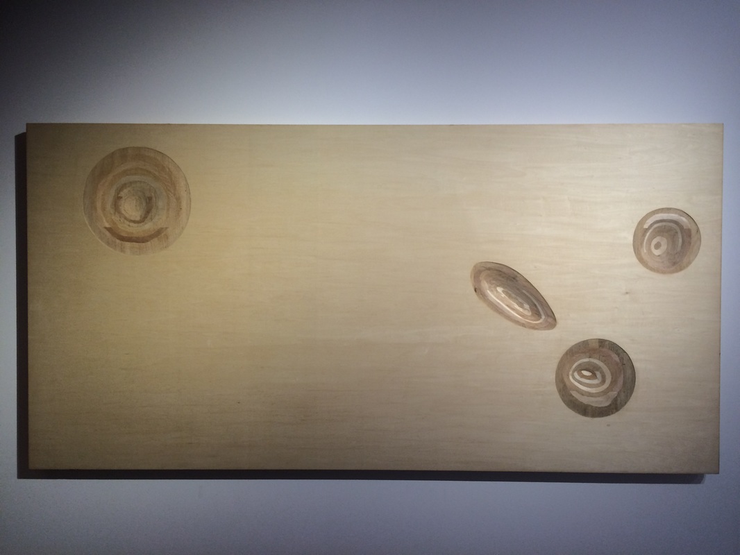
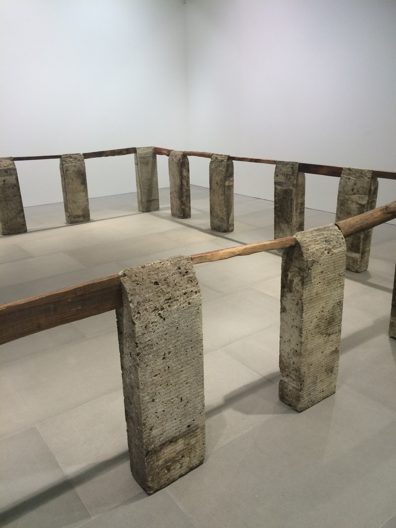
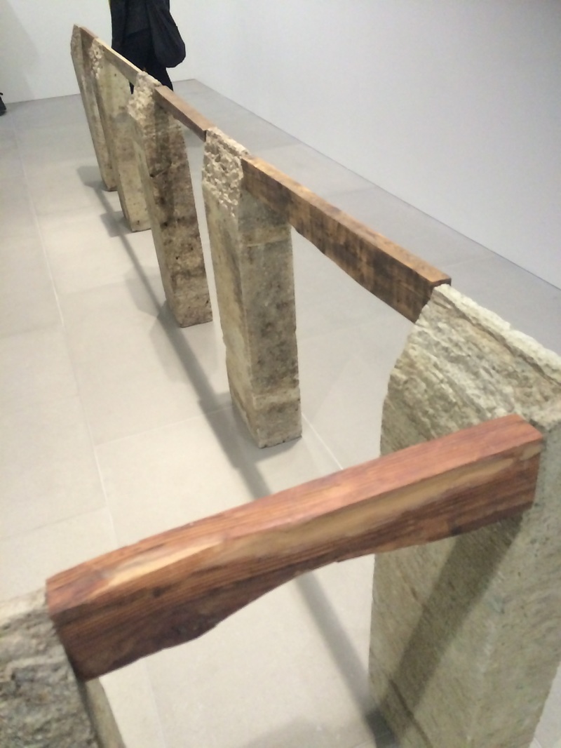
Kishio Suga's 'Perimeter [Entai],1985] was also being displayed, encircling the space with a perimeter of wood and stone, the artist explored the interaction between the physical realm of objects and the emotional world of the viewer. He says "To see the hidden reality of 'mono' things is to understand the structure of the world."
T H R E E S T R A N D S
1 S T S T R A N D
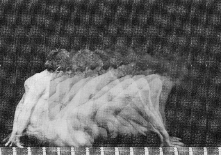
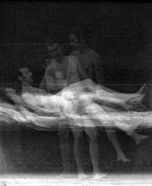
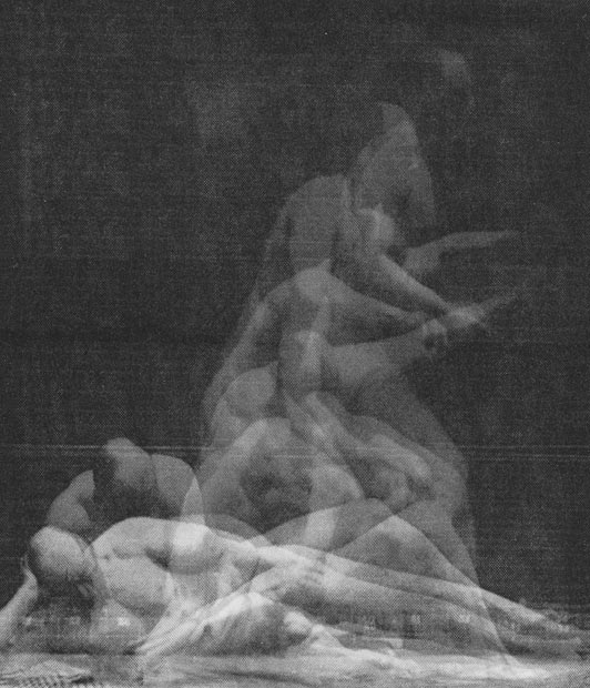
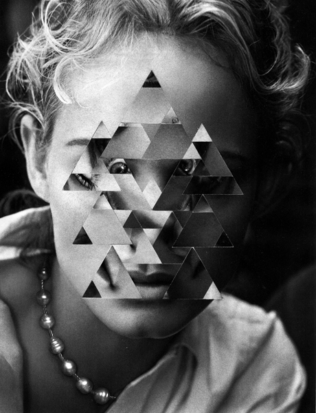
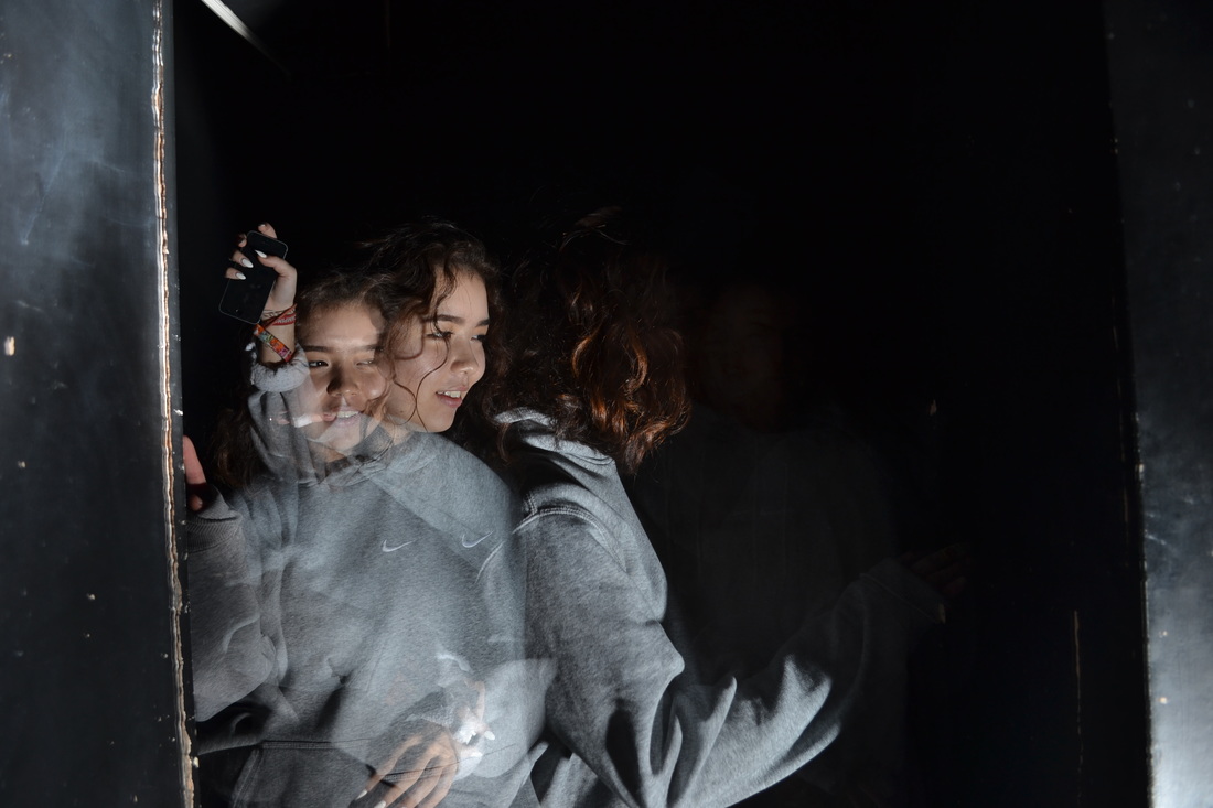
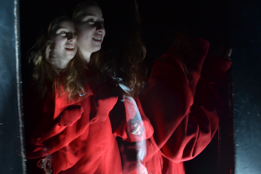
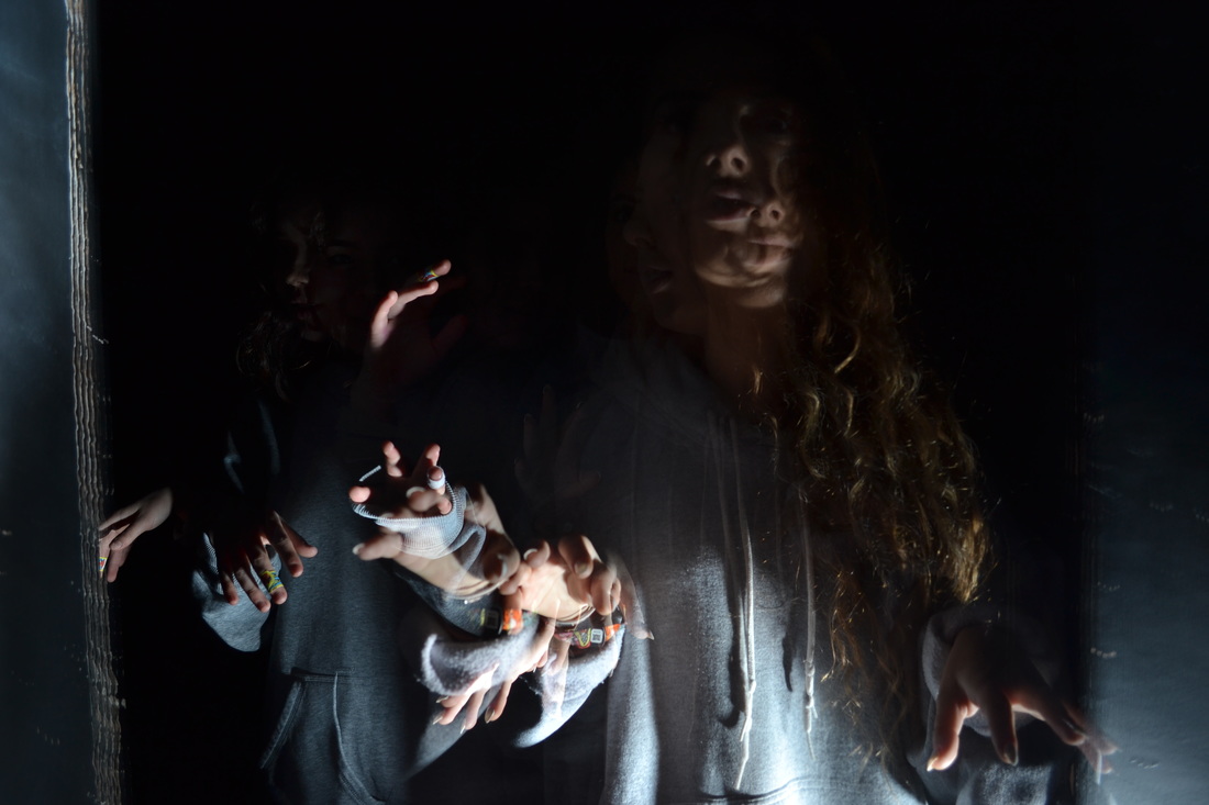
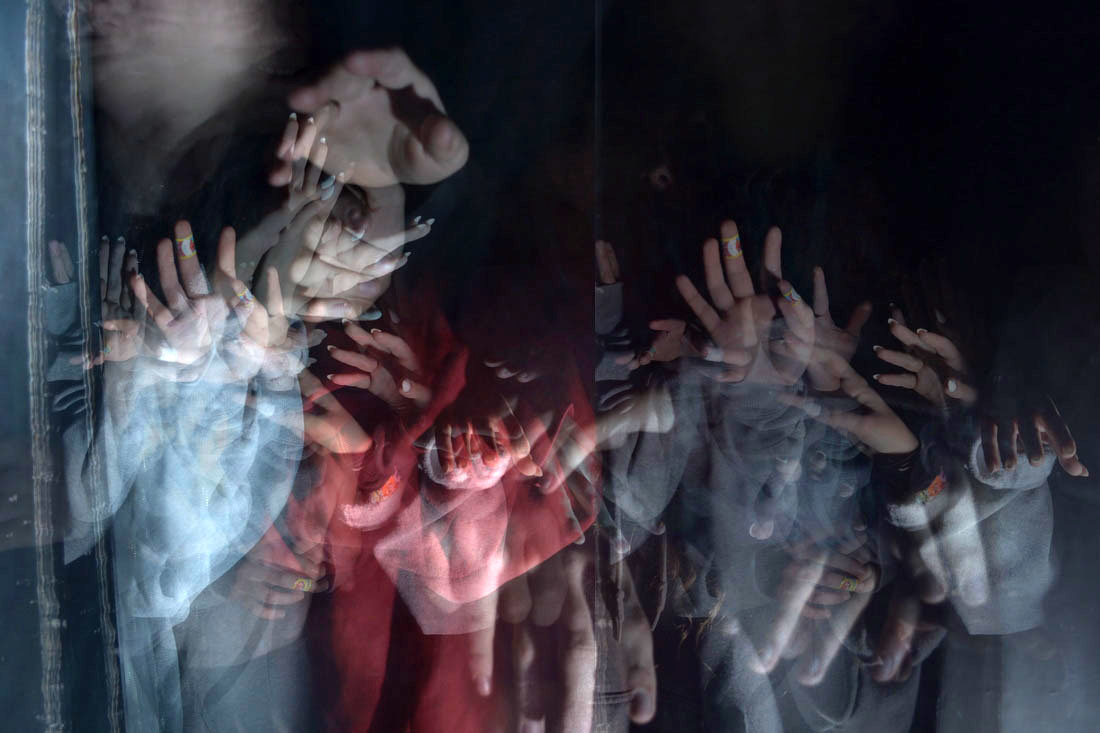
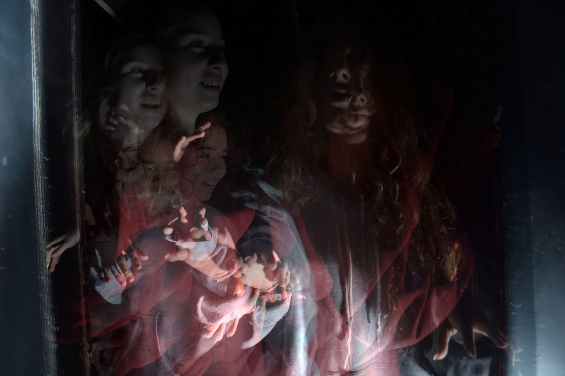
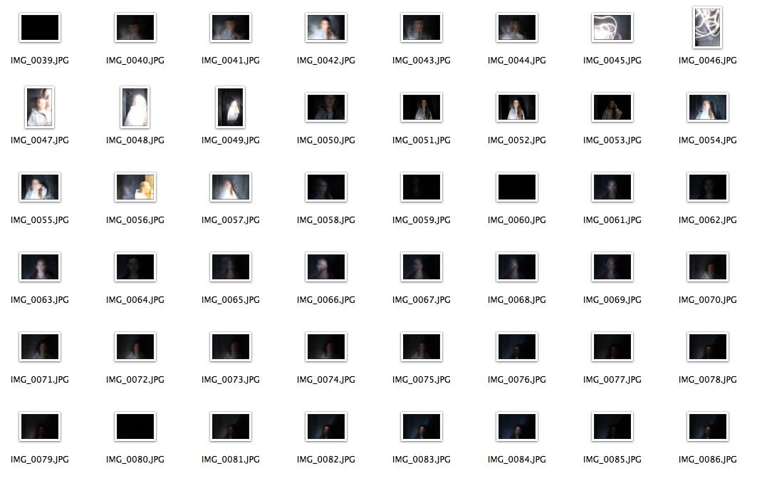
L I G H T D I S O R D E R
For my first strand I chose to do light disorder. This consisted of using the dark room and a strobe light, I used my camera on the bulb mode and used a long shutter speed to capture the movement. We used a range of different gestures and moving speed to vary my end results. These are my 3 selected images:
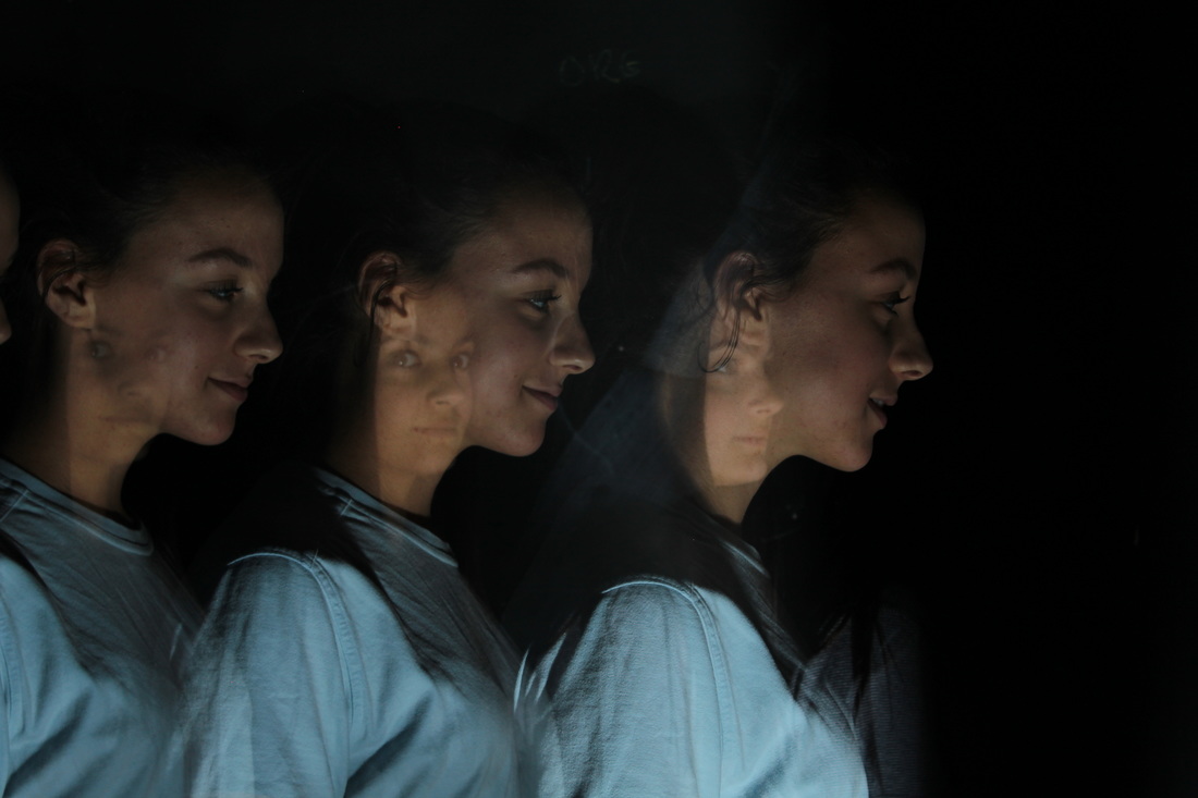
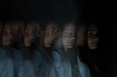
I D R I S K H A N
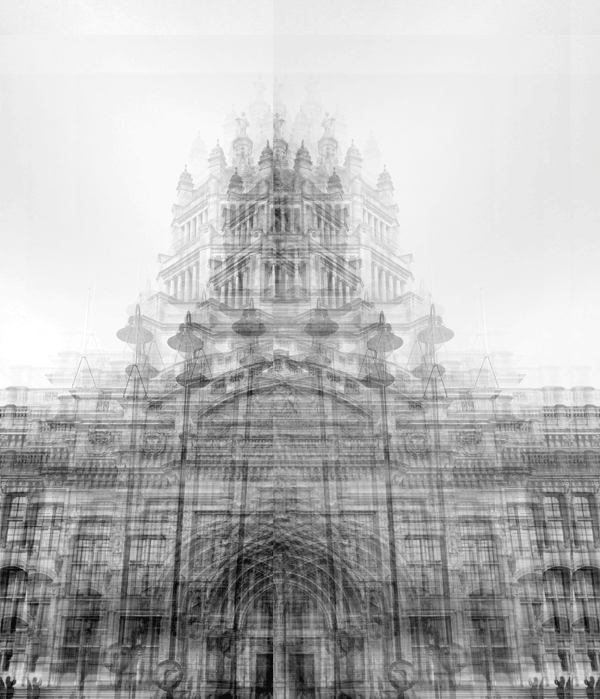
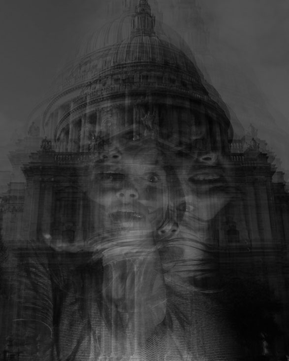
My work was inspired by Idris Khan. Khan's works rely on a continuous process of creating and erasing, or adding new layers whilst retaining traces of what has gone before. He first gained attention for work in which he used digital technology to overlay and combine series of visual or textual work. Repetition and action have always been central to Khan's practice along with a restricted set of processes.
I developed my work by using photoshop to change the colour to black and white so that it looked more like Khan's work
S E C O N D R E S P O N S E
G O R D O N M A G N I N
Los Angeles-based artist, Gordon Magnin, produces work that is a perfect combination of his education, talents, and environment. Gordon finds himself in a city that is visually influenced by celebrity and Hollywood advertising. He uses photographs and distorts them using different shapes which leads the image to look more surreal. Magnin uses various different shapes and photographs to do his work with, each completely new and portraying different things
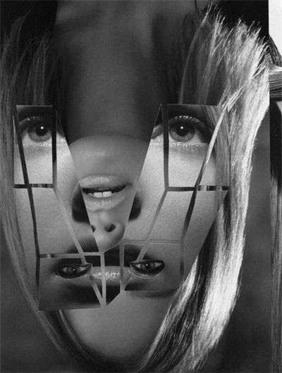
I further developed my strand by using the work of Gordon Magnin in my response. I did this by making selections of shapes, copying and pasting them onto a new layer, and then using free transform to rotate the shape.
|

|
T H I R D R E S P O N S E
I did a third response to develop my first strand of light disorder. I did this by taking more pictures of different people and then edit them all using different techniques. I layered two or three images on photoshop to give the photo more depth.
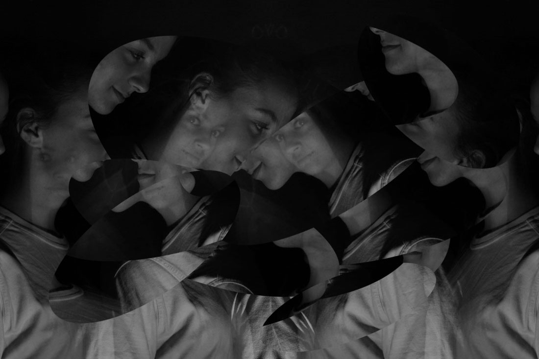
2 N D S T R A N D
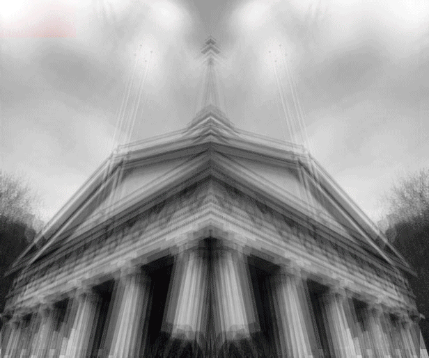
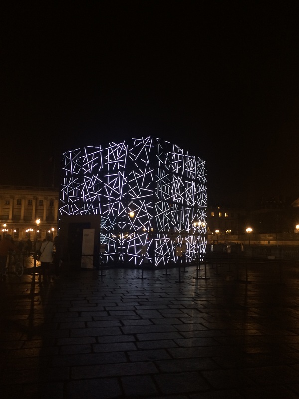
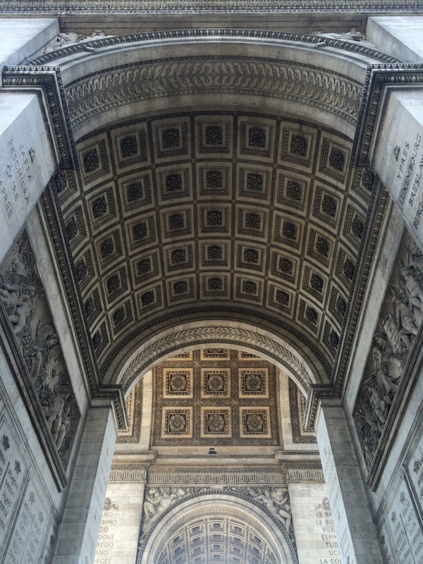
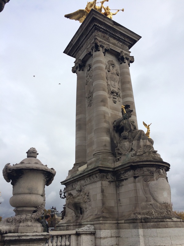
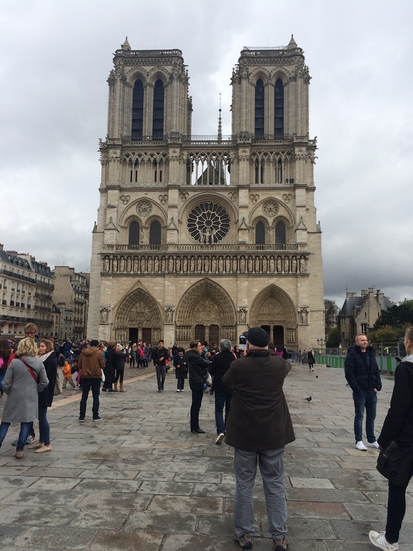
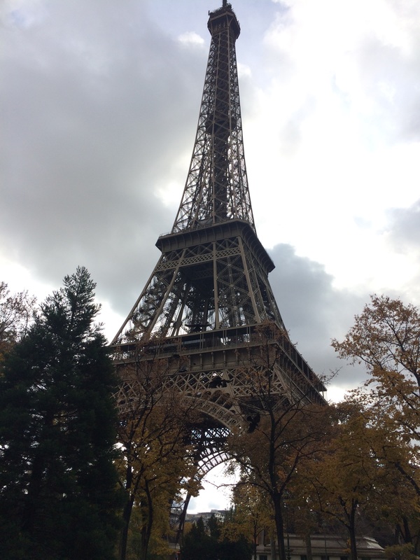
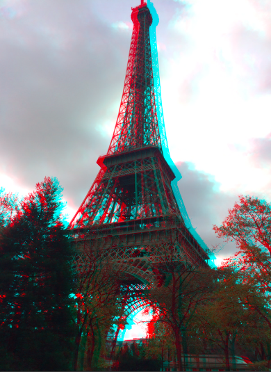
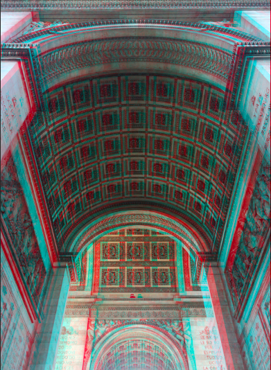
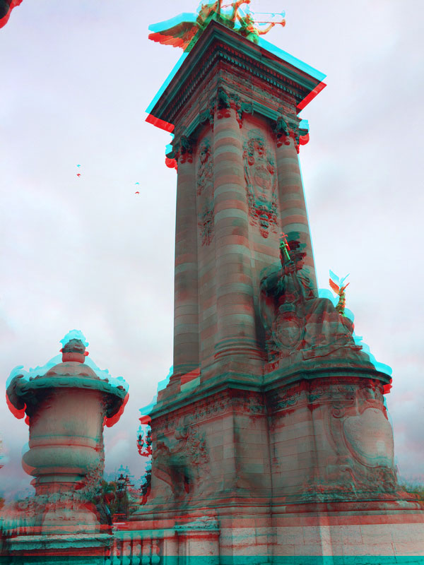
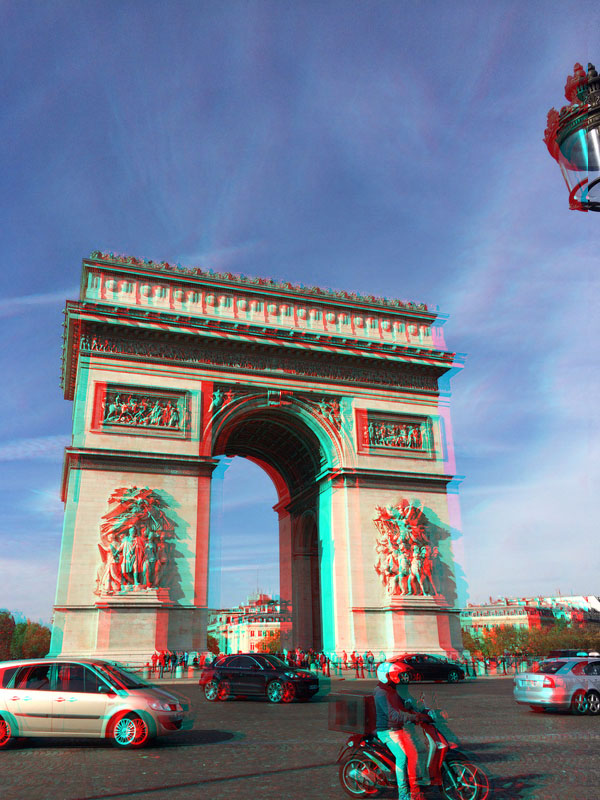
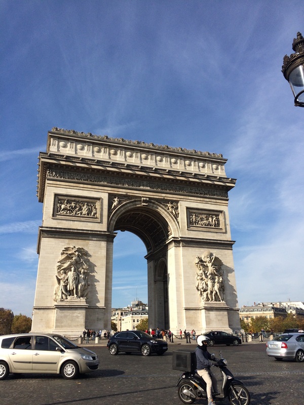
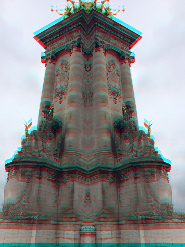
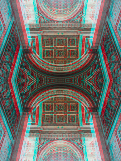
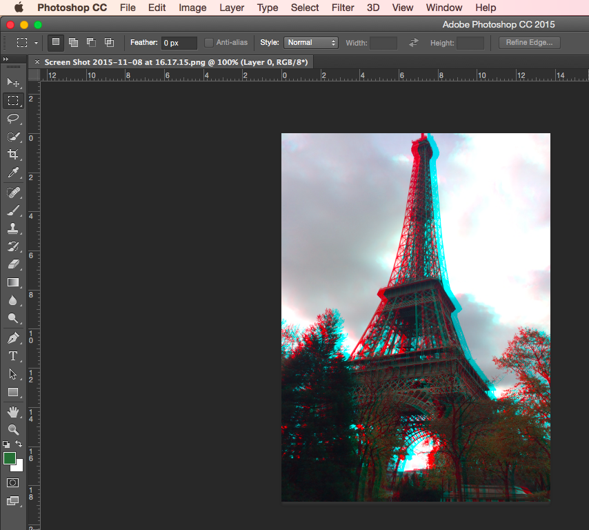
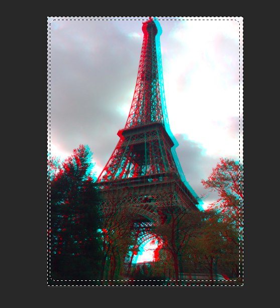
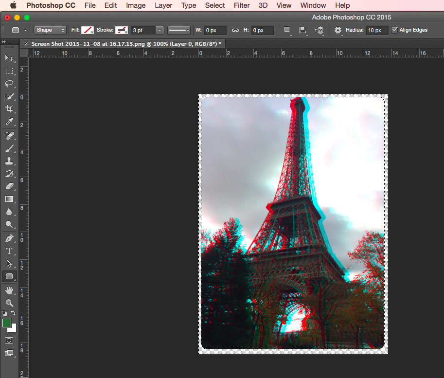
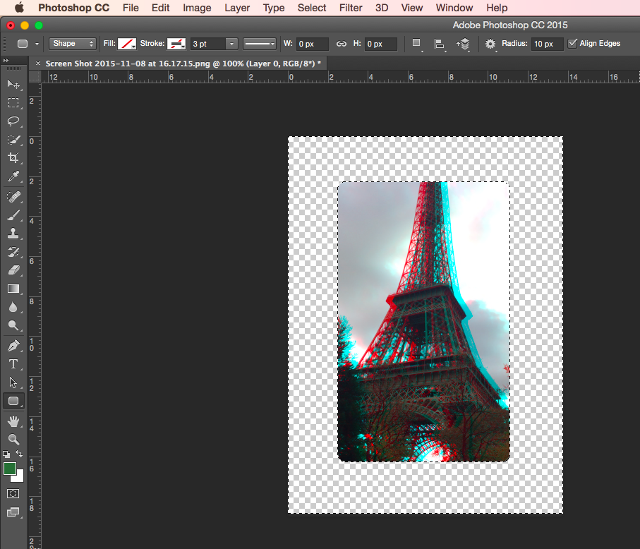
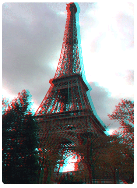
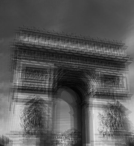
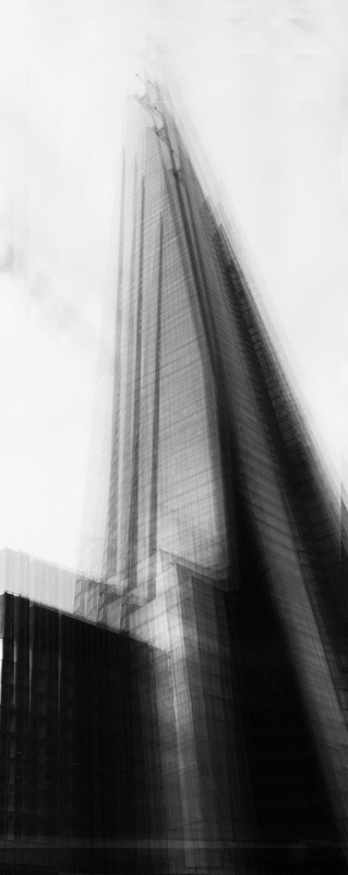
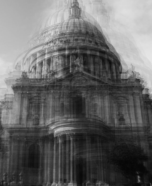
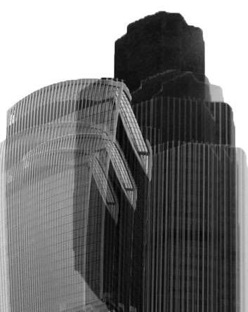
A R C H I T E C T U R A L D I S O R D E R
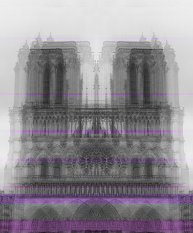
For this strand I took pictures of imposing architecture in Paris, I have manipulated them on photoshop by giving them a 3D effect. I did this by creating 2 new layers and changing their colours to create 'red' and 'cyan' layers, and then layering them. I then developed this by using photoshop again to make the images symmetrical.

|
|
P H O T O S A F T E R P H O T O S H O P :
|

|
|

|
|

|
|
|
S E C O N D R E S P O N S E
I developed my work by making my photos symmetrical, I did this on photoshop. I then showed the process of turning one of the images into a gif for my final development of this strand.
|
|
P R O C E S S :
3 R D S T R A N D
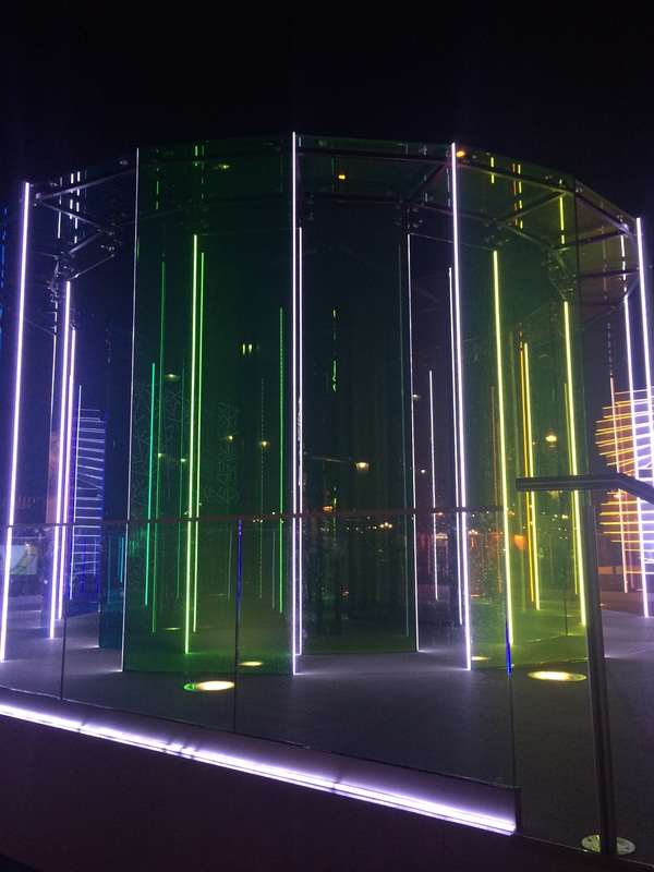
C O L O U R D I S O R D E R
For my final strand I wanted to take pictures of colourful/bright objects or places and use photoshop to manipulate them. I used grayscale and then used the brush to paint the colour back onto the sections I wanted to. I selected 3 images which I photoshopped to emphasis the colours in them and then edited them to enhance the colours even more.
A F T E R P H O T O S H O P :
|
|
|
S T R A N D D E V E L O P M E N T :
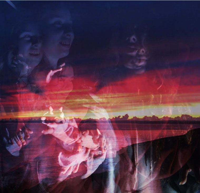
For my strand development I decided to combine light disorder with architectural disorder. In the mock exam I used different techniques on photoshop to try and show this - although some of the images I made weakly relate to my chosen strand, I further developed them in order to improve my results.
M O C K E X AM : F I R S T D E V E L O P M E N T
My first development for this strand was my most experimental, the first image doesn't really relate to my strand however I tried to include buildings to follow on from the architectural aspect, however it didn't turn out how I expected. I used a light disorder picture for my second attempt and used bright sunset as the background to incorporate my idea of the light disorder strand.
|
|
M O C K E X A M : S E C O N D D E V E L O P M E N T
My second development is where I started combining my two strands together - light disorder (portrait transformation) and architecture. I used Idris Khan's work as inspiration for this development and carried on using it throughout my other developments.
|
|
M O C K E X A M : T H I R D D E V E L O P M E N T
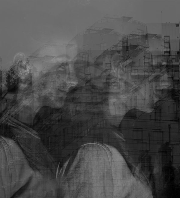
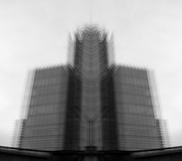
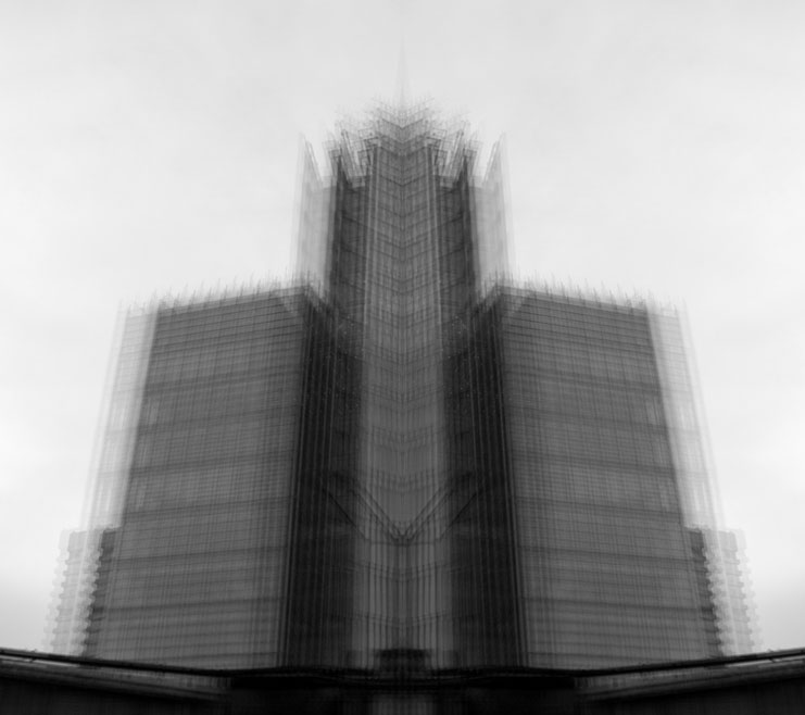
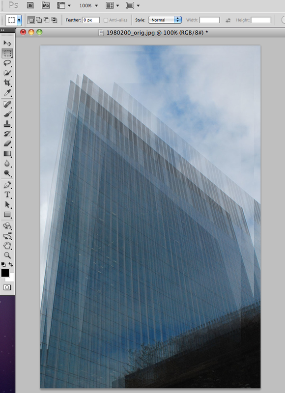
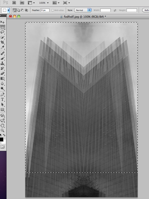
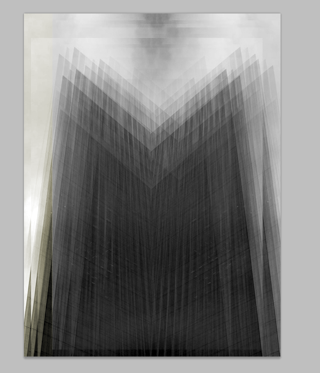
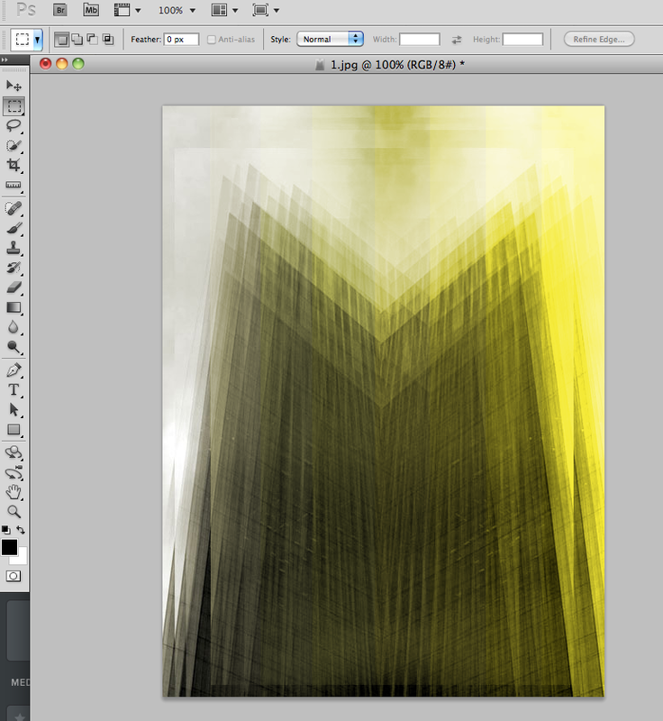
My third development is when I decided to refine my work more and focus on the architecture - using black and white, I continued using Idris Khan's style of editing for this response. I tried to use different angles and make sure the buildings filled up the composition, although my third attempt is my best because of the head-on angle, I kept my used my other two images to show how I refined my work.
|
|
|
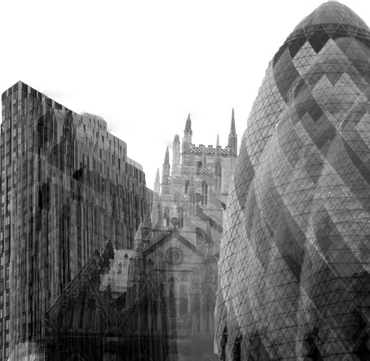
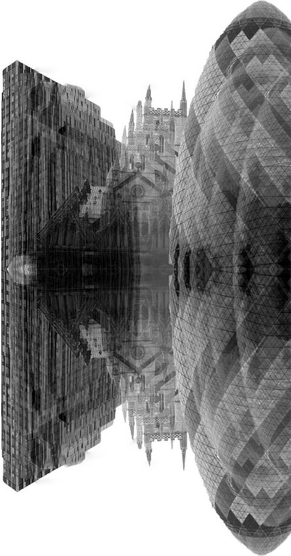
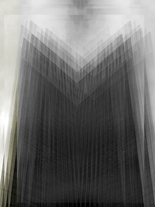
A R T I S T & M E
Khan's work draws from a diverse range of cultural sources including literature, history, art, music and religion to create densely layered imagery that is both abstract and figurative and addresses narratives of history, cumulative experience and the metaphysical collapse of time into single moments.
I D R I S K H A N |
M Y W O R K |
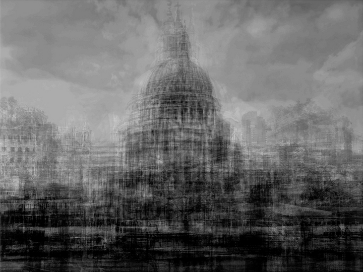
I tried to recreate his work for my strands, we used the same type of building and layered them in black and white, however Khan's composition is more zoomed out as it involves the surrounding buildings. His composition makes the image look more symmetrical, as the main focal point is the building as it is in the centre. His work looks more busy which is what he is trying to capture in a single moment. My response of the buildings is too cropped at the top and sides, to improve it and make is more similar to Khan's work I would layer the building more and use more of the surrounding area so it isn't as cropped.
|

|
S T R A N D D E V E L O P M E N T :
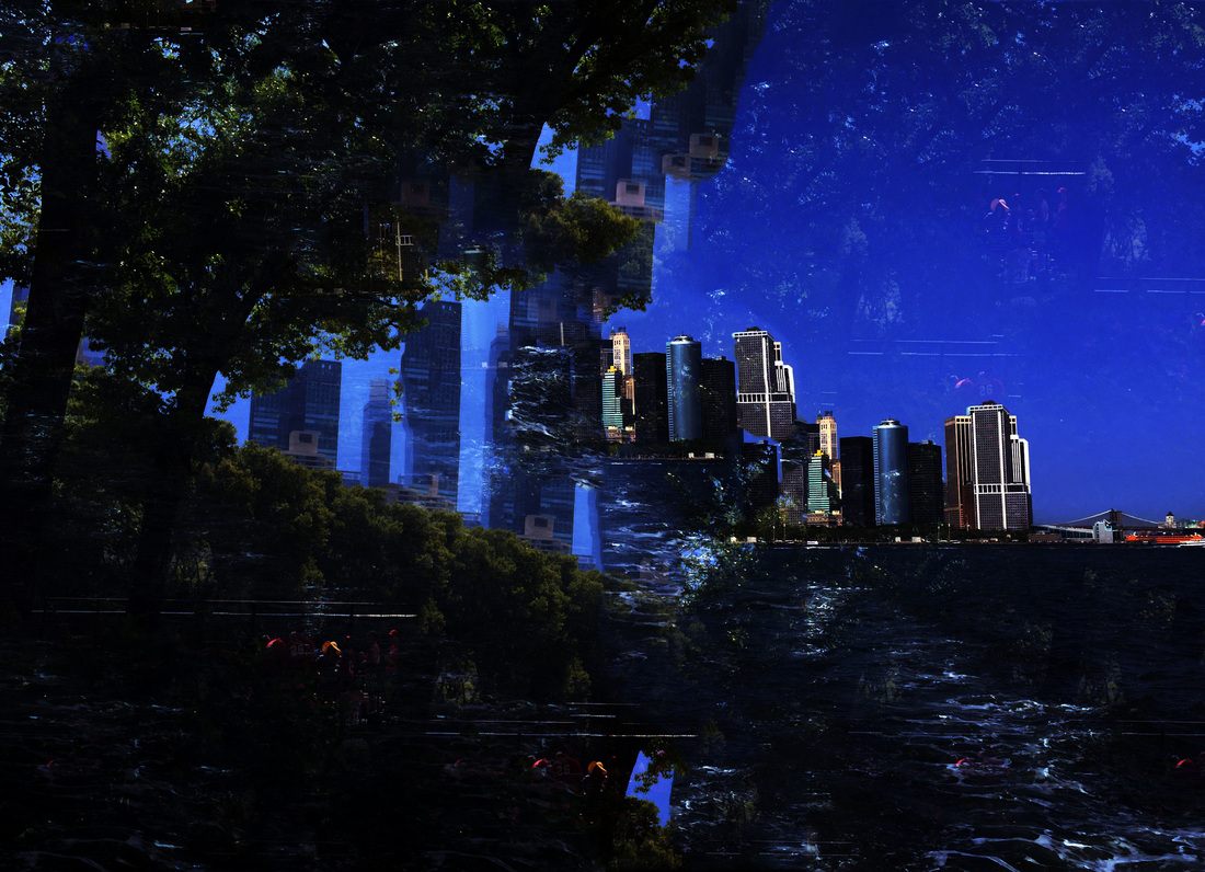
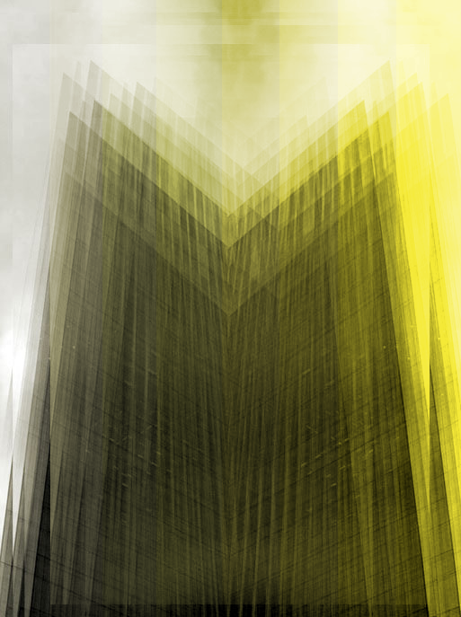
I will take more photos of buildings in central London from a symmetrical viewpoints in order to use them later on in my work. I'm developing my strand now focusing more on architecture combining Khan's black and white layered work with colour. I'm developing my response by introducing symmetry into my work. I created theses images by using photoshop to layered it, made it black and white, made it symmetrical and then for my next development turned it into a gif using a strip of colour on Photoshop to contrast against the black and white.
After this development I will take more photos of the London landmarks, and layer them into a condensed skyline, as a second response I'll make an abstract version by cutting up the buildings on photoshop and using colour, and finally develop this into a gif for my final piece.
After this development I will take more photos of the London landmarks, and layer them into a condensed skyline, as a second response I'll make an abstract version by cutting up the buildings on photoshop and using colour, and finally develop this into a gif for my final piece.
F O U R T H D E V E L O P M E N T
I created a skyline using edited buildings using Khan's layered effect on them, I did this to try something new in order to further develop my work and split the skyline into two so that the buildings are more recognisable and contrast more against the white background.
|
|
F I F T H D E V E L O P M E N T
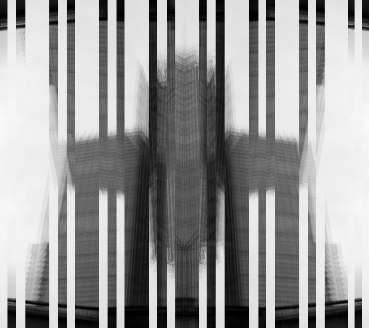
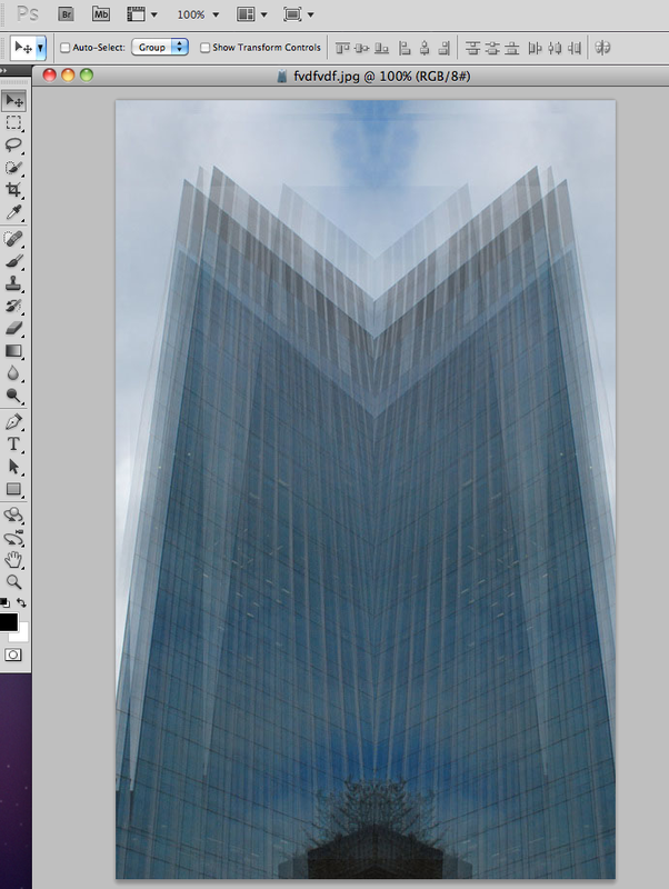
My fifth development is where I started created gifs so that I could develop them again for my final piece, I used symmetry to add in a technique in order for it to be a more refined development.
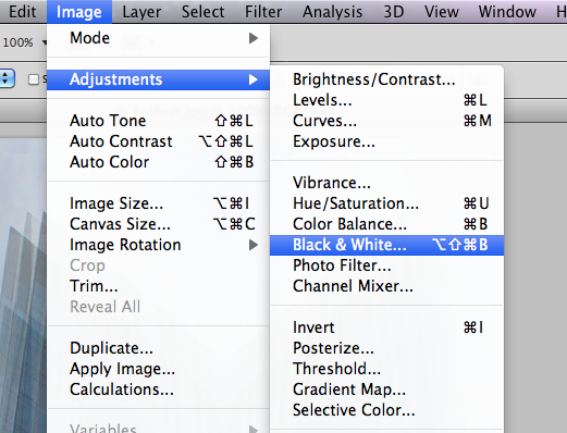
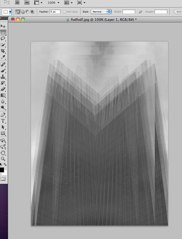
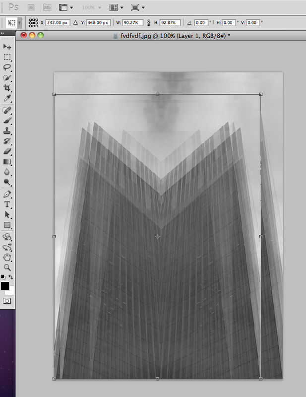
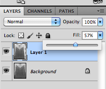
P R O C E S S :
I duplicated my original image many times to create the same effect as Idris Khan, then made it symmetrical and took vertical pieces of the image and rotated them 180 degrees to create the gif.
I duplicated my original image many times to create the same effect as Idris Khan, then made it symmetrical and took vertical pieces of the image and rotated them 180 degrees to create the gif.
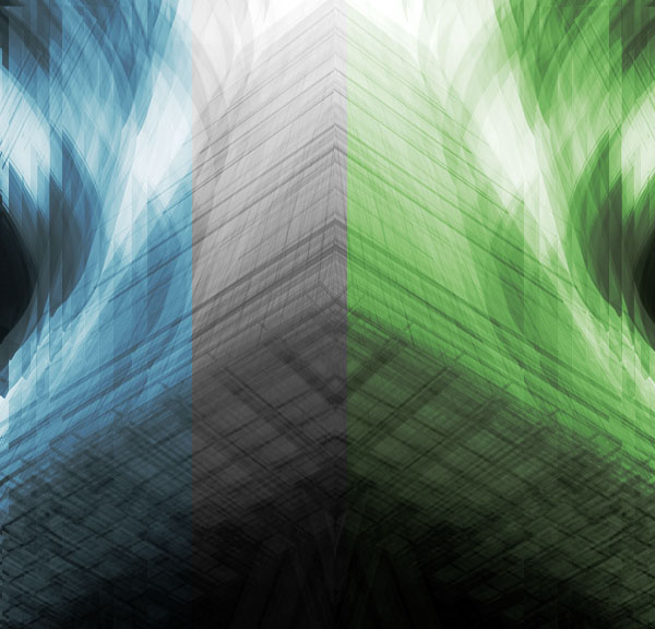
S I X T H D E V E L O P M E N T
For my final development I used symmetrical buildings in black and white and edited them with colour in order to make them look more interesting, the contrast makes the images more pleasant to look at as most of my previous work for this strand has all been in black in white - although this was to copy Idris Khan's style of work, this response kept that aspect while still developing it further.
|
|

|
F I N A L P I E C E S