L A N D S C A P E
L Y N N E C O H E N
|
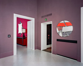
This image consists of two purple walls with doors leading into a colourful room, and the other door next to a circular picture. The main focal point of the image is the line where the two wall's meet, this may be because it's in the centre of the composition and has a bright feature on either side, however either the pink room or the orange, white and black picture are prominent enough to be considered the focal point of the image. The room looks distorted as there are various shapes such as circles and different sized door frames. The bright colours contrast with the plain purple, but the purple also contrasts with the bright white door frames. The foreground of the image is empty but behind the floor in the foreground the image is quite busy. The photographer has hidden details (the rooms) to give the photograph a mysterious feel as it makes you want to go inside.
|
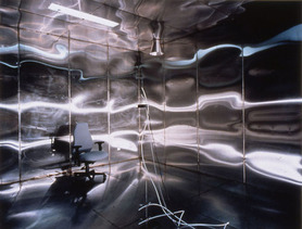
The composition of this image contains a blue office chair on the left of the image, and it is in a room that has metallic walls. This bleak environment leaves you feeling cold and uncomfortable because of the lack of objects and colour. The main focal point is the chair, this is because it is the only object in the room, and the light reflecting off of the metallic walls surround the image so it's not the first thing that catches your eye. The photographer has used a fast shutter speed, and you can tell this because the image is in focus. The attention has been draw to the chair, I think this is because it emphasises how empty the room is, by putting it in the left of the composition so you can see my of the empty space. There is no sign of manipulation because the image looks realistic and there isn't anywhere on the image where it looks like anything has been changed.
|
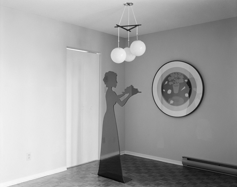
In this black and white photograph, it contains a circular picture on the wall, a door, a dark statue of a woman standing near the corner of the room, holding something in the air, and three white lights hanging from the ceiling. The main focal point of this image is the woman, this is because it is in the centre of the image, and is framed by the lights, picture and door. This image is very simple as it only has a few objects in it, but they are bold and eye-catching. All of the image is in focus and the photo is in black and white to intrigue the viewer, the light is coming from the right of the image which makes the left side lighter than the right, this is either natural light from a window or a light which is facing to the left. The picture has been taken from the side/corner, and the line where the two walls meet makes the image feel more symmetrical as it is in the centre and there are objects on either side.
|
G E O R G E R O U S S E
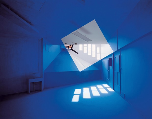
This image consists of a room that has been manipulated to become blue, the room is empty but the main focal point is the white square in the centre if the image. This is because it is the only shape and contrasts with the blue. The location has been chosen because the room is empty and there are no objects in the background, this makes it easier to tell what is happening in the photo. The photographer has positioned the light so that a symmetrical pattern has formed in the white and blue.
|
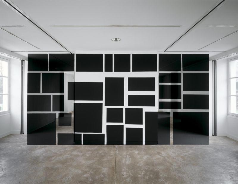
In this photo there are various sizes of black squares and rectangles in the centre of the image, taking up most of the empty room. There aren't an blurred areas which means that the picture has been taken with a tripod. The natural light is used effectively, so there is no need to use artificial lighting or flash as it's bright white and contrasts with the black shapes, and the attention hasn't been drawn to a specific object but to the whole block of shapes.
|
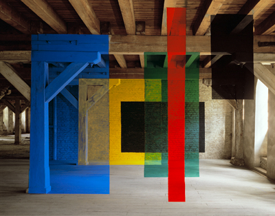
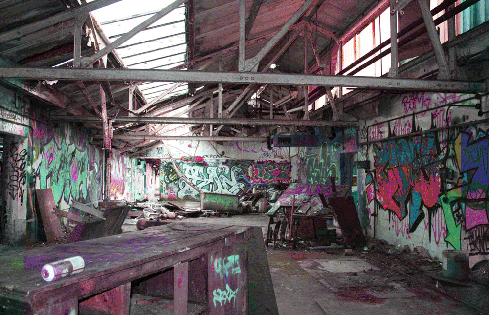
This photo has been taken in a large empty room, it looks quite old and worn down, and this contrasts with the other colours in the image. There main focal point is the long red beam or the yellow on the back wall, this is because they stand out most against the rest of the image. They also contrast because colours look smooth whereas the building looks rough. The image has been manipulated so that the colours are shown.
|
M I C H A E L W O L F
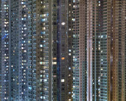
This image is of a collection of buildings, they are very tall and close together, and the image is quite zoomed out so that you are able to see more windows. The main focal point is the centre of the image because there is a darker blue, however there are various lights on the buildings and coming from the windows, so it is hard to tell. The photo has been taken directly opposite to the subject, so you are able to see the photo head on. A fast shutter speed has been used to free the image so that it is in focus.
|
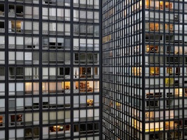
This photo consists of two black and white buildings, the main focal point is in the centre of the composition, where the angle of the photo has made the photograph look three dimensional. The lights coming out of the windows contrast with the buildings because the orange and different shades of white and grey stand out. The attention has been drawn to the perspective part of the image because the sizes of the windows differ from the rest of the photo.
|
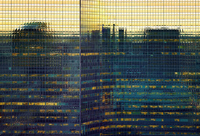
This image contains a large building, and you can see the city reflected onto it. The the main focal point is the yellow coloured part of the building at the top, this is because it contrasts with the black reflection, but you can also see office lights. This image differs from the rest of Wolf's photos because, although they are all different and express different things, this one shows a reflection, which is unique.
|
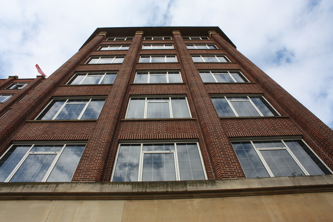
S C H O O L E N V I R O N M E N T
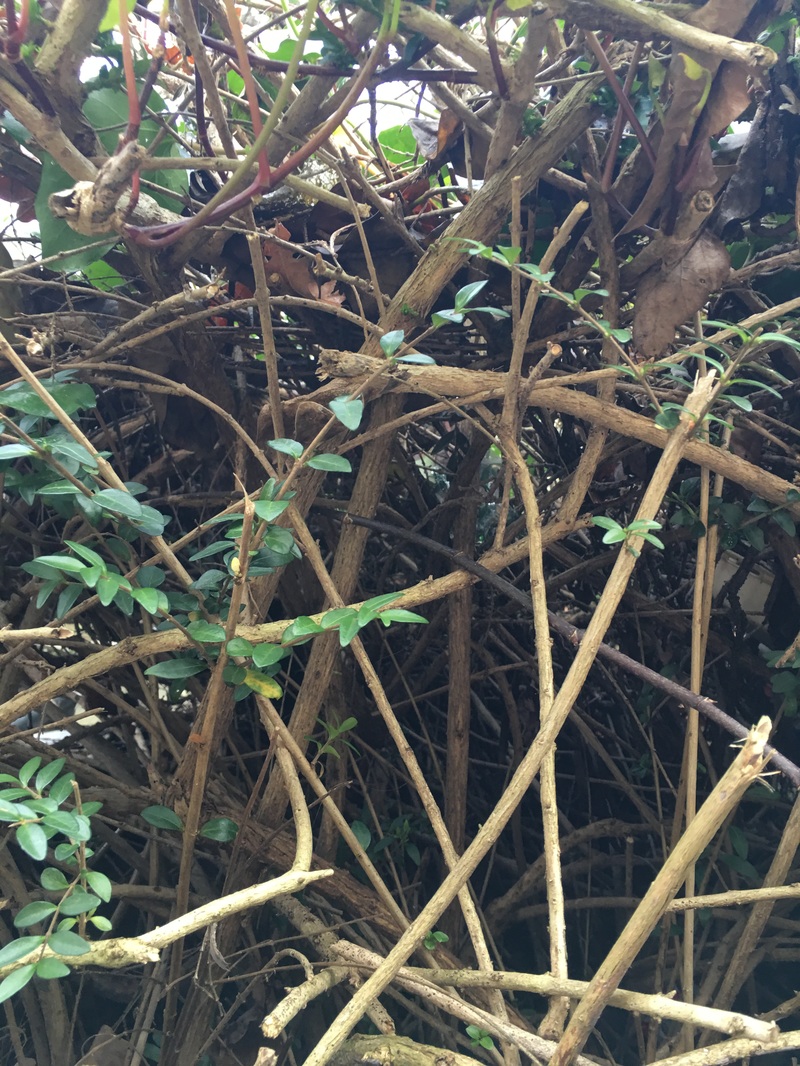
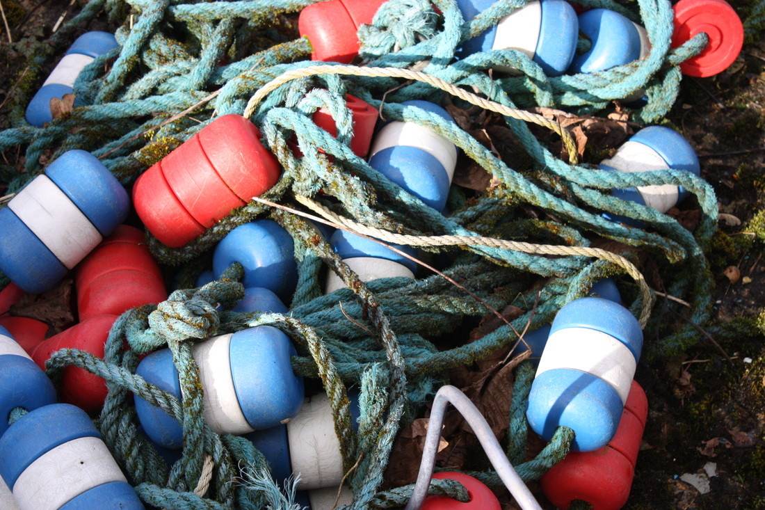
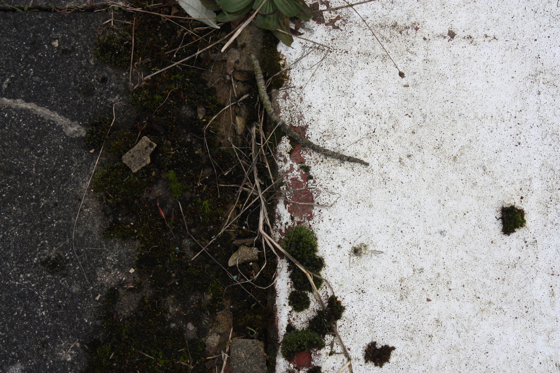
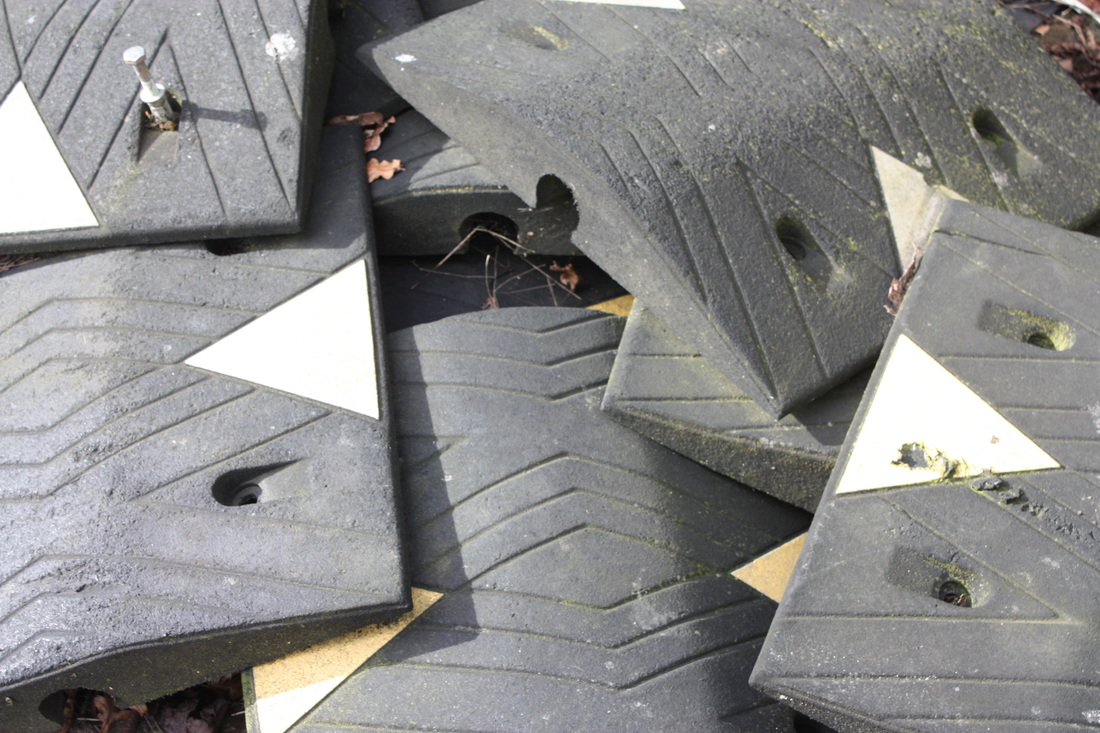
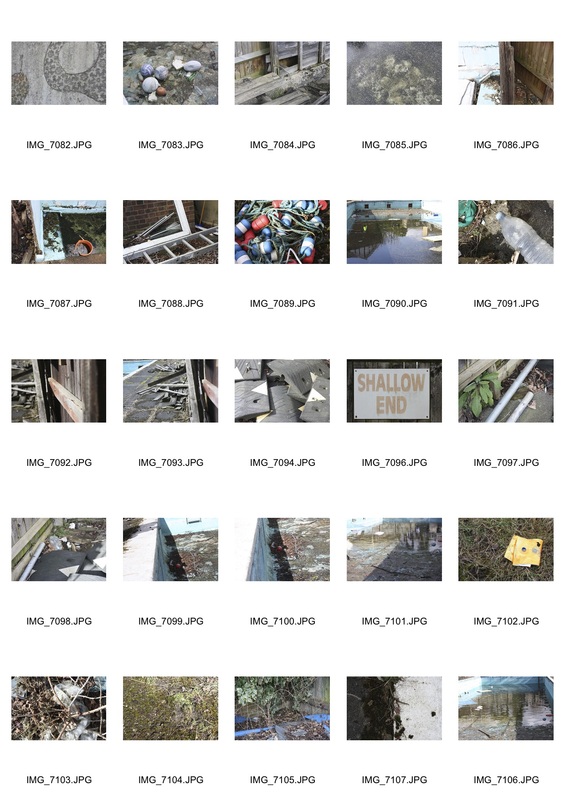
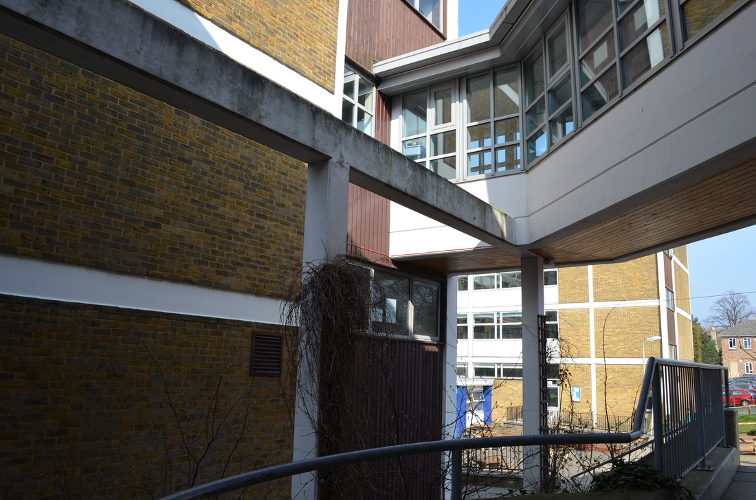
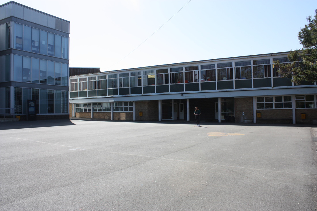
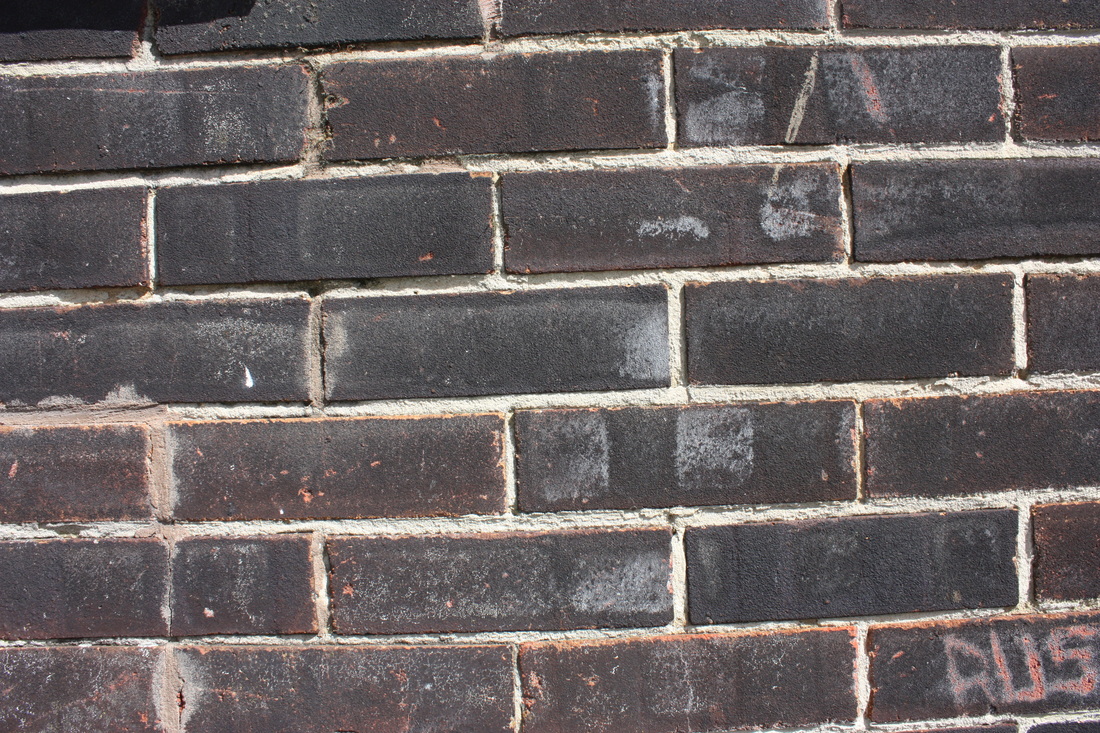
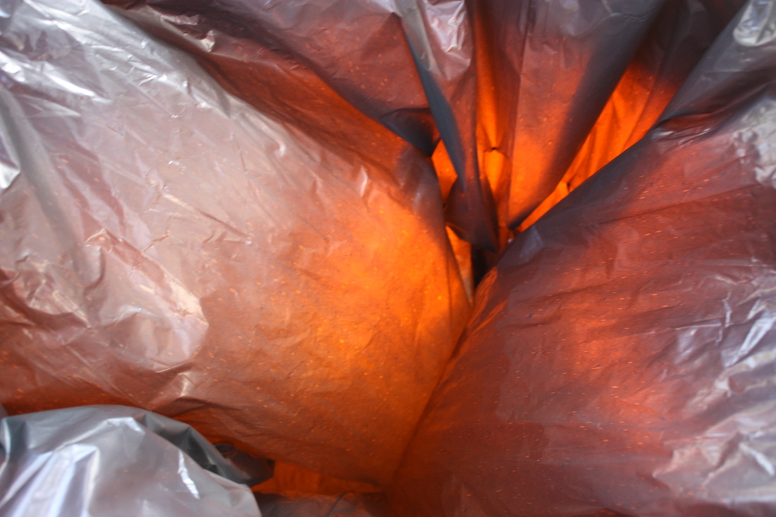
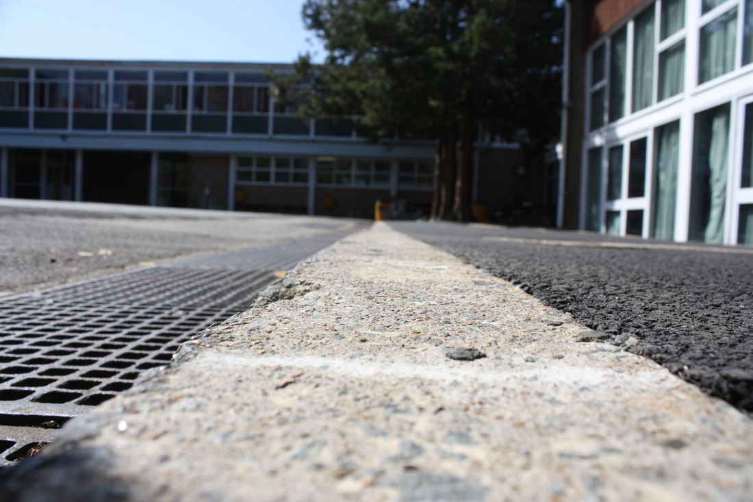
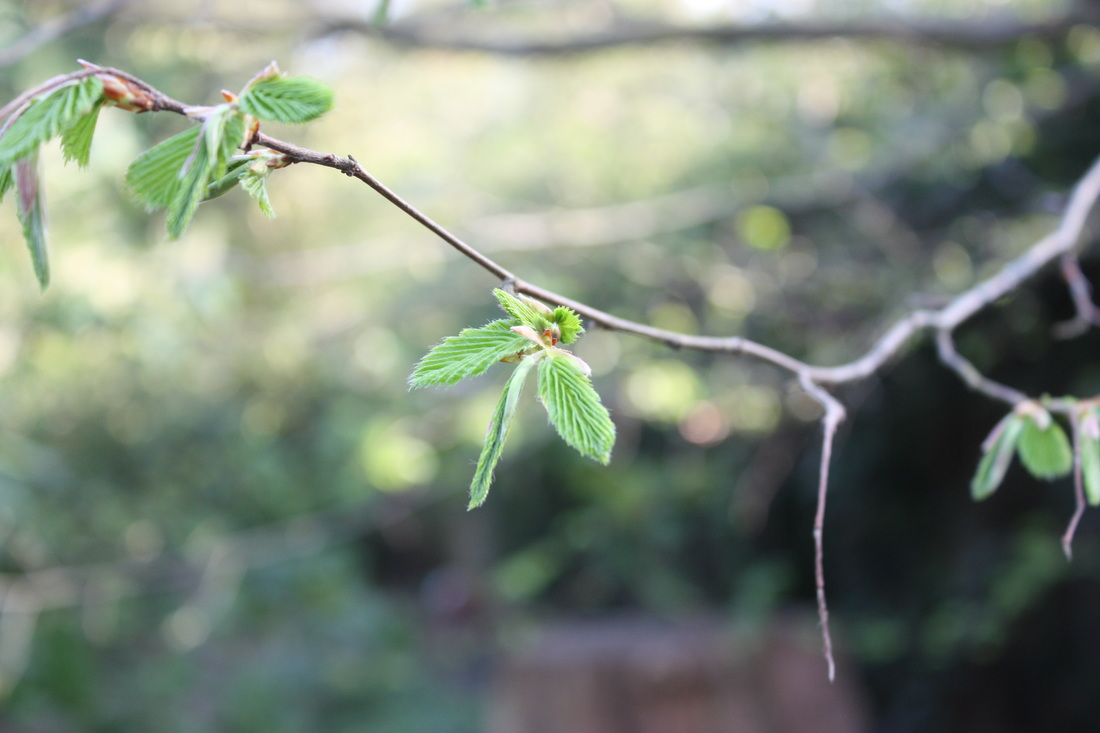
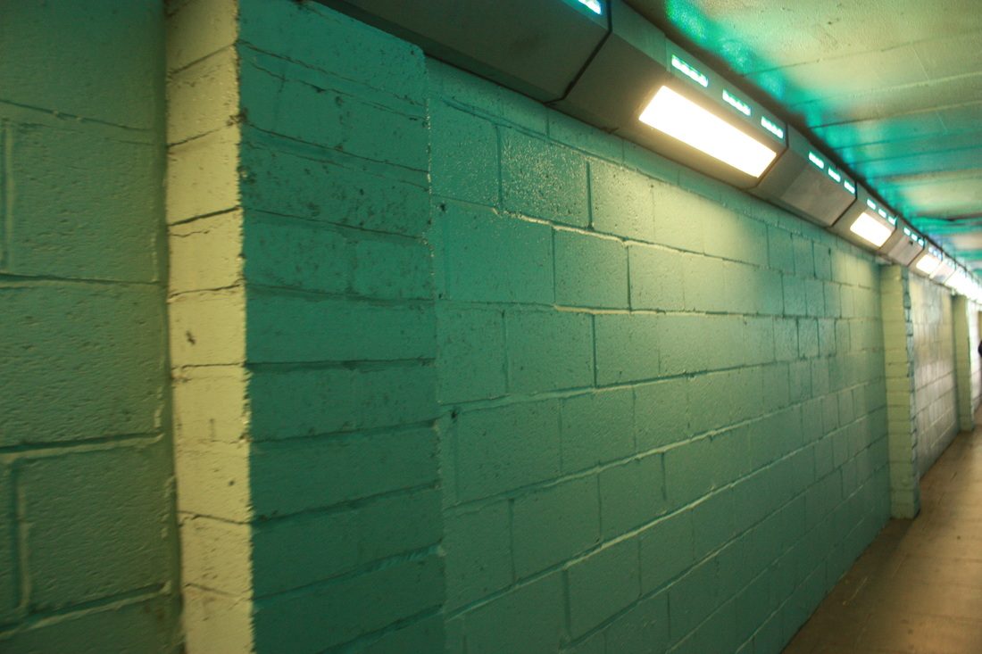
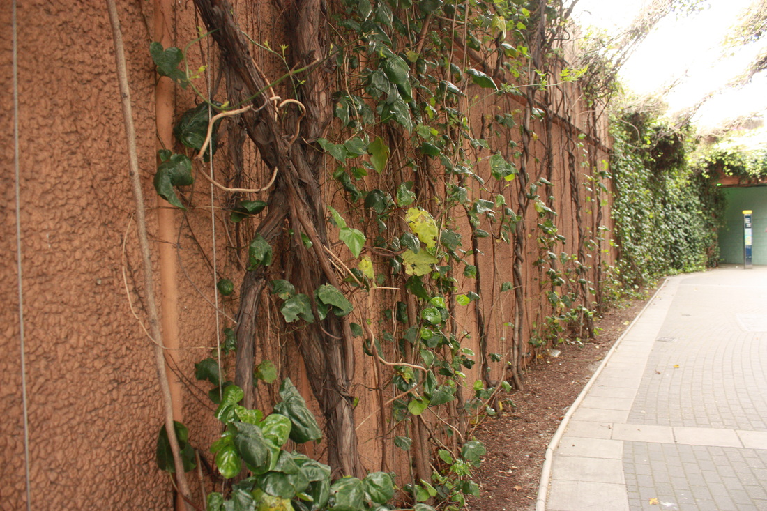
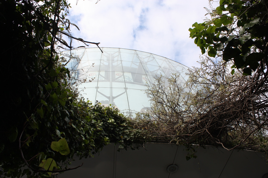
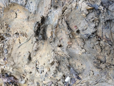
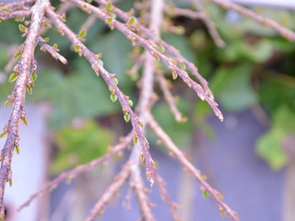
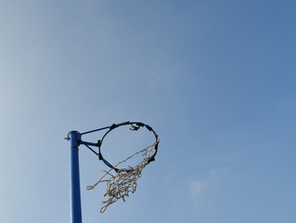
For this task we went around the school to capture aspects of the landscape surrounding us. I took close up photos and photos from further away to show the variation and difference in landscape depending on how much detail was captured in the photo.
I N I T I A L R E S P O N S E

S E C O N D R E S P O N S E
C O N T A C T S H E E T
|
|
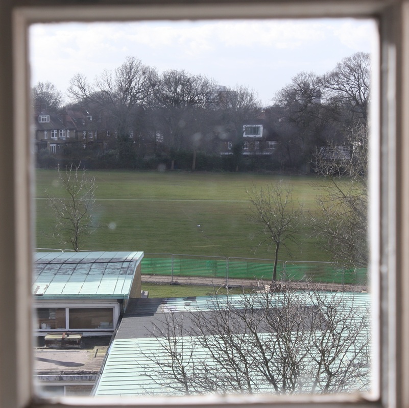
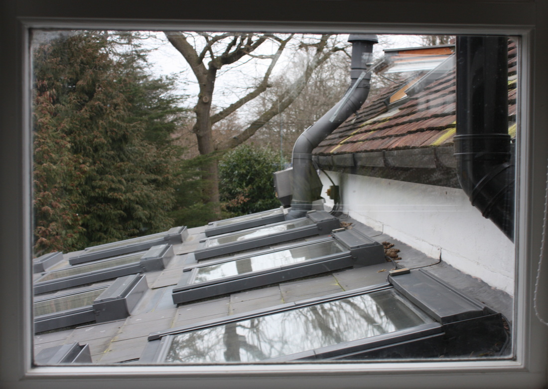
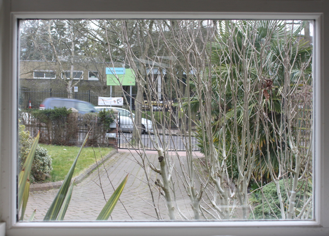
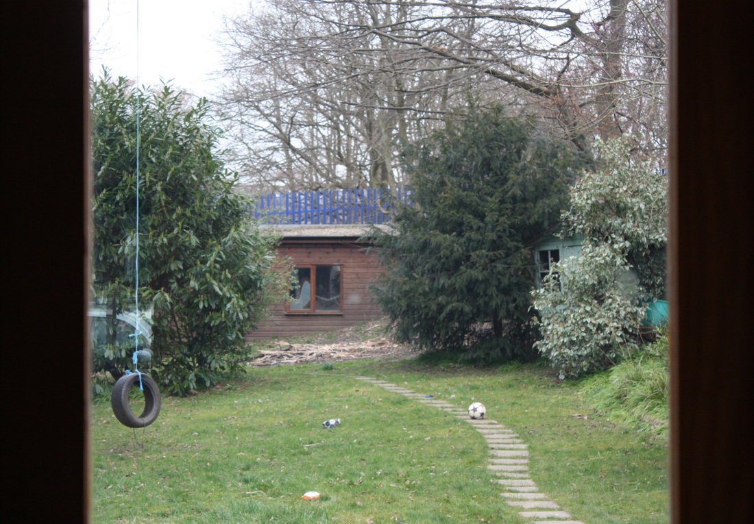
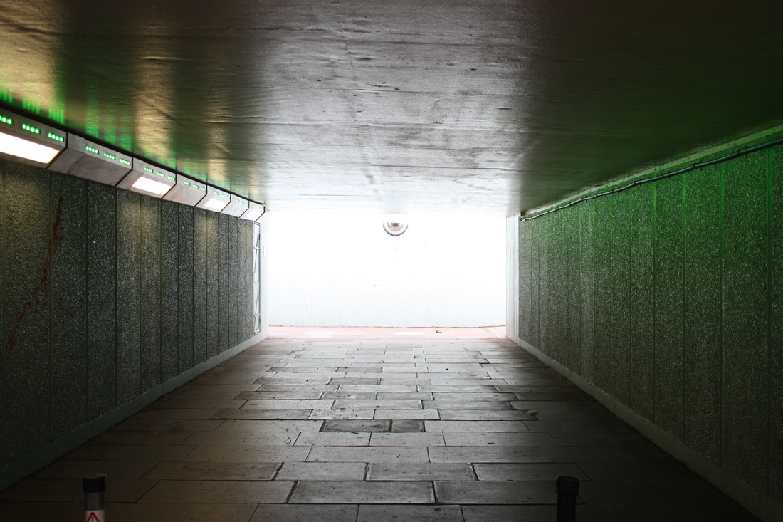
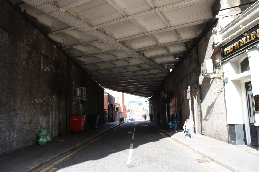
F R A M I N G T H E E N V I R O N M E N T
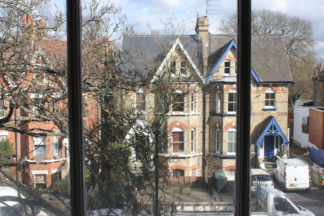
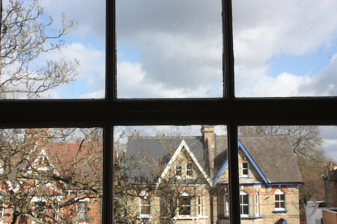
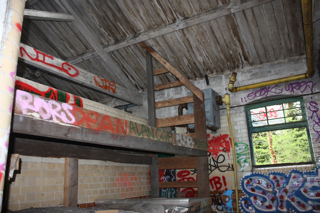
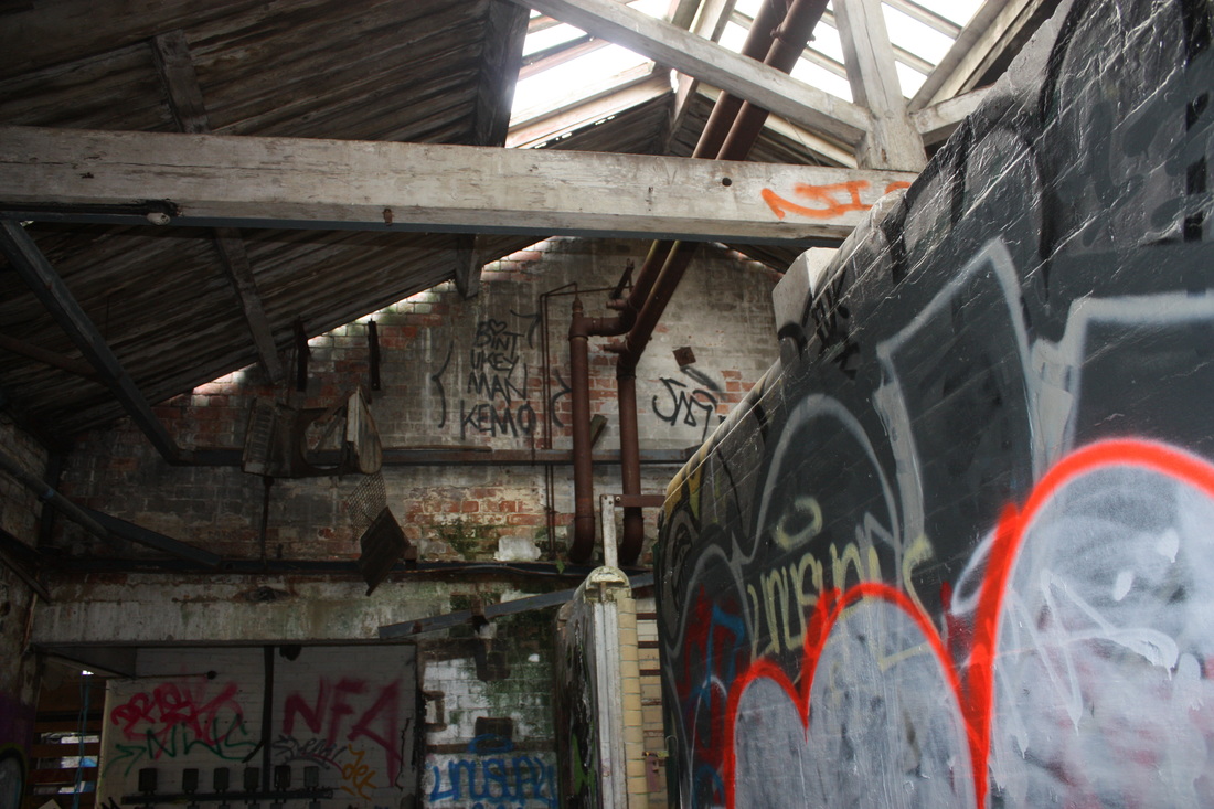
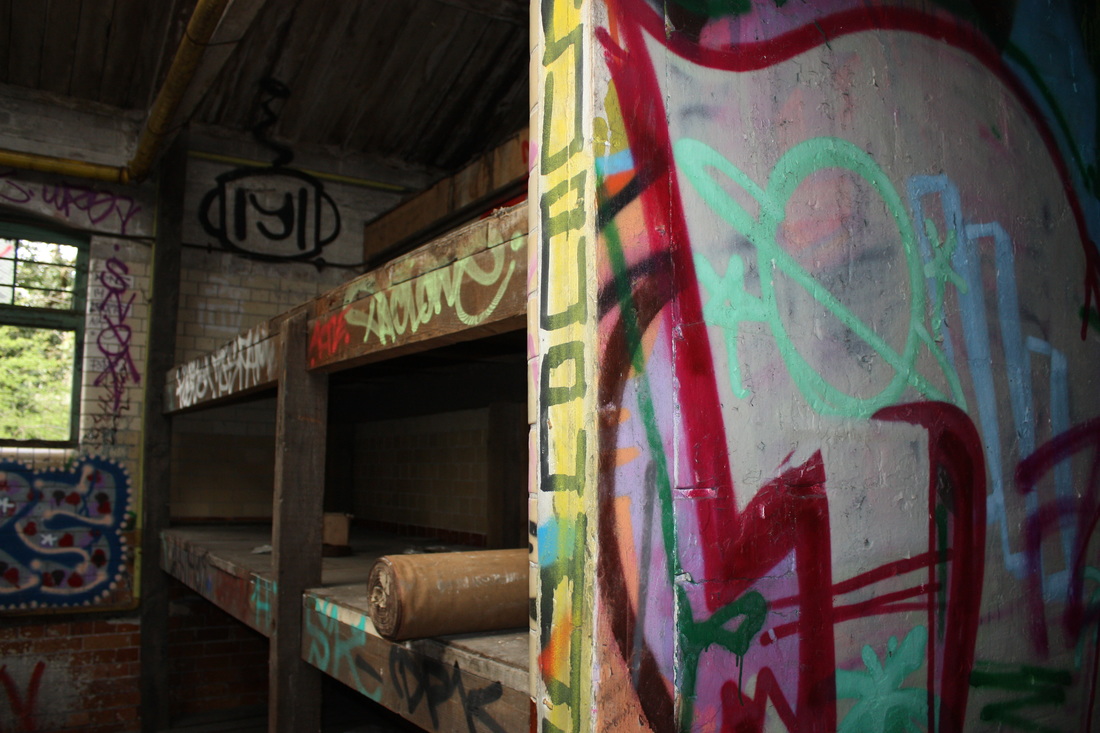
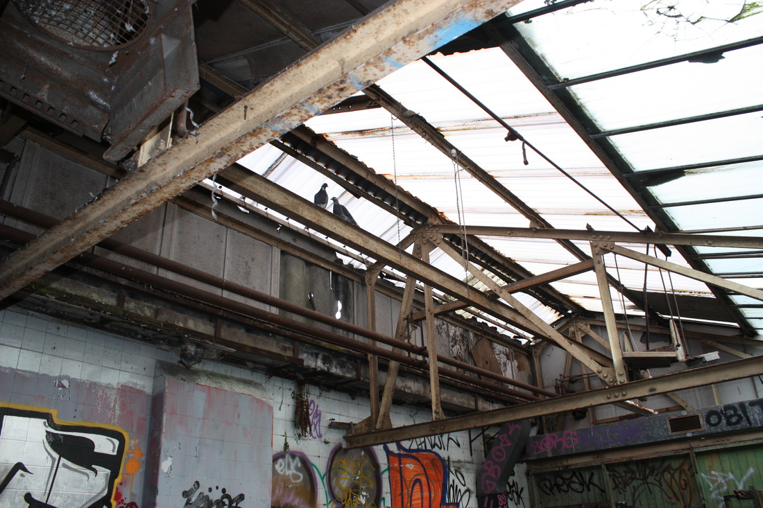
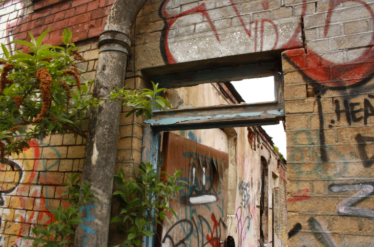
These photos were taken to replicate John Divola's work, I took several images of the interior and exterior of buildings using window frames to frame the environment.
I N I T I A L R E S P O N S E
S E C O N D R E S P O N S E
C O N T A C T S H E E T
|
|
J O H N D I V O L A
John Divola is a visual contemporary photographer, he explores landscapes by looking for the edge between abstract and specific. He is interested in the relation between real artworks and representations of them and has recently had his work put in an exhibition called, 'As Far as I Could Get', in the Santa Barbara Museum of Art and the Pomona College Museum of Art.
|
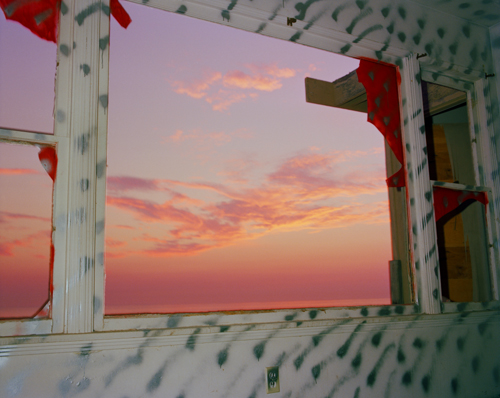
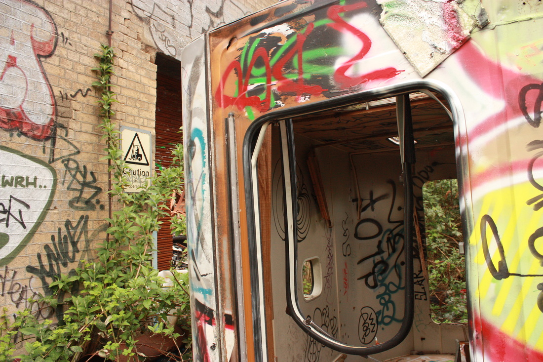
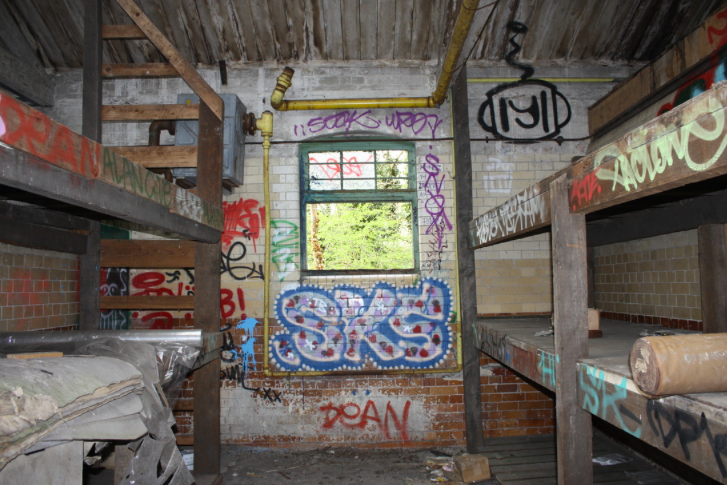
This image is a close up view of a large window looking out onto the sunset. The main focal point of the photo is the window because the red, orange and blue in the sky contrasts with the white wall that has been painted with graffiti. The photograph has been captured in an abandoned room which creates a dark mood because of the ripped paper and graffiti on the wall. This image differs from many of Divola's photographs because of the side on angle and zoomed in effect, which means less interior space can been seen.
|
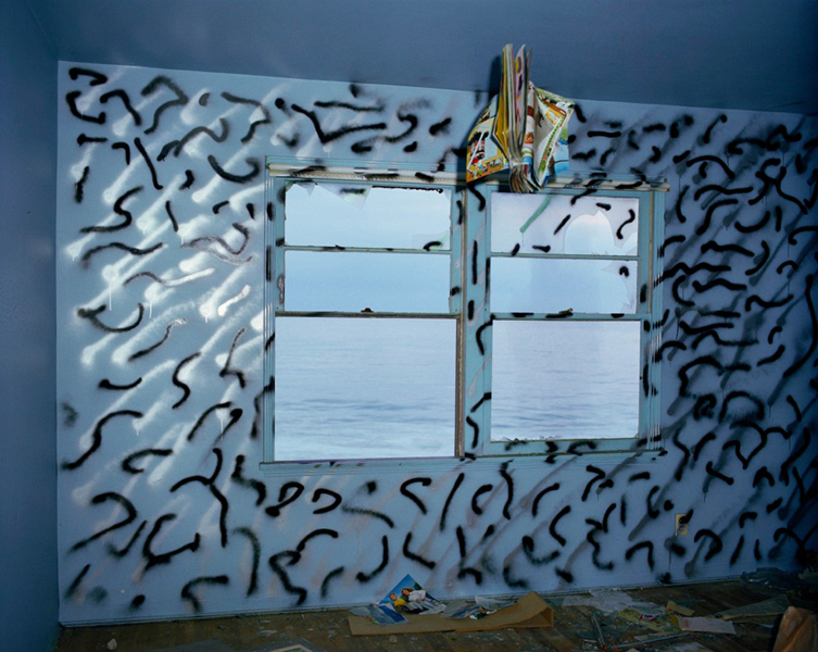
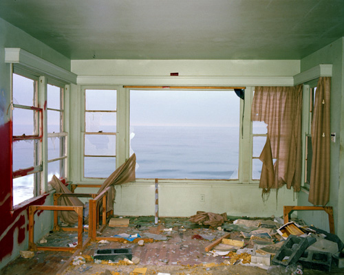
This composition consists of a wall that has graffiti drawn all over it, in what looks like an old unused room. There is a large window in the centre of the wall which over-looks the sea. Because it is in the centre it catches your eye and is the main focal point. The main colour used in this image is blue, so the black graffiti stands out. A short shutter speed as been used to capture this image, you can tell this because you can see that the waves have been frozen in motion.
|
This photo is of an abandoned room by the sea. It is very worn down and messy and seems to have been left for a long time. The photographer is facing the main window directly in front, but there is also a window on the left wall. The blue sea out of the window contrasts with the white wall, and the smooth waves contrast with the messy floor of the room.
|
P A N O G R A P H I E S
To make these panographies we went around the school and took several pictures of the same area and then used photoshop to create the results below. For my second response I did the same thing but at a different place,
I N I T I A L R E S P O N S E
S E C O N D R E S P O N S E
T H I R D R E S P O N S E
T E C H N I Q U E :
Firstly I put my camera onto P, or auto mode, then I went to find an interesting location to take several different pictures. You have to take a series of 9 pictures of that place, and to develop the effect, take the pictures from different angles and perspectives. After you have done that, you need to go onto photoshop and create a collage of the pictures, first upload your 9 images. To do this you need to go to file > automate > photo-merge > select collage mode and untick default mode. If you want the edges of you panography to look more rounded like my second and third response, then click auto instead of collage. Then I chose the drop shadow layer style and changed the stroke option to white for a more 3D effect. Lastly I made the background of the collage white by adding a new layer.
D A V I D H O C K N E Y
Hockney is an English painter, draughtsman, printmaker, stage designer and photographer. He is connected to the Impressionist art movement and this movement was interested in responding to popular culture. Hockney has also created photomontages, he took pictures from different angles and perspectives and rearranged them, he called these joiners.
|
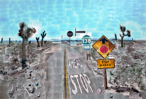
This image consists of a series of photographs put together of what looks like very dry land, a desert or somewhere near the sea. The images have been taken from a perspective view, looking down the road onto the horizon. The sky and the orange sign both contrast against the dark road, and this catches your eye. The main focal point is the vanishing point because it is in the centre of the image and therefore your eye is drawn to it. Hockney has overlapped some parts of the image and distorted it to make it seem more unique and interesting.
|
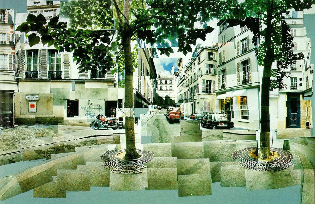
This photo is of a street or square, the photos have been taken so that you can see down a street that is in between two trees which are in the foreground. The main focal point is the tree in the left-centre of the image and this is because the green stands out from the neutral coloured pavement and it being in the foreground means that it catches your eye. The photographer has moved pieces of the image to make it look more 3D, but not too much so that the image still looks natural.
|
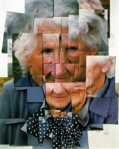
This image is of a old woman's face that has been taken from many different angles and perspectives. The main focal point is the middle of her face where her eyes and nose are, this is because it is the centre of her face, and is also is the centre of the image. The pictures have been taken quite close to her face, but with different amounts of zoom used, and this enhances the details of her face, but at the same time, allows you to see the whole of her face.
|
T H E F O R M A L E L E M E N T S
D E F I N I T I O N :
The formal elements are key features within a photo which makes up the composition. These are traditionally used within fine arts, to refer to the composition which generally include the following: contrast, pattern, texture, scale, negative space, layers, focus and perspective
The formal elements are key features within a photo which makes up the composition. These are traditionally used within fine arts, to refer to the composition which generally include the following: contrast, pattern, texture, scale, negative space, layers, focus and perspective
I N I T I A L R E S P O N S E
|
negative space
|
layers
|
focus
|
contrast
|
|
scale
|
pattern
|
texture
|
perspective
|
I added 5 more images to my initial response to show examples of each formal element
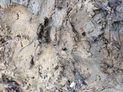
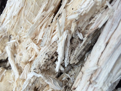
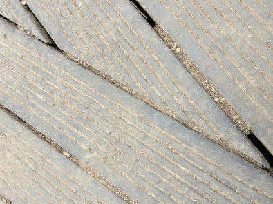
S E C O N D R E S P O N S E - T E X T U R E
|
|
W H E R E T H E P H O T O S W E R E T A K E N
C O N T A C T S H E E T - T E X T U R E
T H I R D R E S P O N S E
|
contrast
|
pattern
|
focus
|
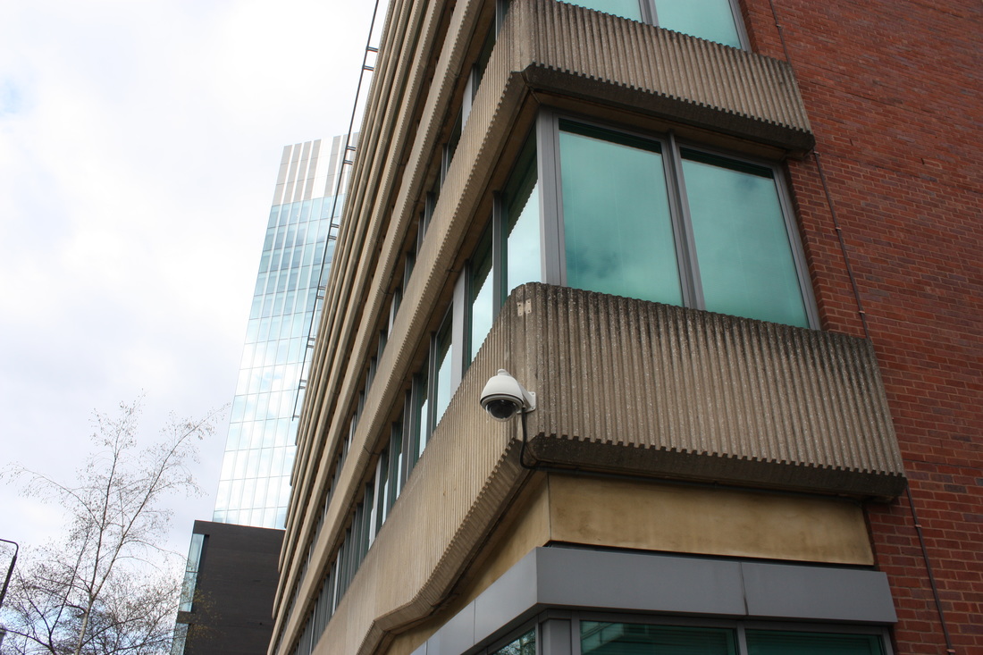
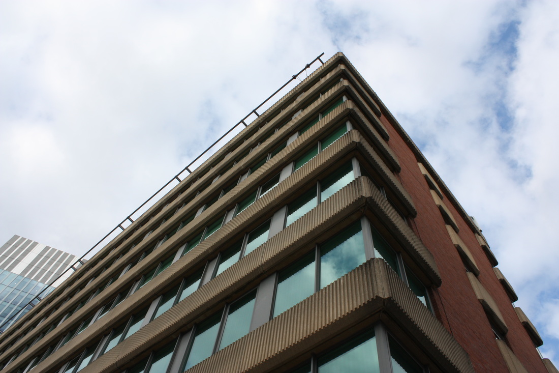
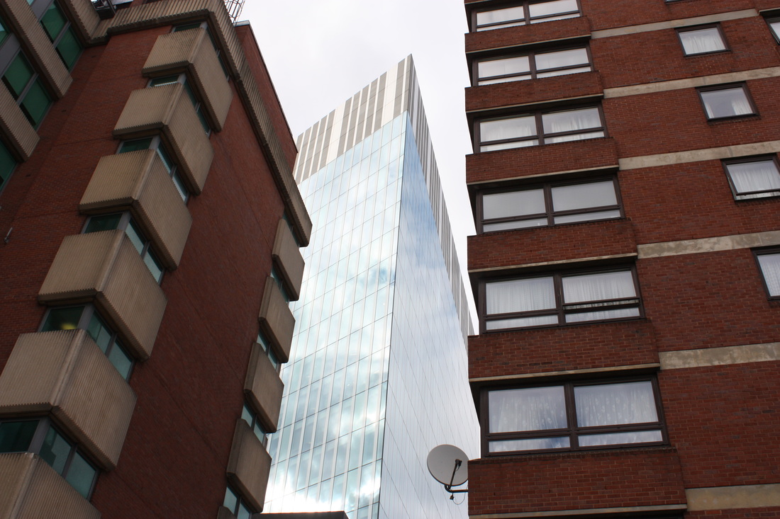
M Y L O N D O N
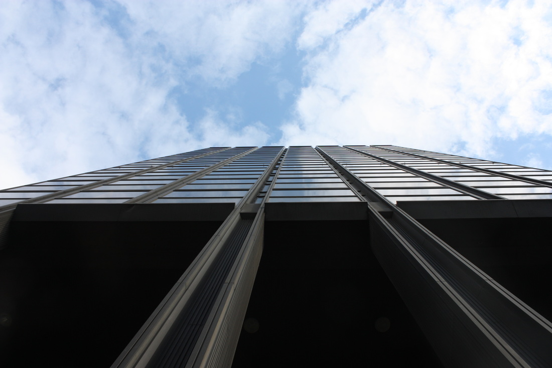
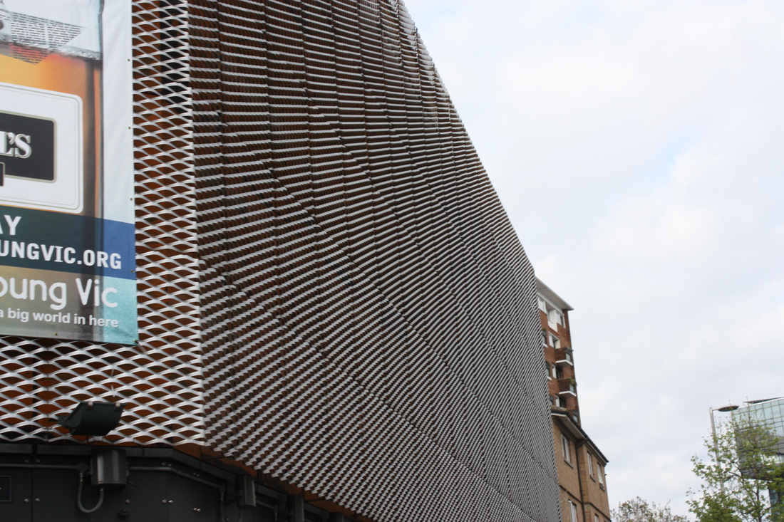
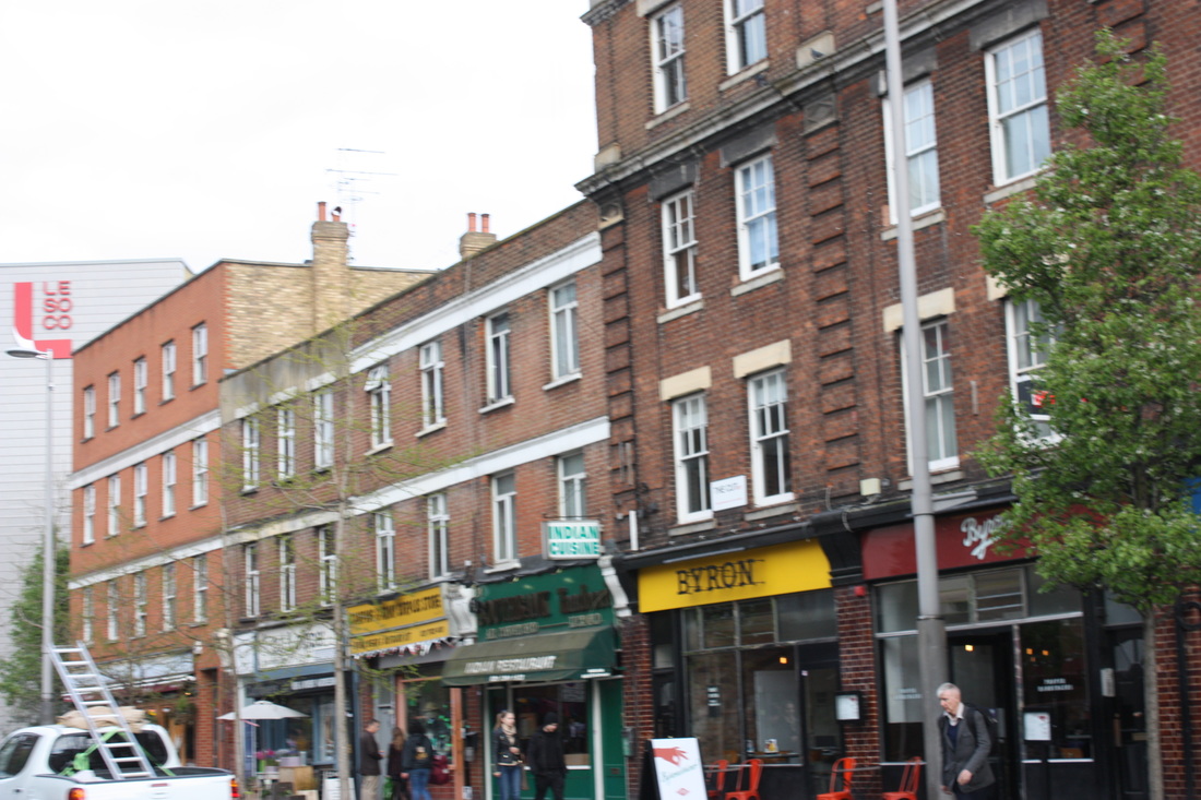
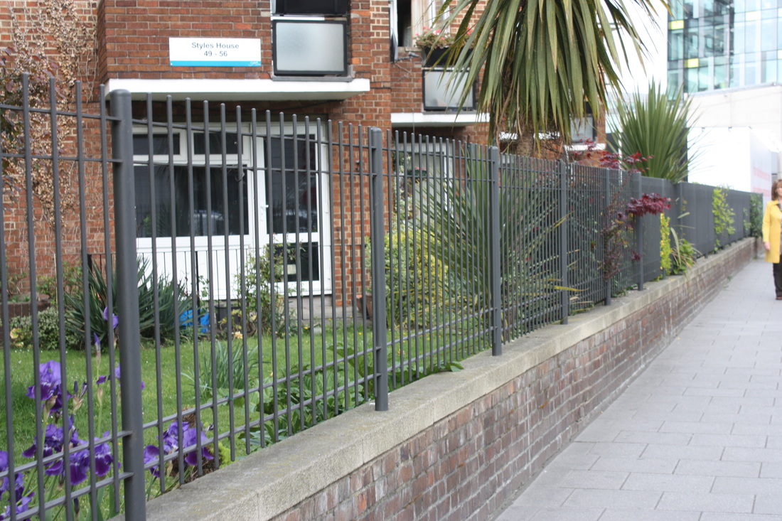
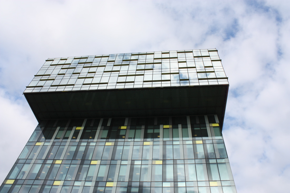
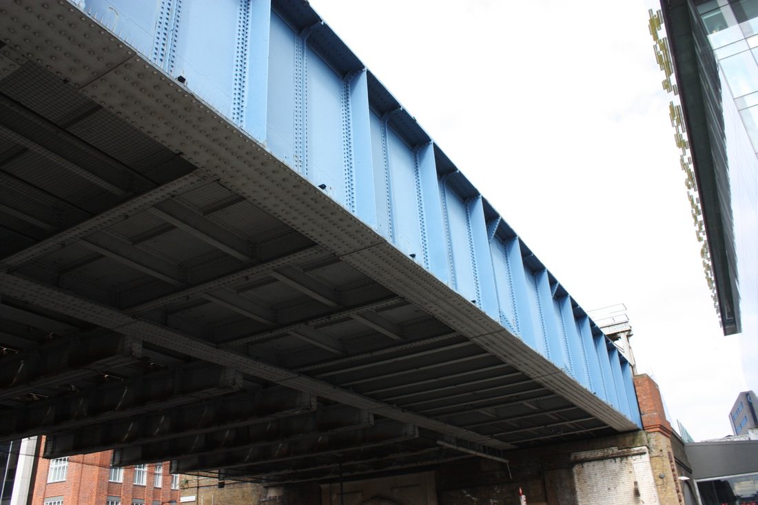
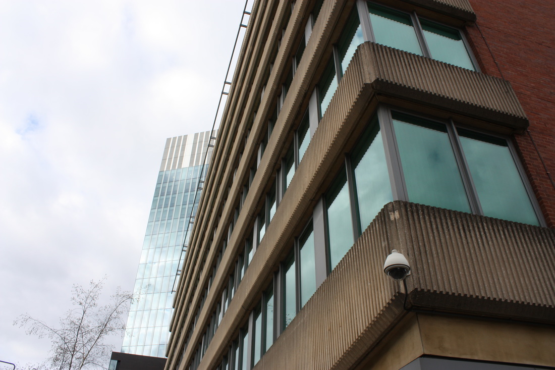
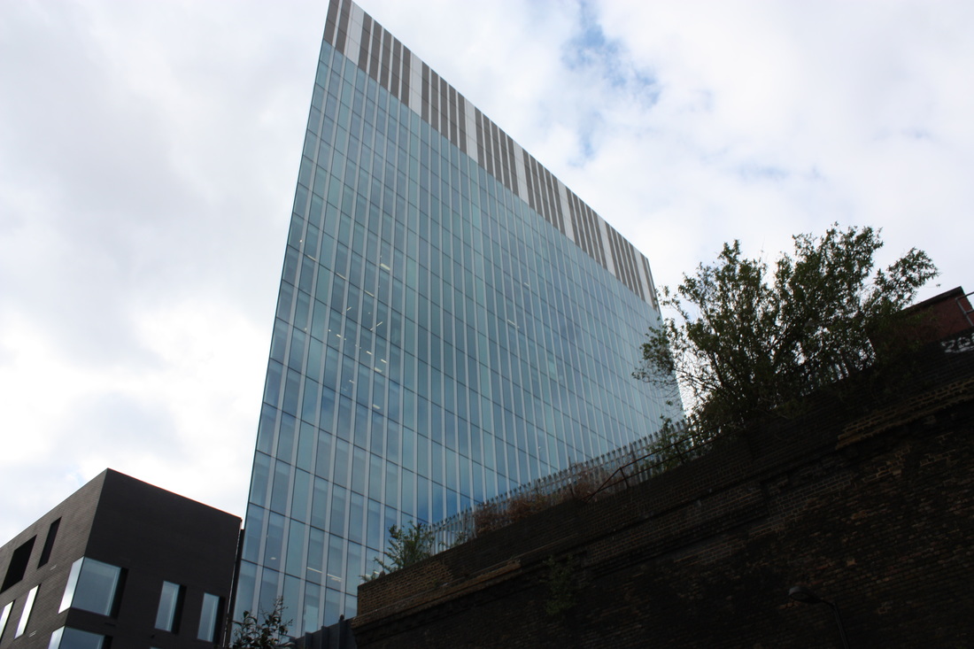
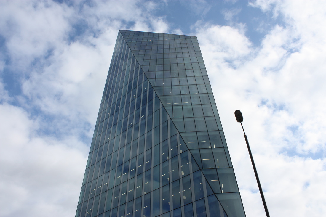
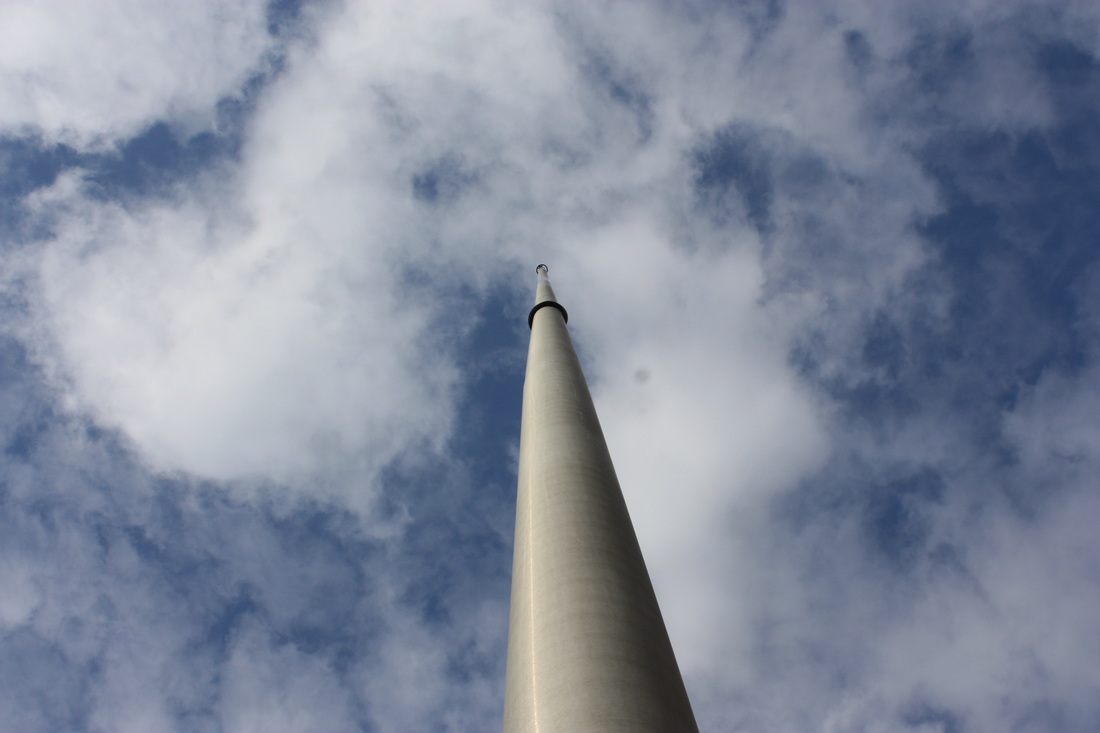
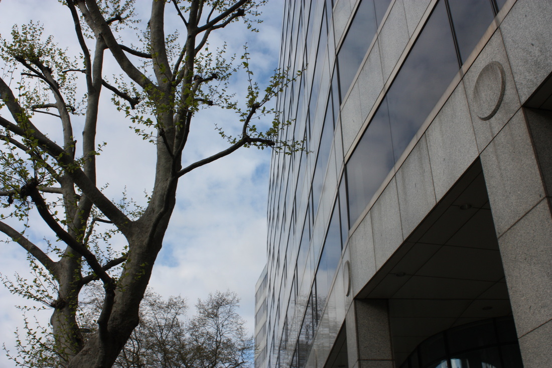
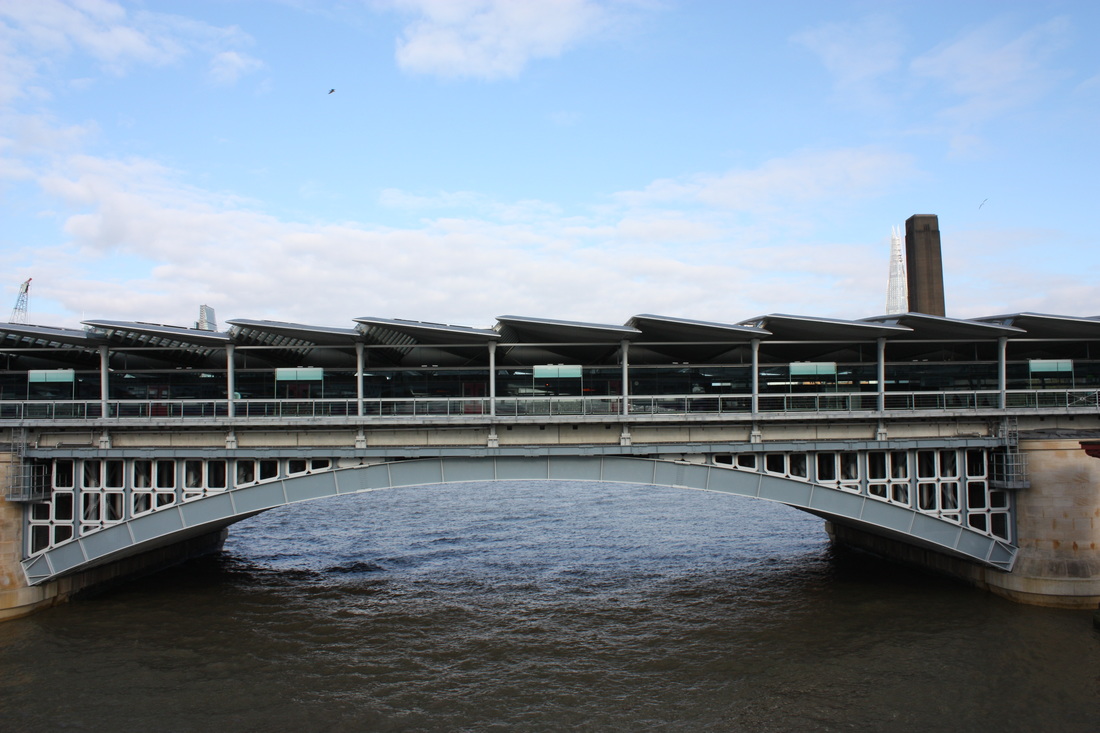
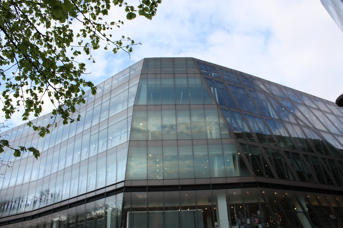
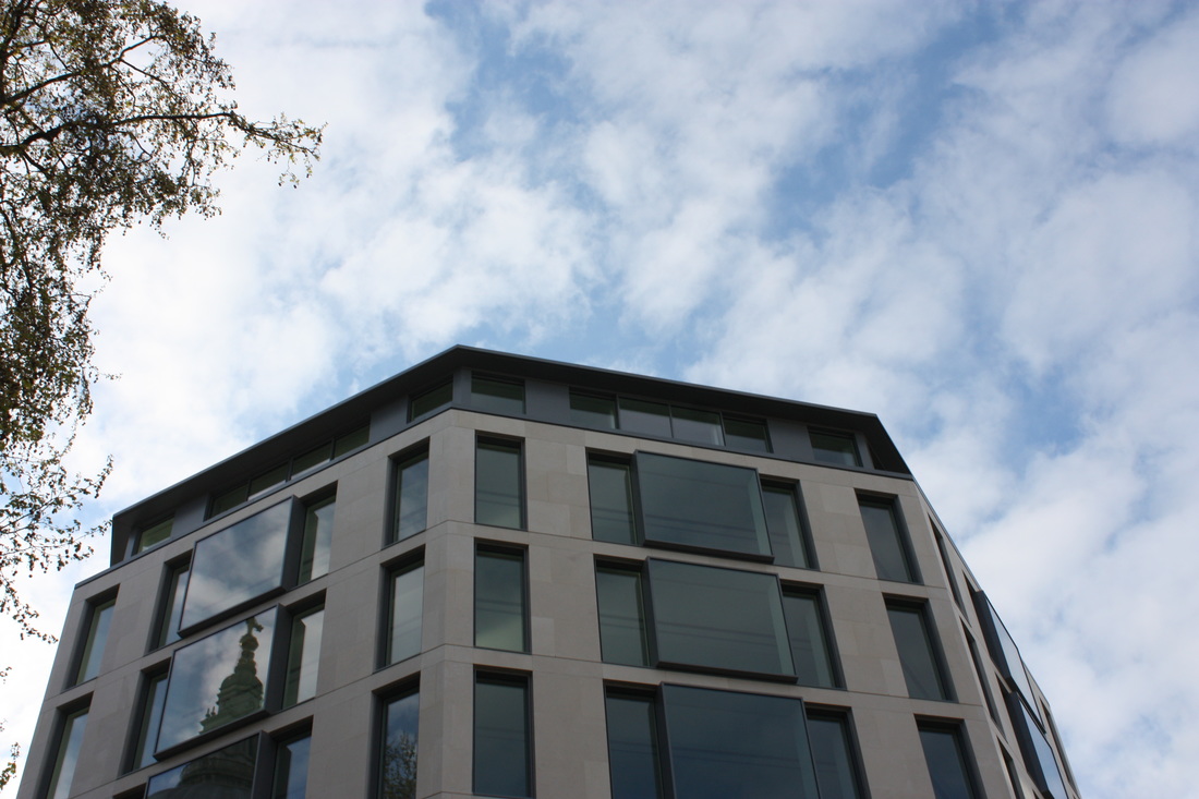
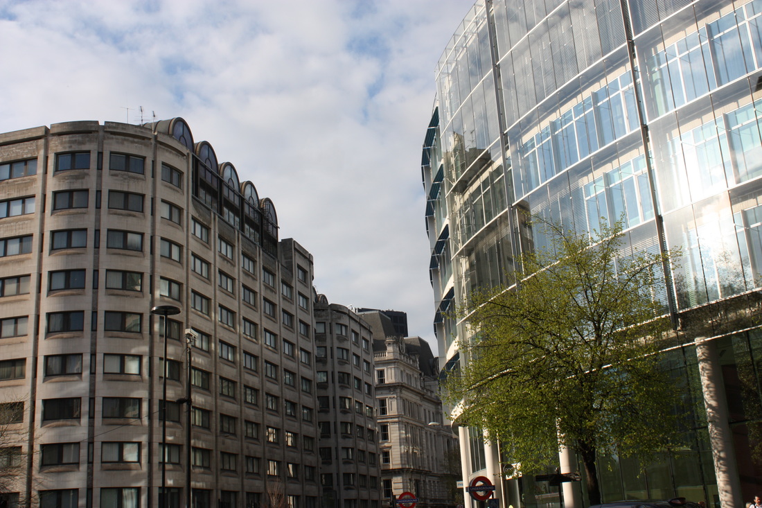
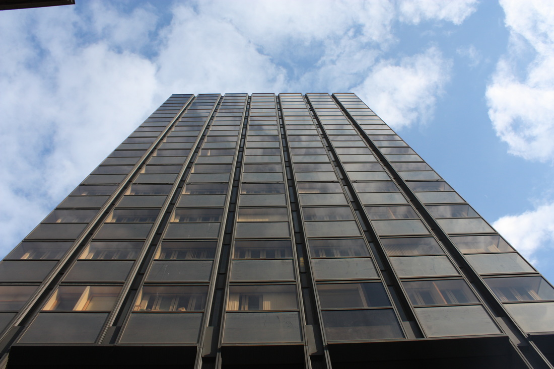
The formal element I chose to take pictures of was layers - focusing on architecture, this is because I find structure of buildings interesting because of the different patterns, shapes and sizes, and I like how varied every layer of a building is. I took a range of photos in different areas of London.
I N I T I A L R E S P O N S E
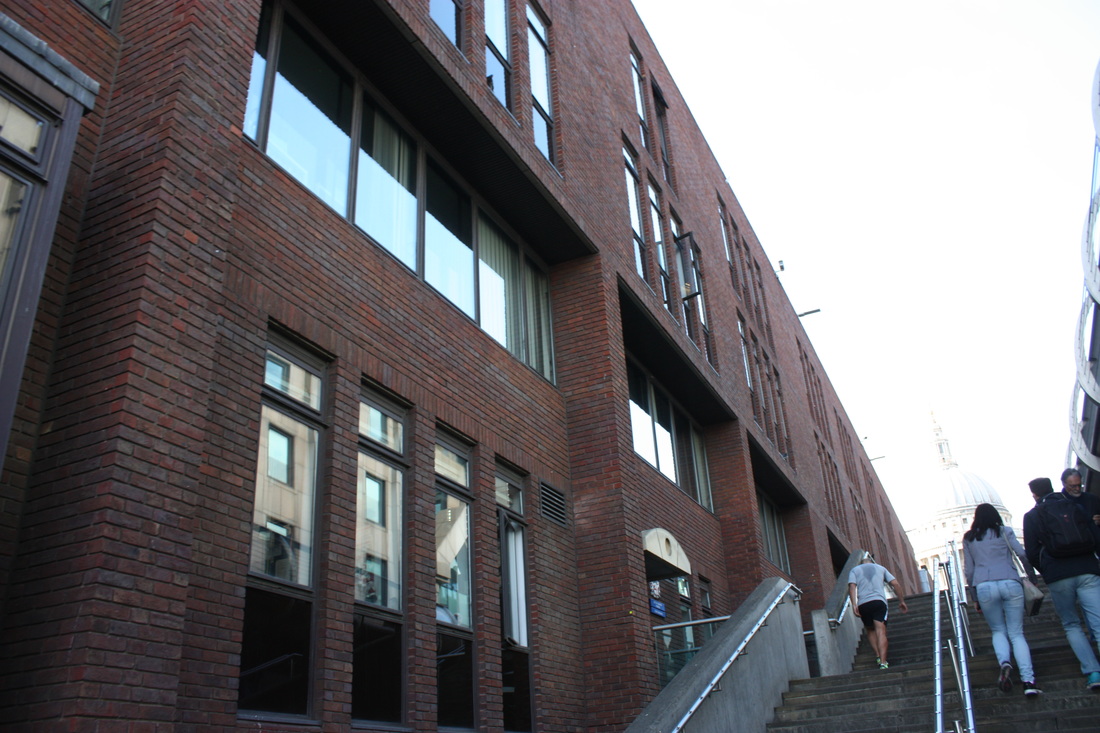
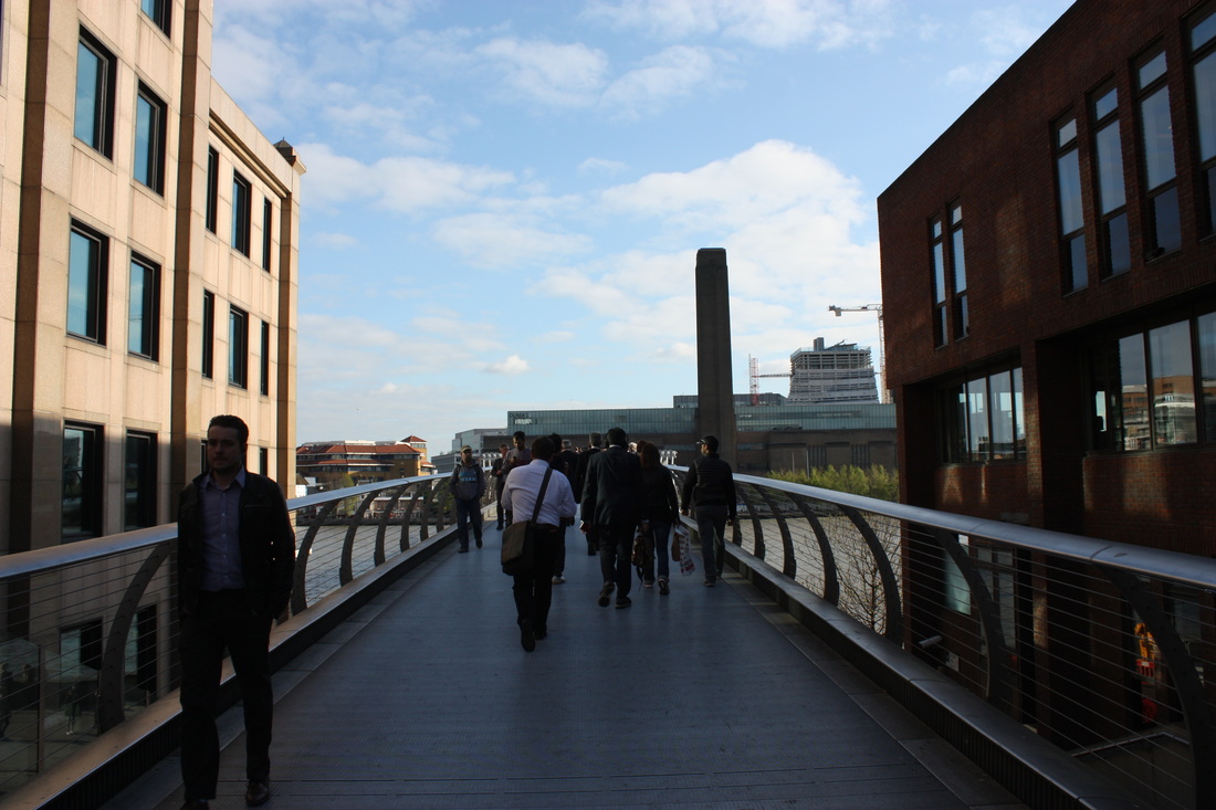
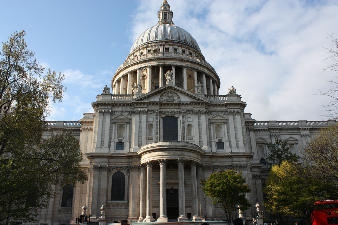
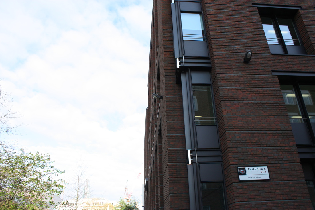
For my initial response I went to Waterloo and South Bank to capture images focusing on perspective. I chose to go the these places for 'My London' because I am focusing on buildings in the urban environment.


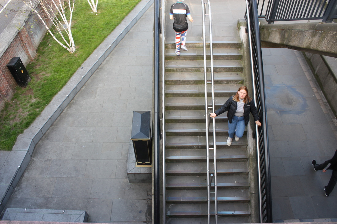
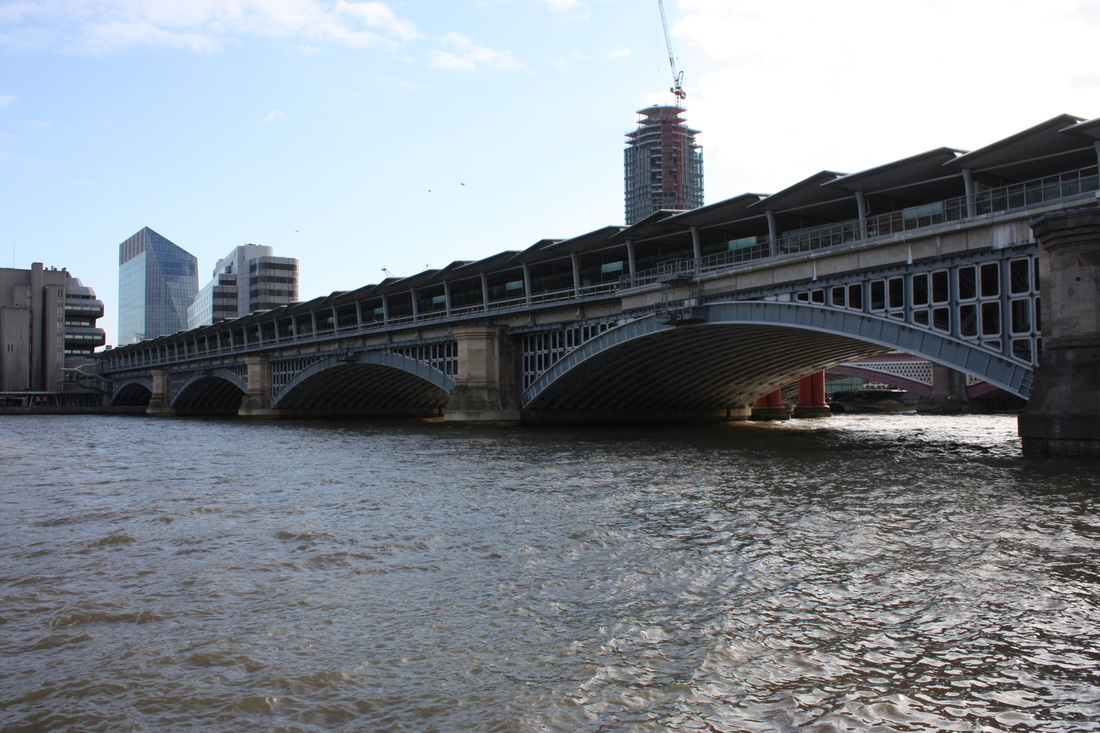
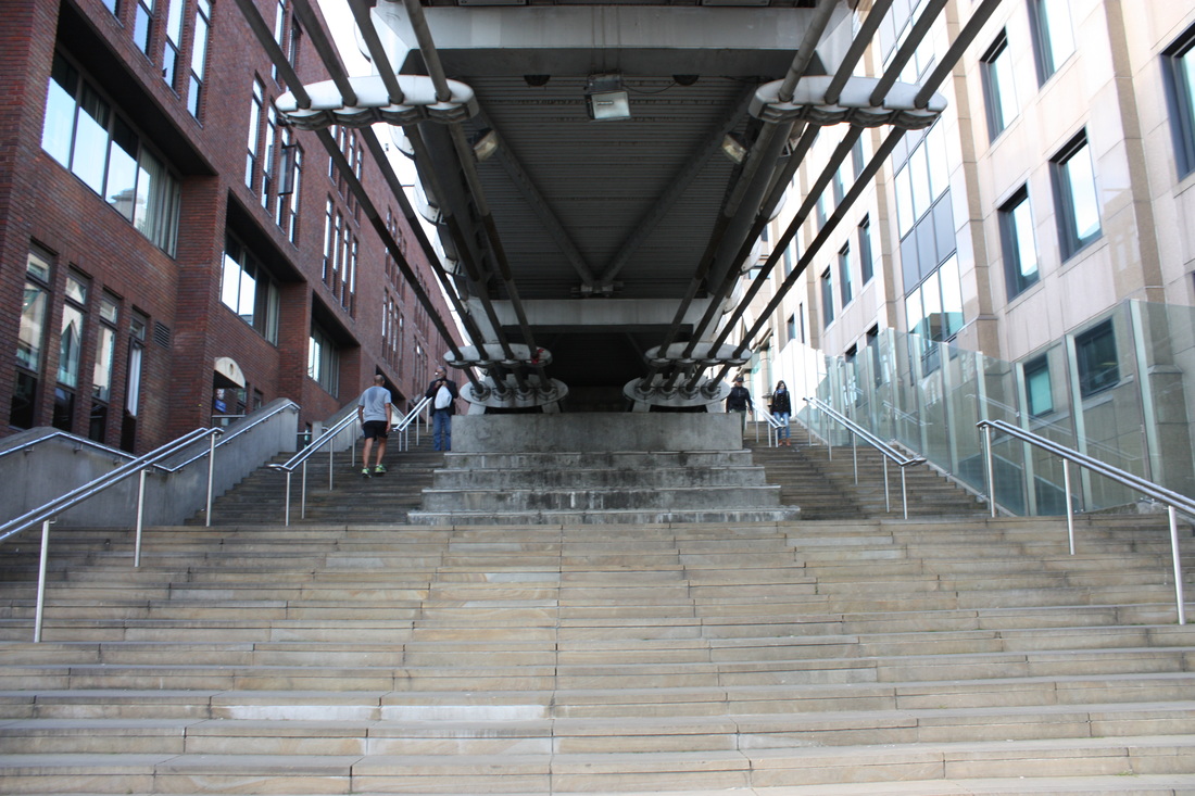
S E L E C T S

S E C O N D R E S P O N S E
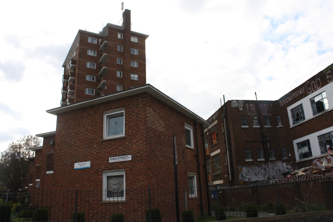
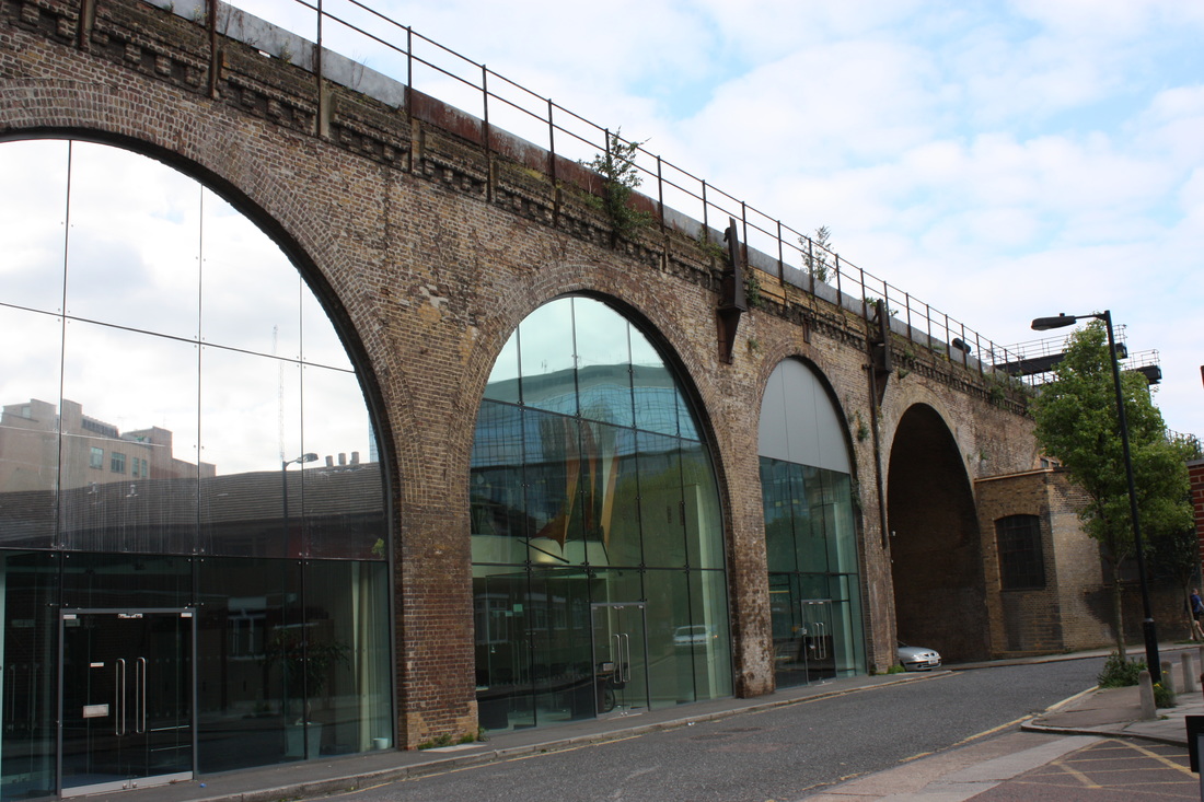
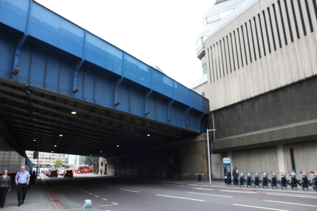
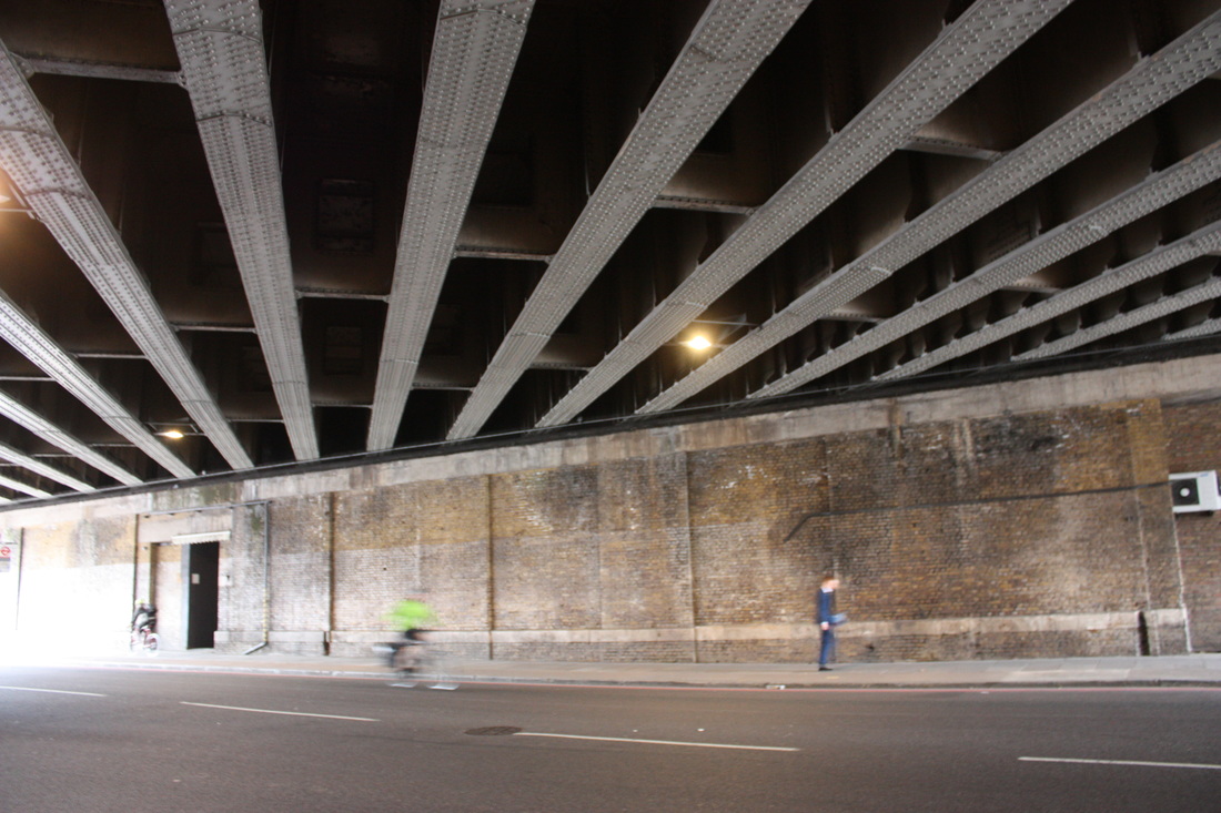
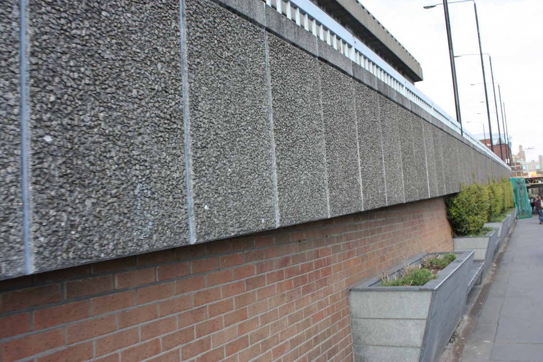
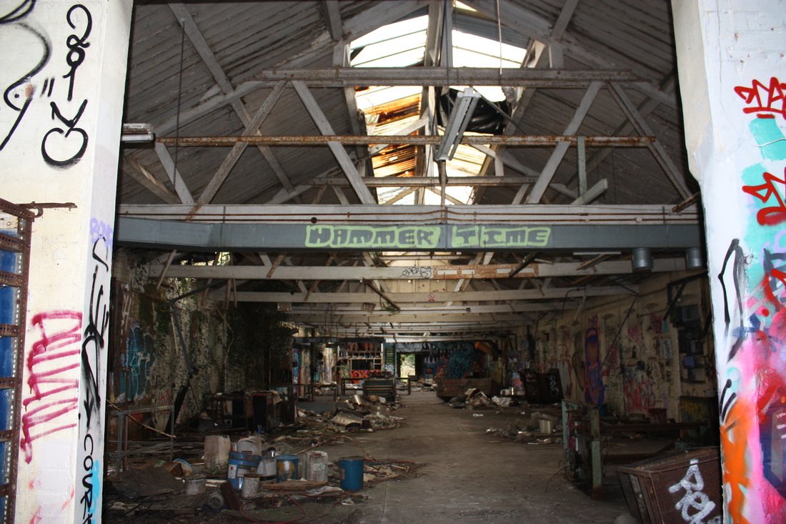
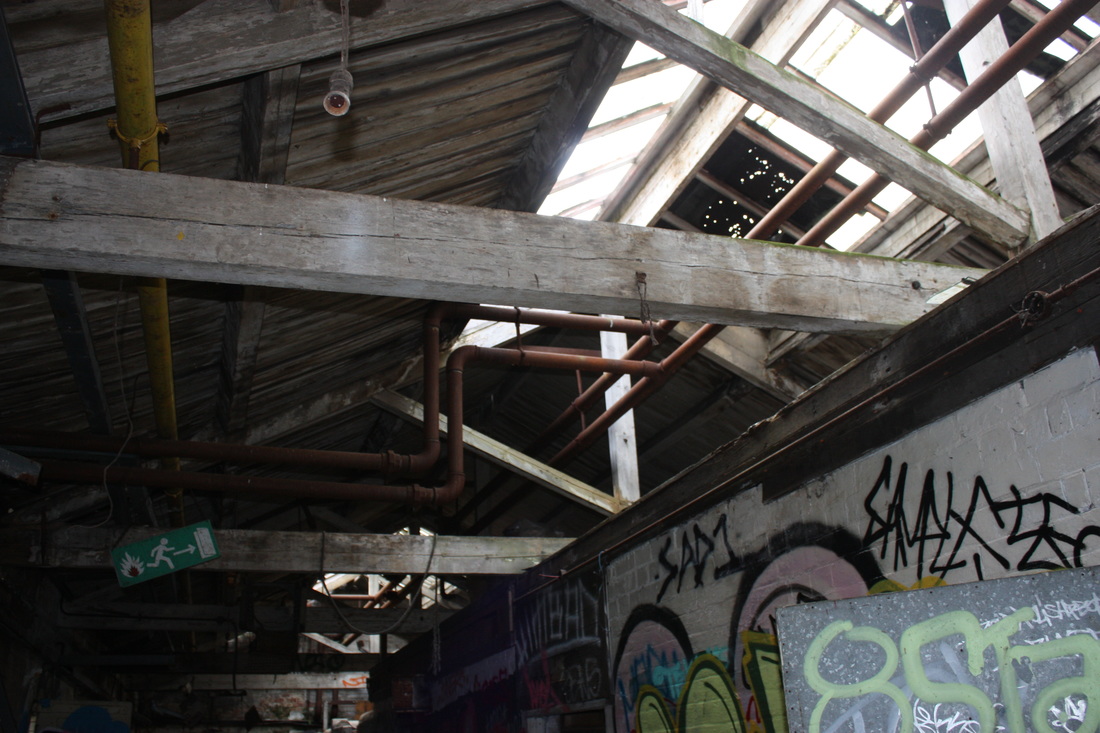
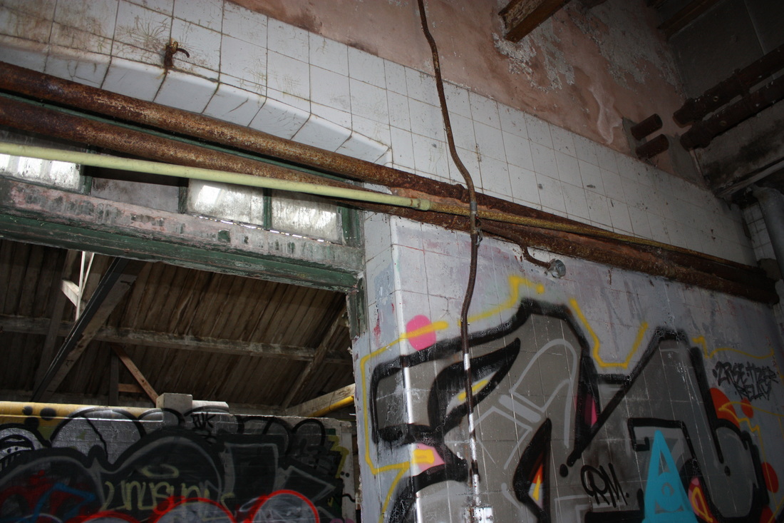
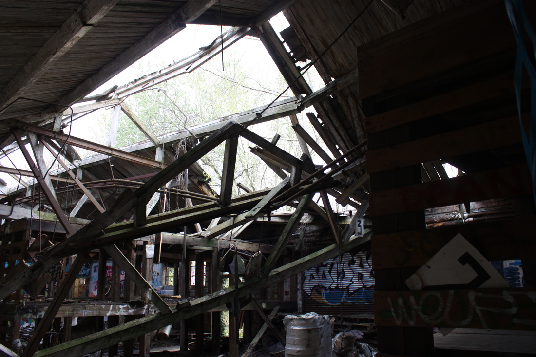
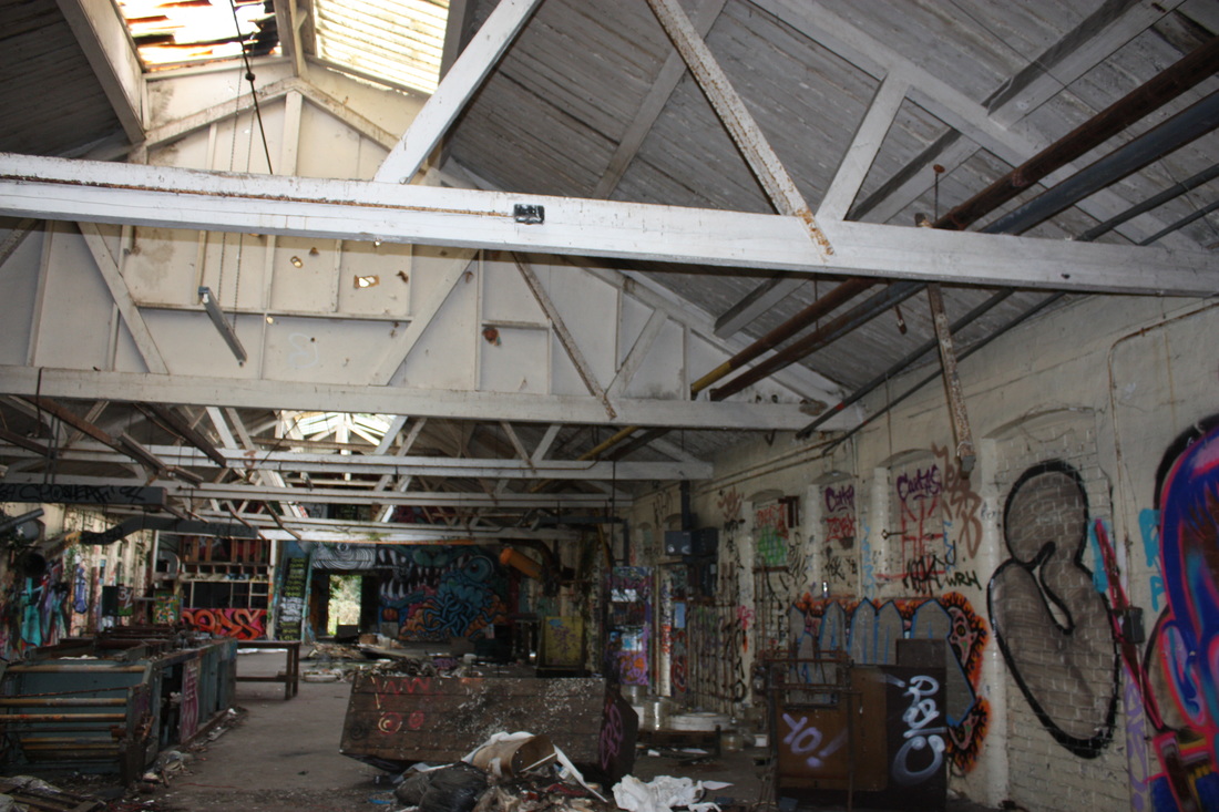
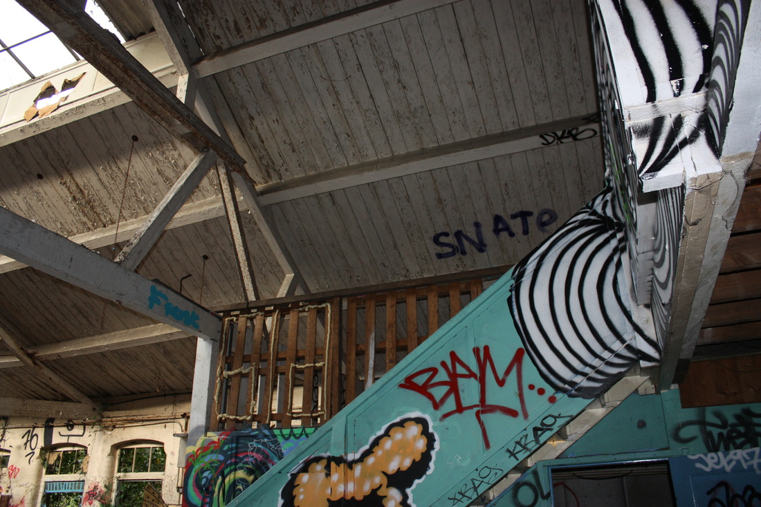
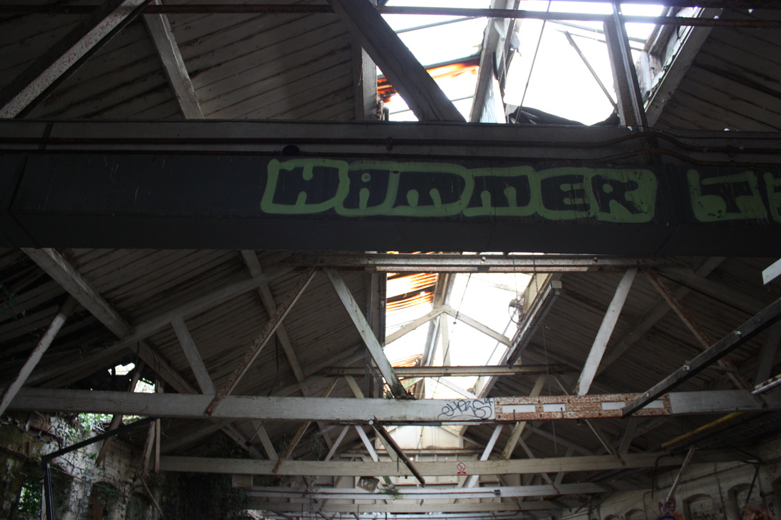
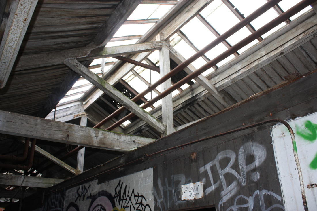
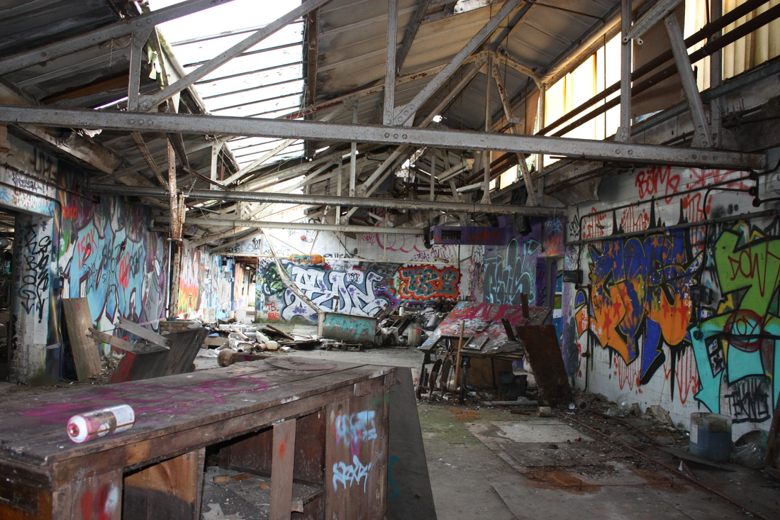
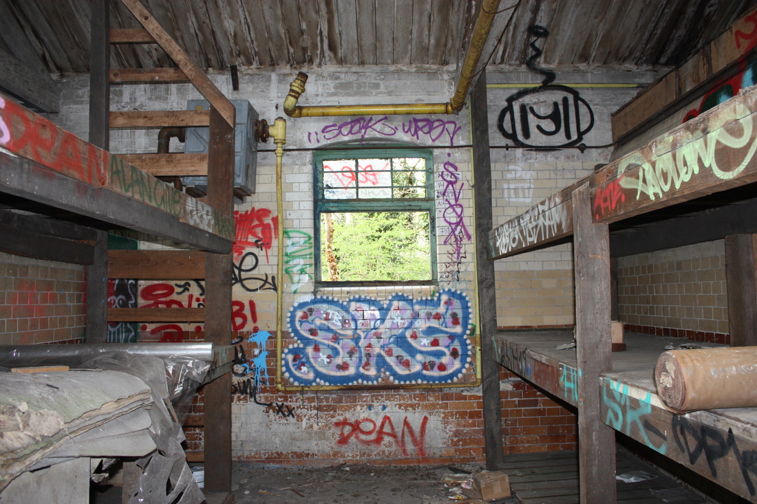
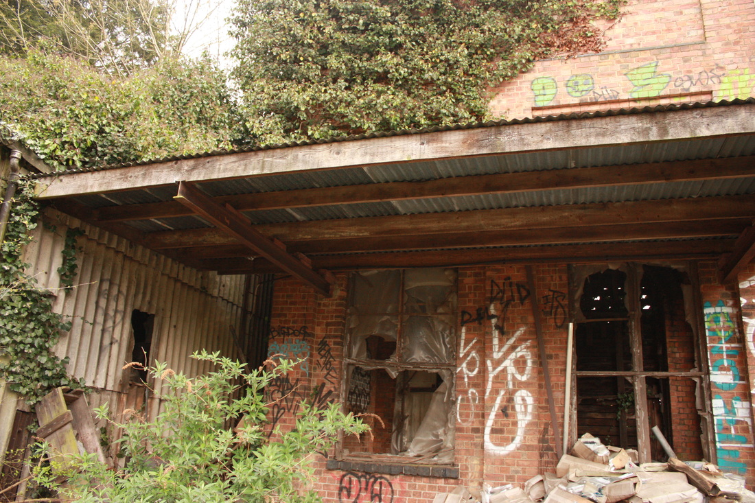
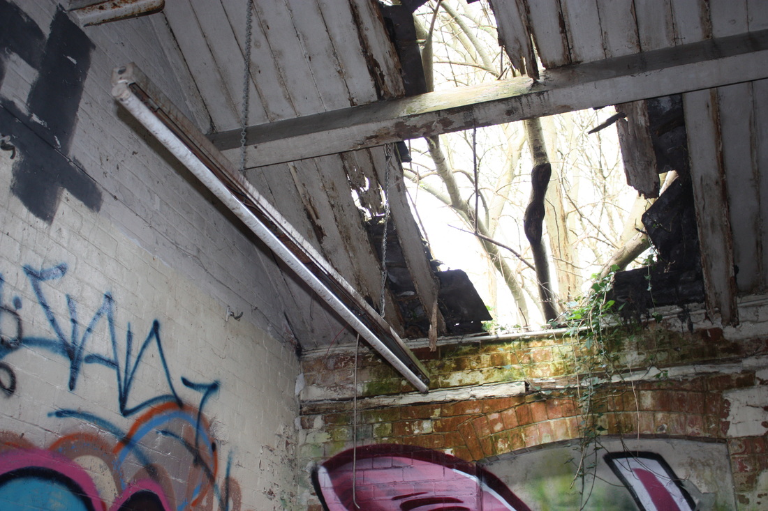
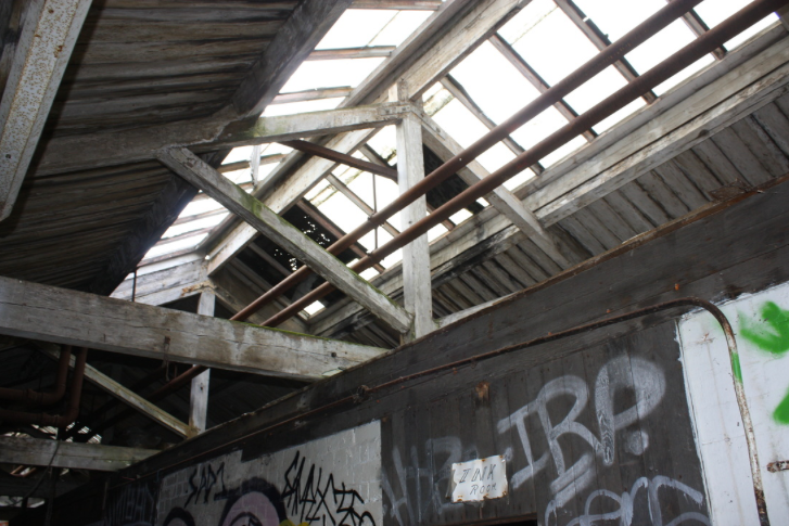
I went to an abandoned building because I find derelict buildings very interesting and I like how run down buildings contrast against the urban environment. I enjoyed taking these photographs because of the variety of colours and structure.


S E L E C T S

H O W I R E F I N E D M Y W O R K :
I took a larger variety of photos also focusing on capturing different shapes, sizes, colours and structures. Doing this enabled me to produce more diverse photos.
E V A L U A T I O N :
I chose these 6 photos for my final piece because I think that they show what I did best out of each section. I really liked taking pictures of the formal elements because I enjoyed looking for specific things and how each formal element turned out - I also enjoyed how you could focus on one element at a time and how they varied, but also worked well together. My least favourite topic was framing the environment because it was quite boring and repetitive, I also didn't really enjoy panographies, because although the end result looked good, I found it quite hard to take pictures from the right angles and put them together so that they looked realistic.
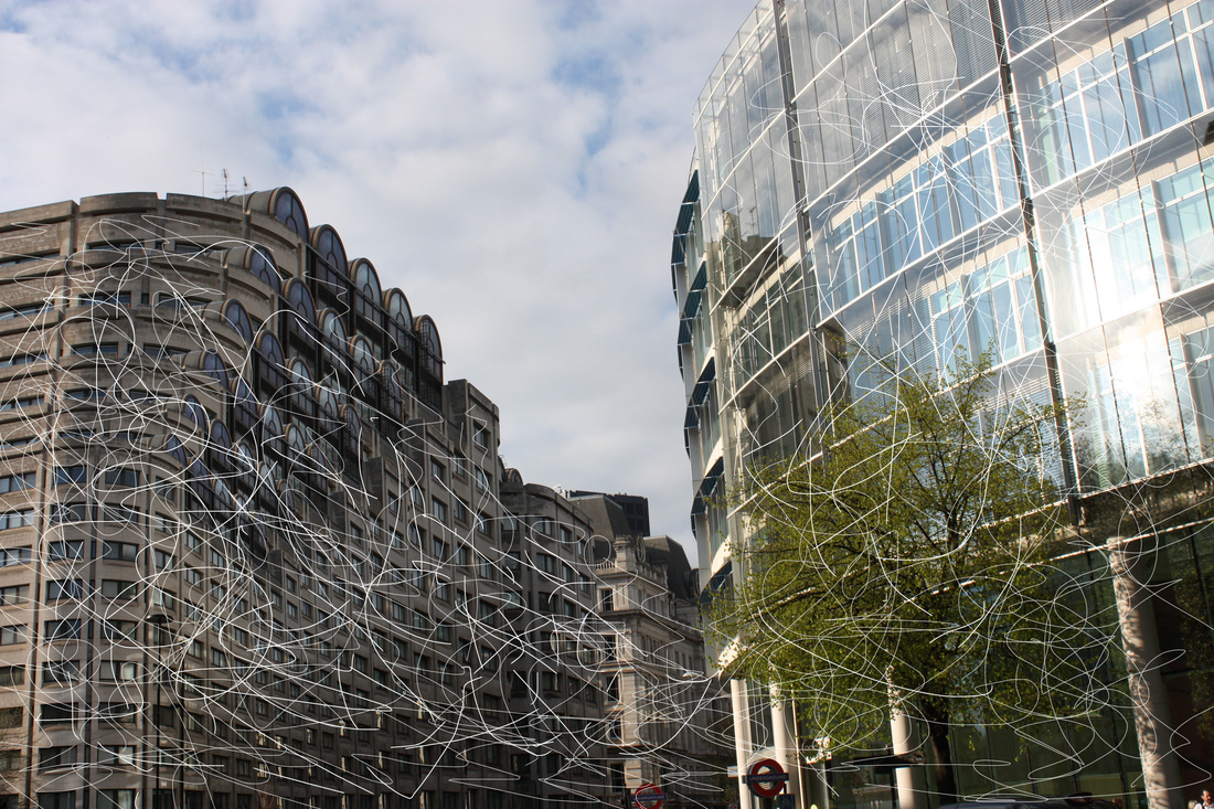
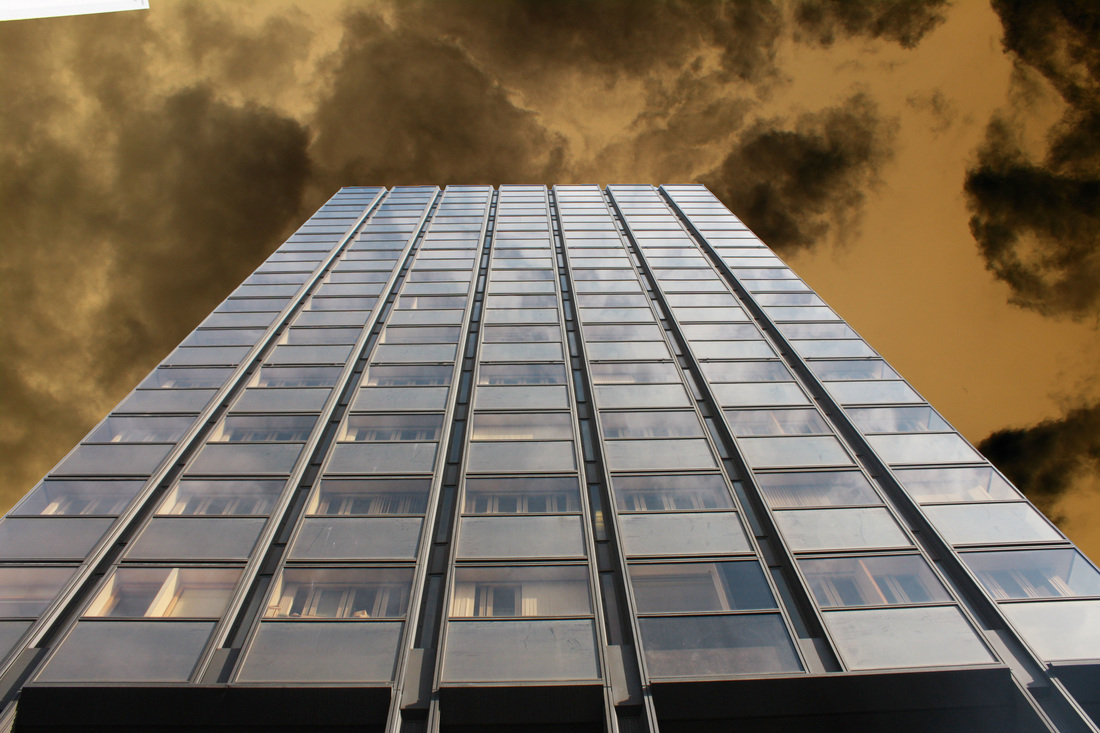
M O C K E X A M - E X P E R I M E N T I N G W I T H P H O T O S H O P
For our mock exam we had three hours to manipulate images on photoshop, I experimented with Photoshop in order to decide what I wanted to create for my final piece.
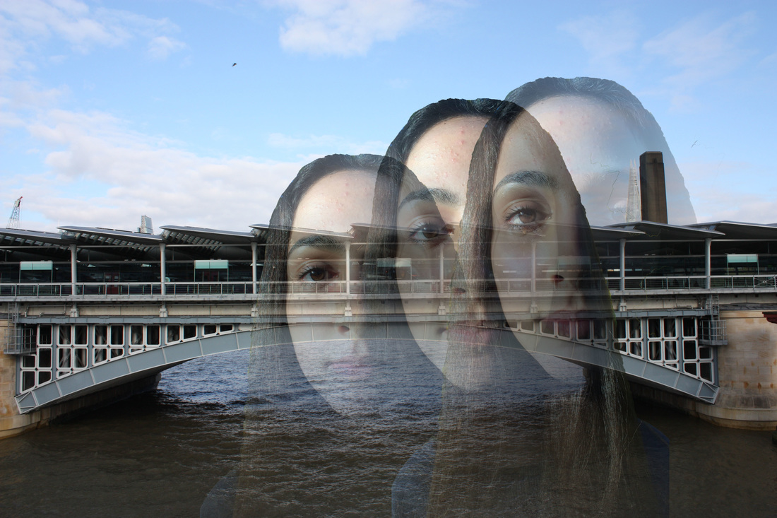
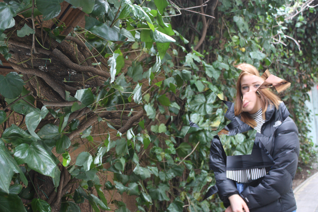
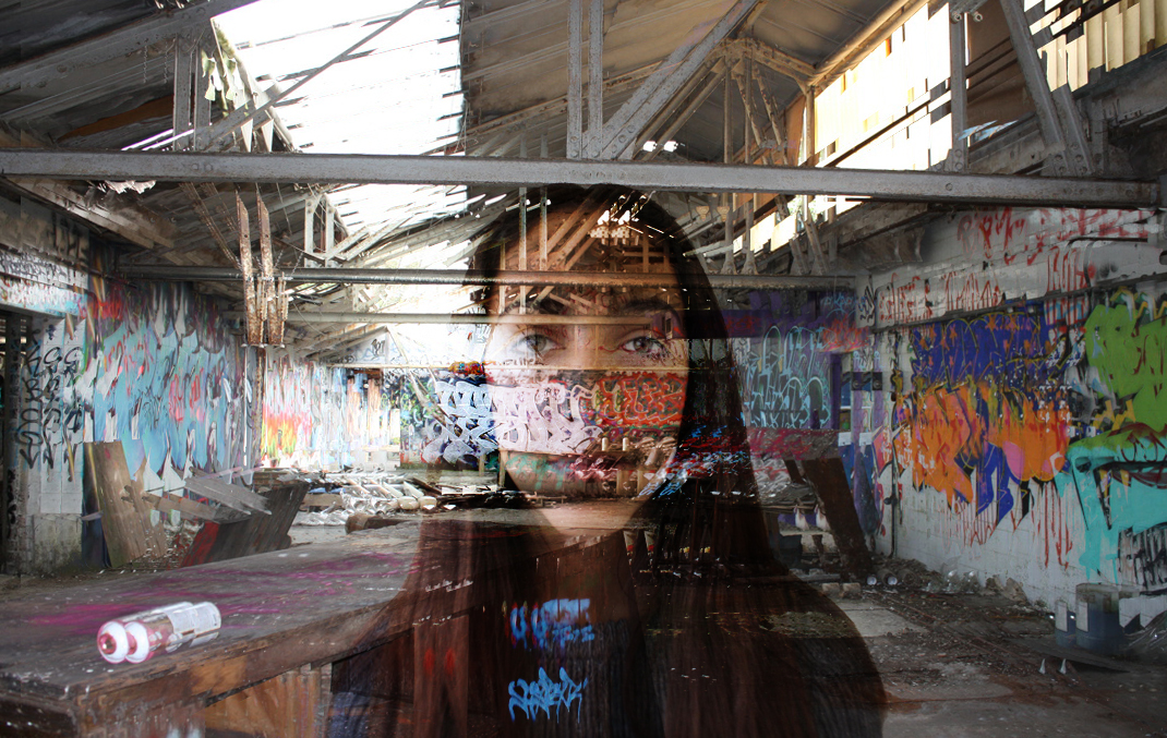
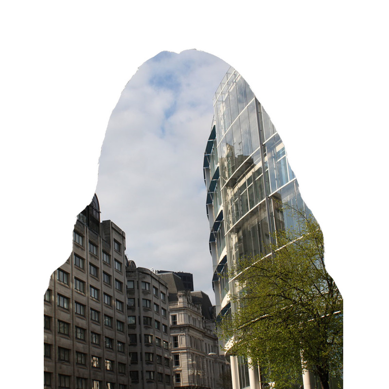
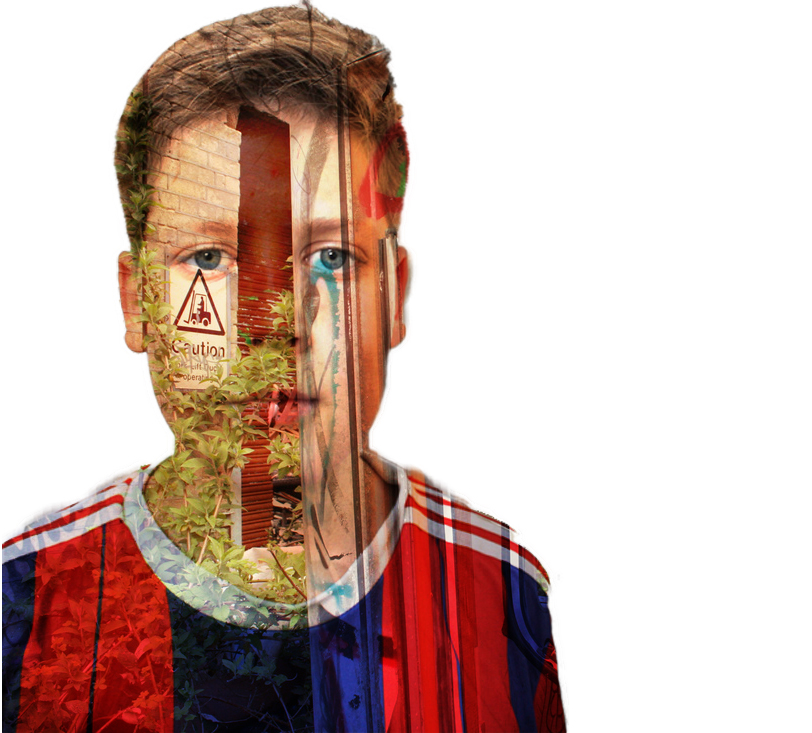
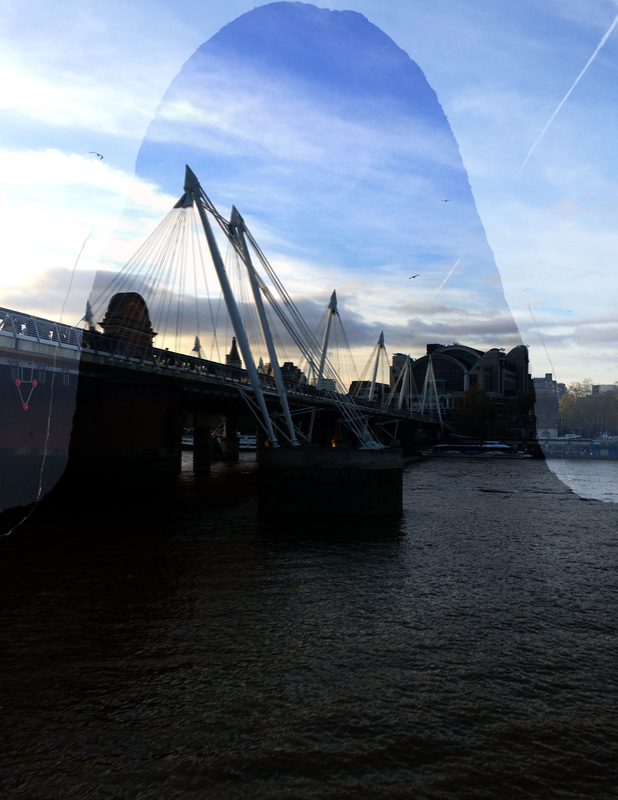
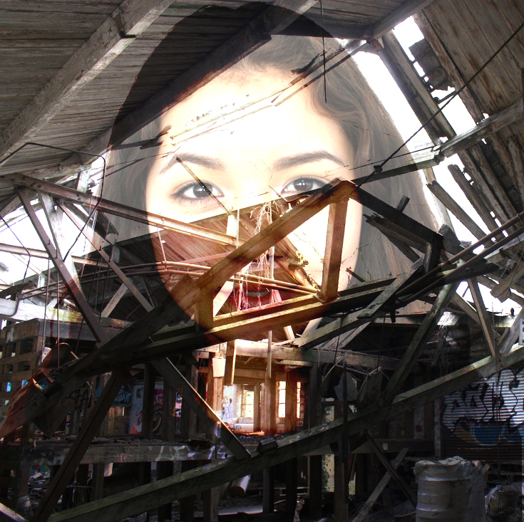
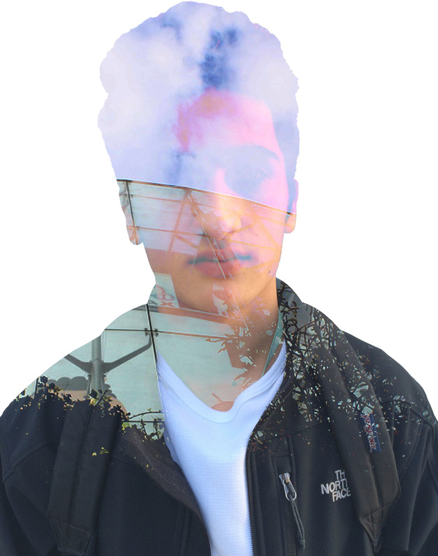
As my previous photos in Landscape consisted mainly of photos from Southbank and of derelict buildings I experimented with these in my mock exam. I used my pictures from Southbank and incorporated portrait images to add more depth to the photograph.
Below for my final piece I continued this theme to experiment with combined portrait and landscapes, using Jasper James as inspiration.
Below for my final piece I continued this theme to experiment with combined portrait and landscapes, using Jasper James as inspiration.
J A S P E R J A M E S
Jasper James is a China based photographer working in Shanghai and Beijing, shooting editorial, advertising and corporate work. His photography ranges from portrait, travel and interiors to concept driven projects.
Over the past decade he has lived and worked in New York, London and Beijing, covering assignments around the globe for some of the worlds leading magazines, design and advertising clients. In the overwhelming and overpopulated Asian megacities it can be hard to find individuality amongst the chaos. British photographer Jasper James has traveled around these places and created a beautiful project entitled "City Silhouettes." These pictures add a highly personal perspective to the vast, anonymous landscapes of Tokyo, Shenzhen and Shanghai.
Over the past decade he has lived and worked in New York, London and Beijing, covering assignments around the globe for some of the worlds leading magazines, design and advertising clients. In the overwhelming and overpopulated Asian megacities it can be hard to find individuality amongst the chaos. British photographer Jasper James has traveled around these places and created a beautiful project entitled "City Silhouettes." These pictures add a highly personal perspective to the vast, anonymous landscapes of Tokyo, Shenzhen and Shanghai.
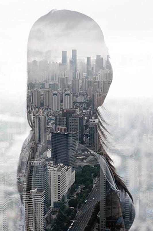
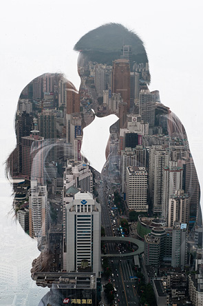
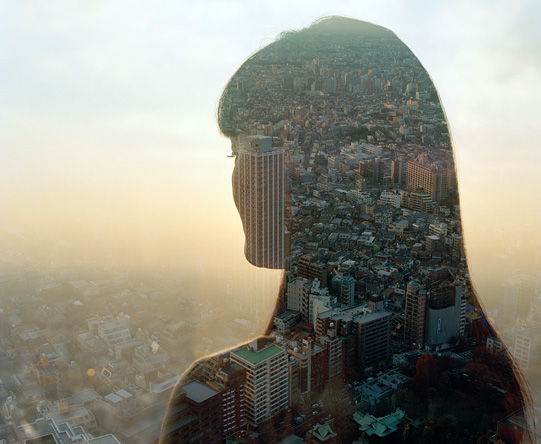
I also created these images inspired by Jasper James, I wanted to try and experiment with the use of portrait images incorporated into the landscape aspect of the photography, however as I hadn't really used portrait before it didn't fit into this topic and chose to continue without the portrait images. Below are 6 images that I created in the mock exam.
F I N A L P I E C E
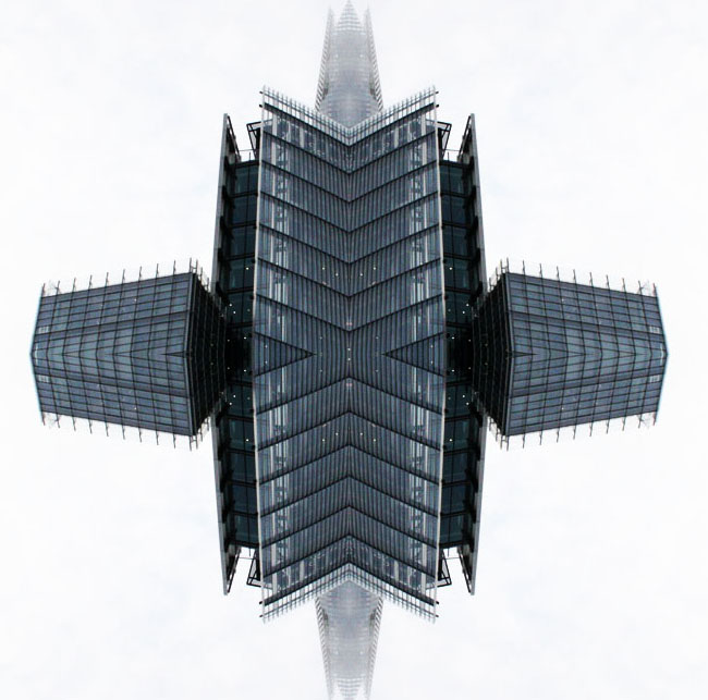
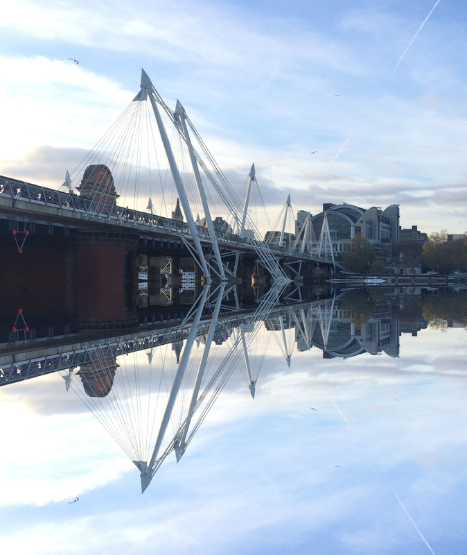
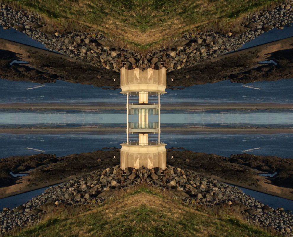
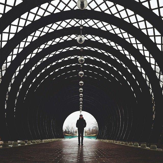
I decided to continue with only using landscape as after my experiments with portrait disorder I decided that the portrait aspect of the photos took away the attention from the landscape - which is what I wanted to focus on. I used Sasha Levin as my inspiration as the pictures he creates are very simple but effective. IN some of the photos created the images look surreal and capture the beauty of the landscape, whereas with others a more mechanical and structured outcome is obtained. These different results can all be made just by using symmetry which is why I wanted to use this technique for my final piece.
S A S H A L E V I N
Moscow-based photographer Sasha Levin, beauty in the world is found through symmetry. The mirroring that Levin sees around him creates a visual funnel that highlights the person appearing in his photos. He explains to the Instagram blog, “My eyes always spot people in the background. It‘s allowed me to show dynamic life in a static frame”. Levin’s beautifully-shot images highlight how something as simple as symmetry can completely alter how we perceive a photograph.
A R T I S T & M E
M Y W O R K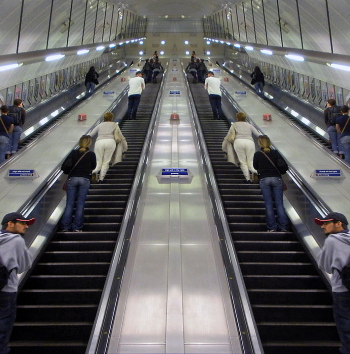
|
S A S H A L E V I N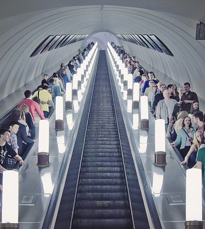
|
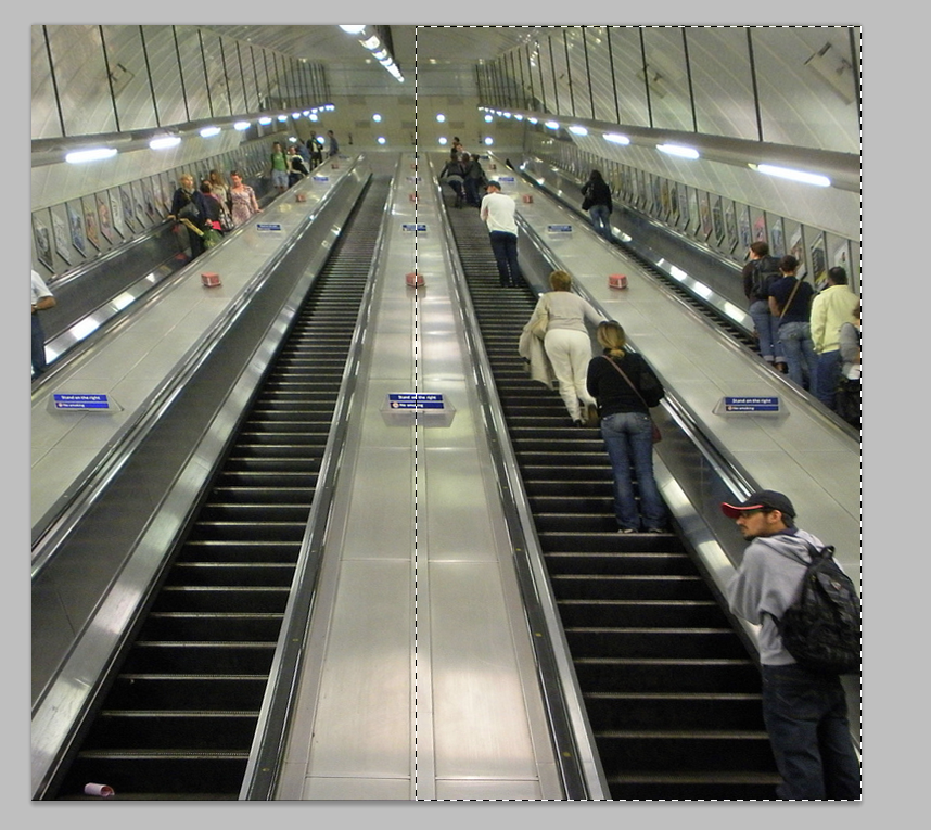
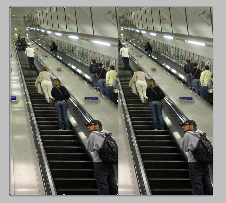
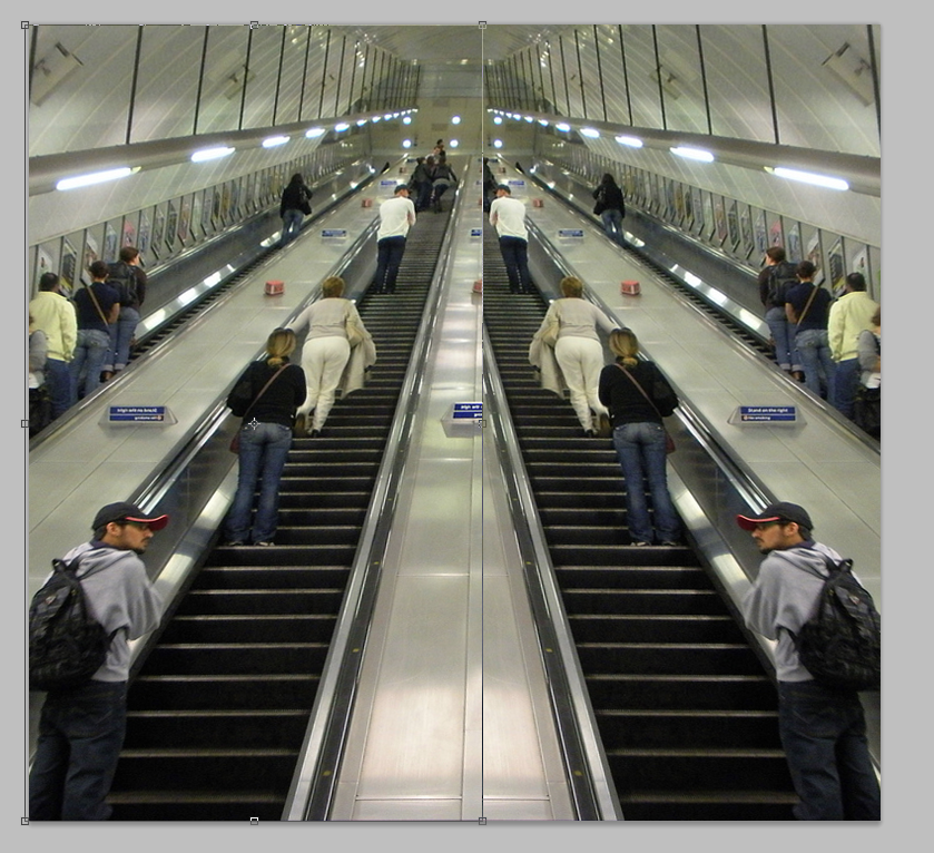
For this image Sasha Levin didn't use Photoshop to create a symmetrical effect, he chose an escalator because it looks naturally symmetrical without any editing. However my photo did not begin looking symmetrical, I used a technique on photoshop (below) to create it. In Levin's photo, the single escalator in the centre of the composition, alongside with the lighting on either side make the image look very even - therefore it doesn't need editing. Whereas the metal part of the escalator is in the centre of the image which is less aesthetically pleasing. Additionally I changed the colour and contrast of my image to be more similar to Levin's as it began a more yellow colour.
S T E P S O N P H O T O S H O P :