P A S T , P R E S E N T & F U T U R E
P I N T E R E S T :
P O R T R A I T - P A S T, P R E S E N T & F U T U R E
M E R G I N G :
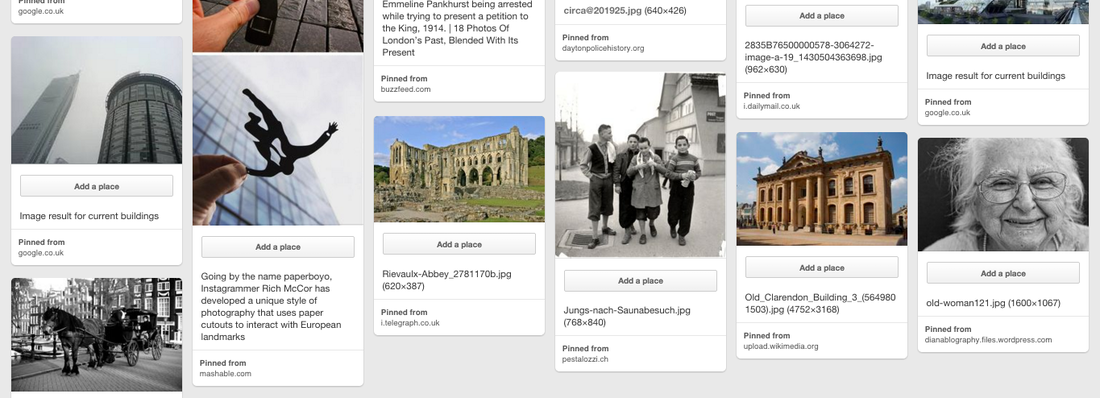
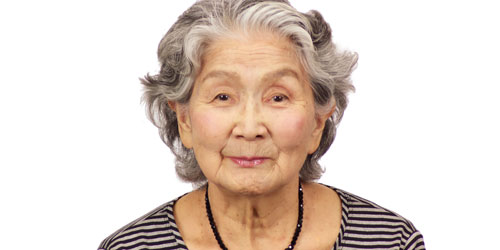
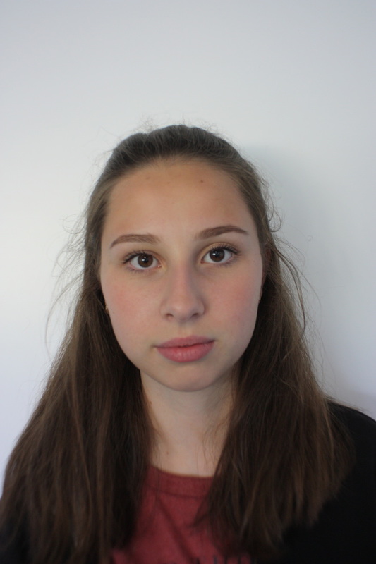
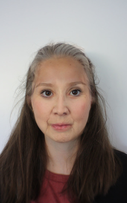
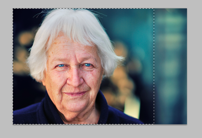
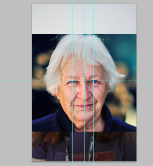
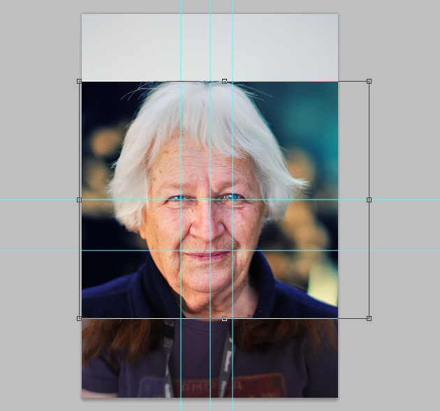
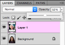
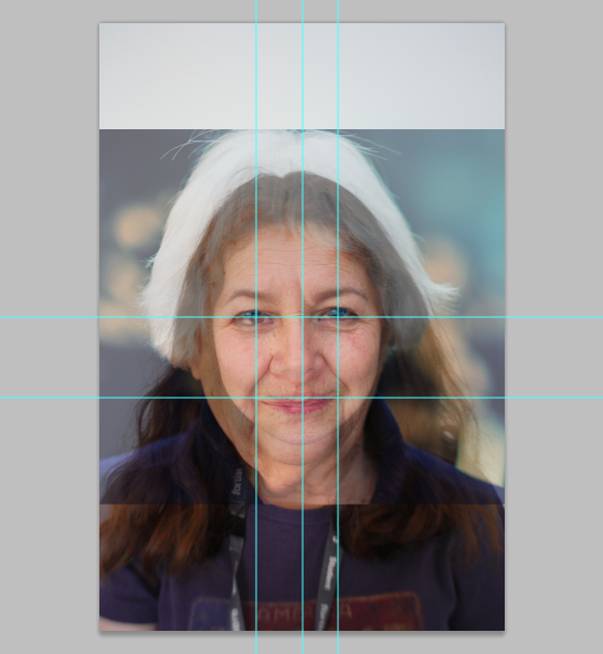
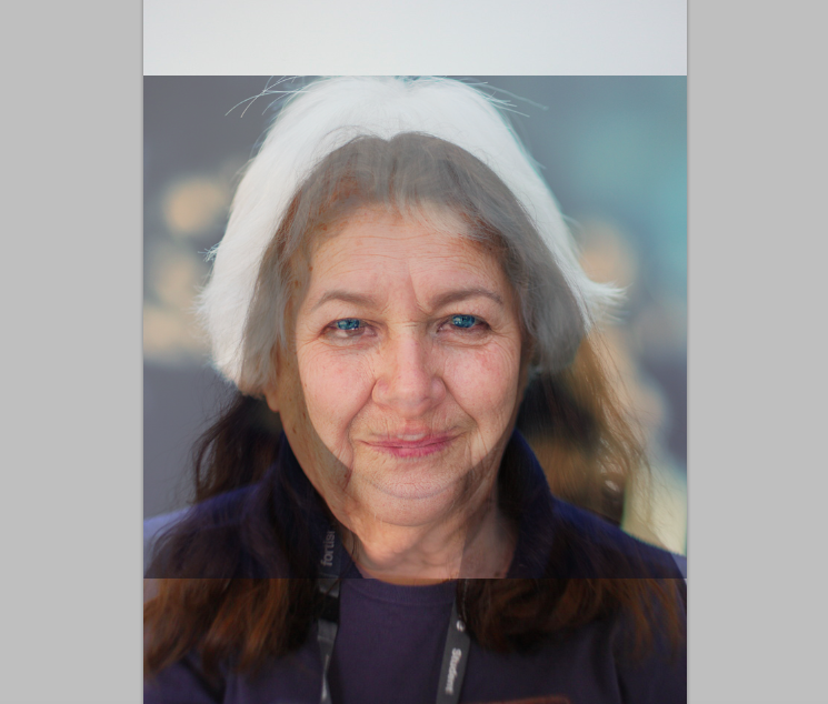
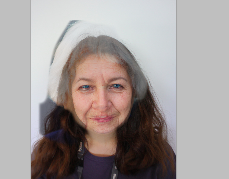
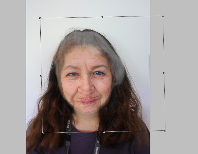
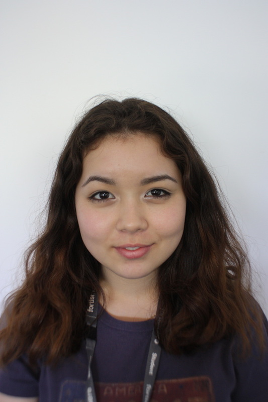
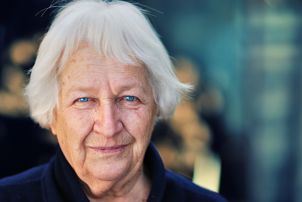
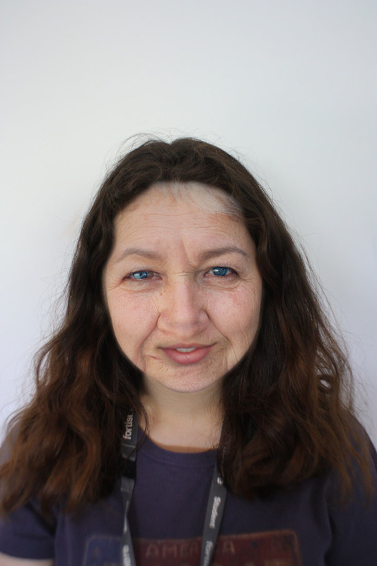
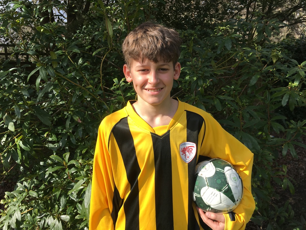
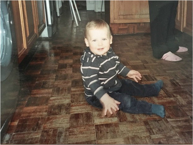
This task consists of merging a portrait photo of a young person with a photo of an older person from the internet. Using photoshop the two people's faces are merged to create an ages portrait.

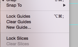
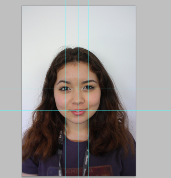
S T E P S O N P H O T O S H O P :


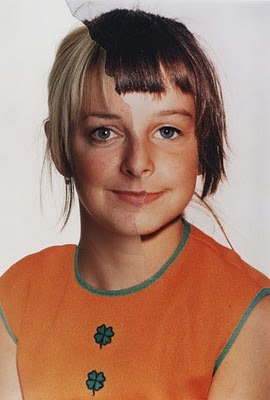
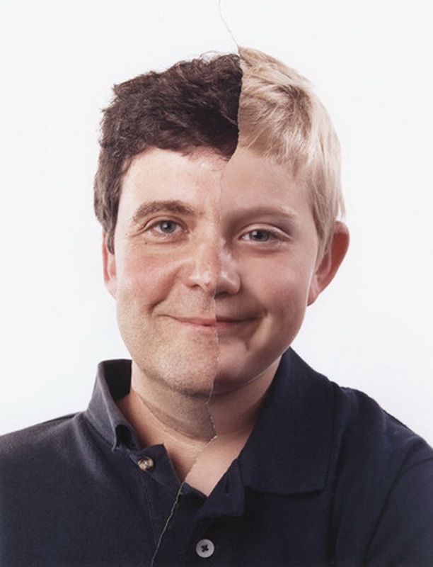
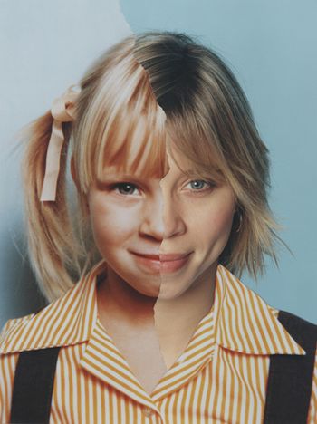
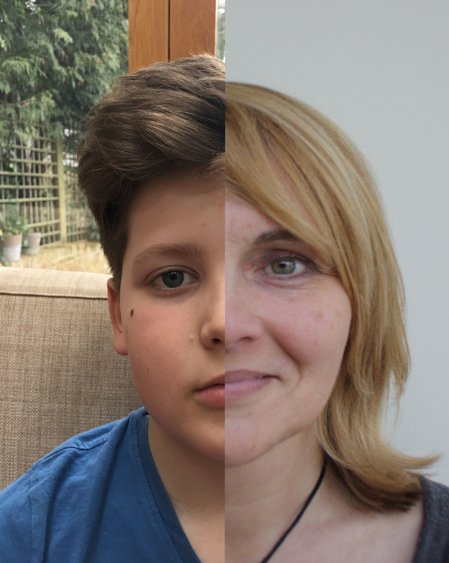
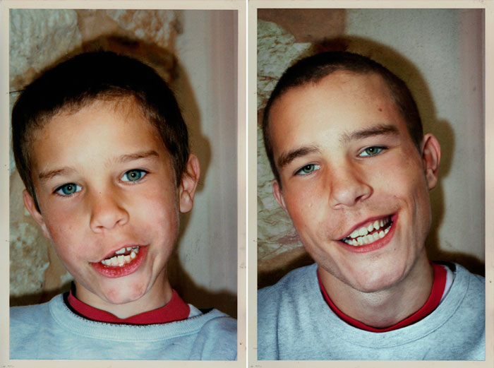
B O B B Y N E E L A D A M S
Bobby Neel Adams is an American photographer, his best-known pictures are those made for the series Beauties and Beasts, Age Maps, and Couples, in each of which he combined two individual portraits in the darkroom to create a single image.
|
|
|
The photos taken by Adams's in this series involve two pictures of the same person - young and old being combined. The photos are taken against a blank background in order to avert all attention to the subject and to contrast against the colour in the clothes. The people are in the centre of the composition which automatically focuses the attention on the their faces. The rip down the centre emphasises the difference in time as there is a clear age difference shown in their faces, but no their bodies as they are wearing the same outfit.
|
|
|
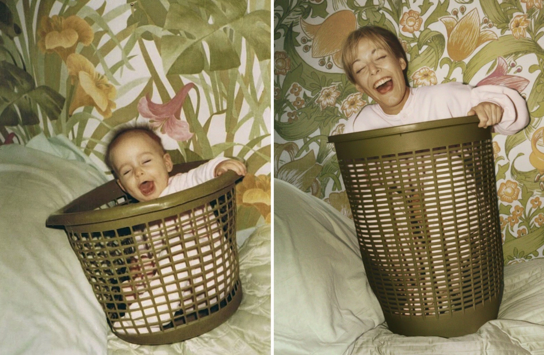
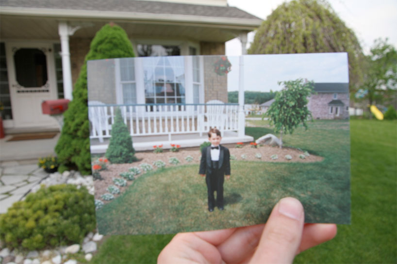
I R E N A W E A R N I N G
Irena Wearning is an Argentinean artist who created a series called 'Back to the Future' by reenacting childhood photos.
"Most of us are fascinated by their retro look but to me, it’s imagining how people would feel and look like if they were to reenact them today… Two years ago, I decided to actually do this. So, with my camera, I started inviting people to go back to their future.."
"Most of us are fascinated by their retro look but to me, it’s imagining how people would feel and look like if they were to reenact them today… Two years ago, I decided to actually do this. So, with my camera, I started inviting people to go back to their future.."
|
|
|
Irena Wearning recreated these images very specifically, the clothes worn in the first pictures were exactly the same when recreated, as was the props (basket) and the background. Doing this emphasises the ageing of the person as everything else is exactly the same apart from the subject. The facial expressions used and the compositions were made as similar as possible, and by doing this, it allowed the reenactment to look like they were actually 'back in their childhood'.
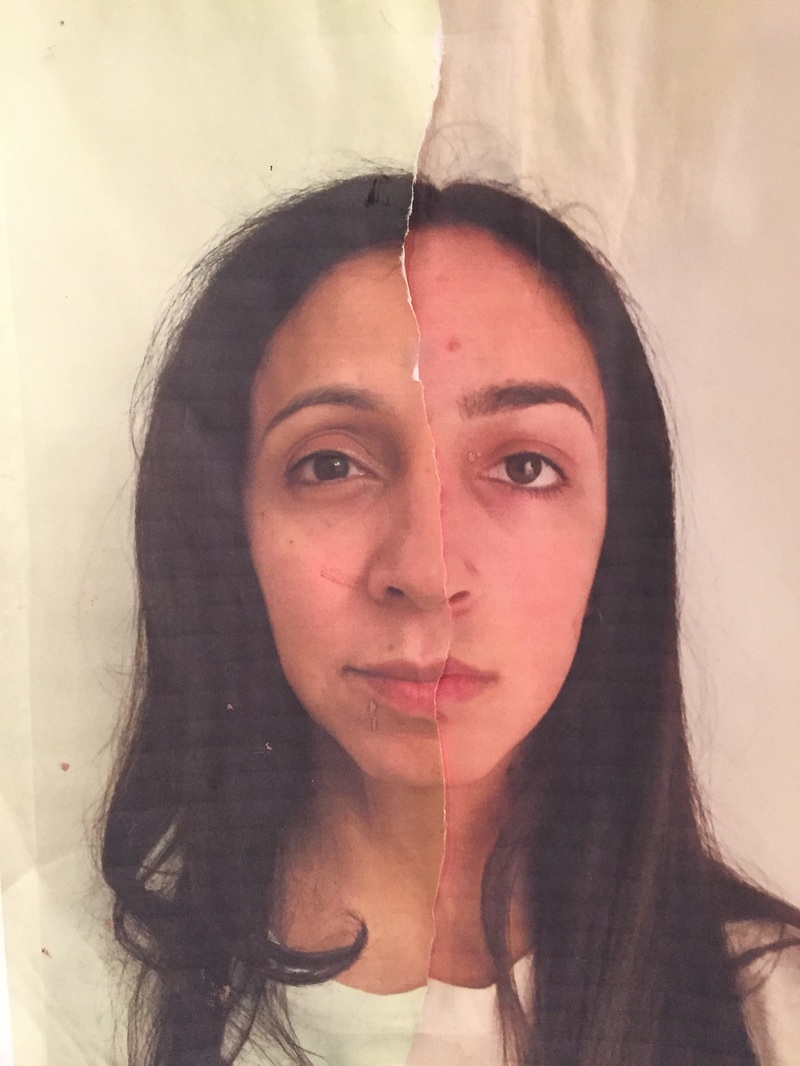
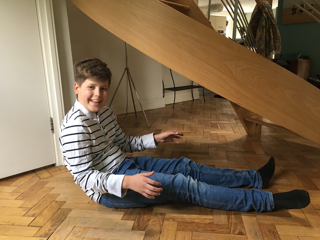
M Y R E S P O N S E
|
|
|
|
L O C A T I O N - P A S T, P R E S E N T & F U T U R E
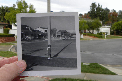
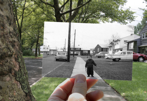
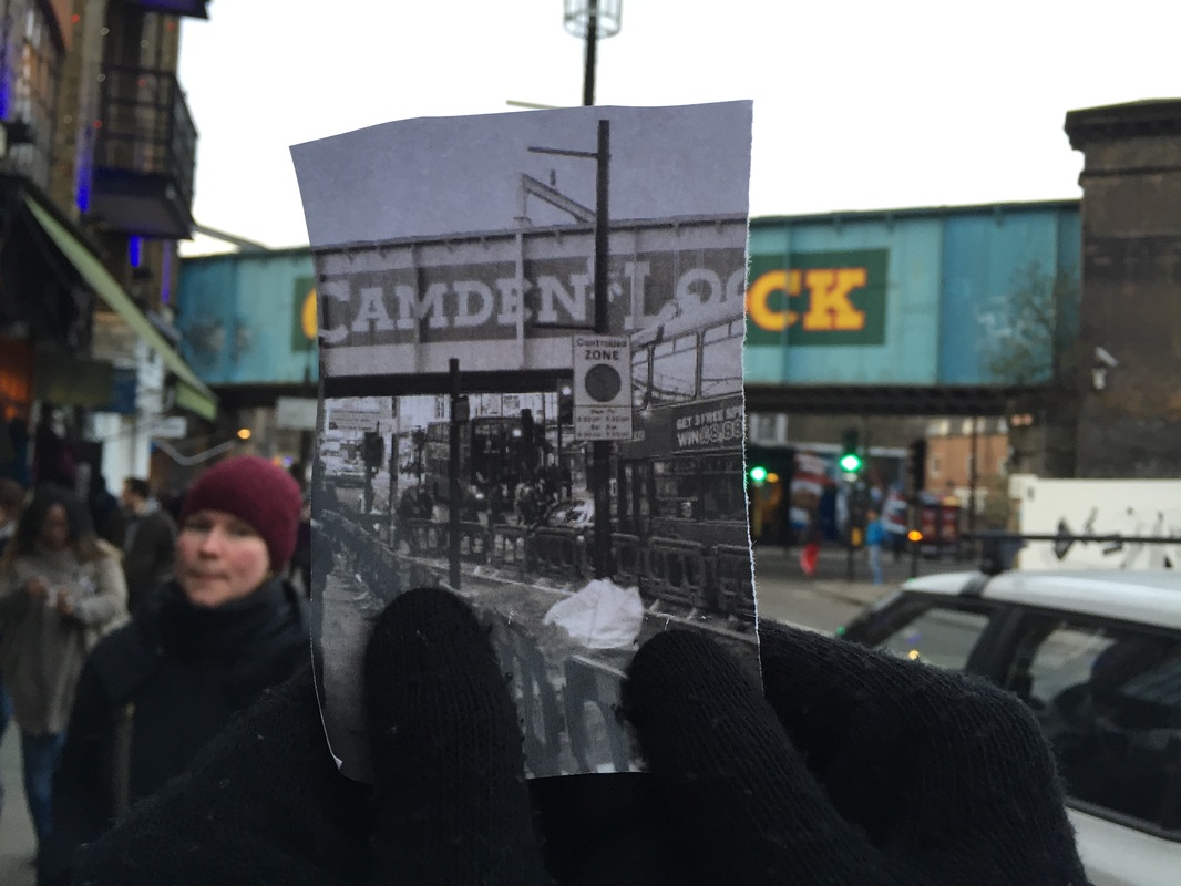
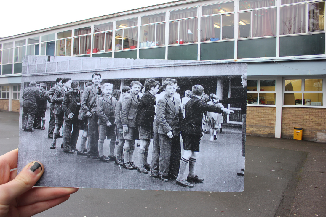
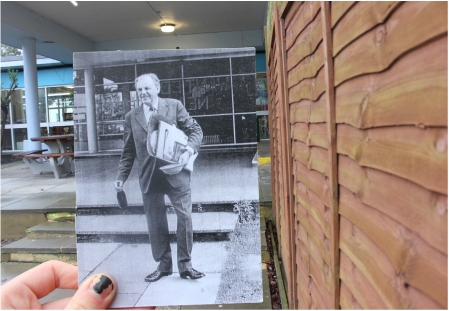
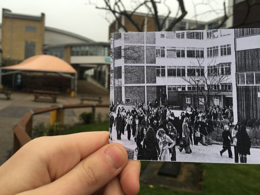
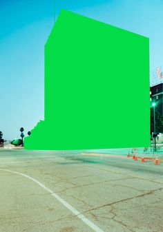
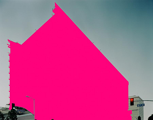
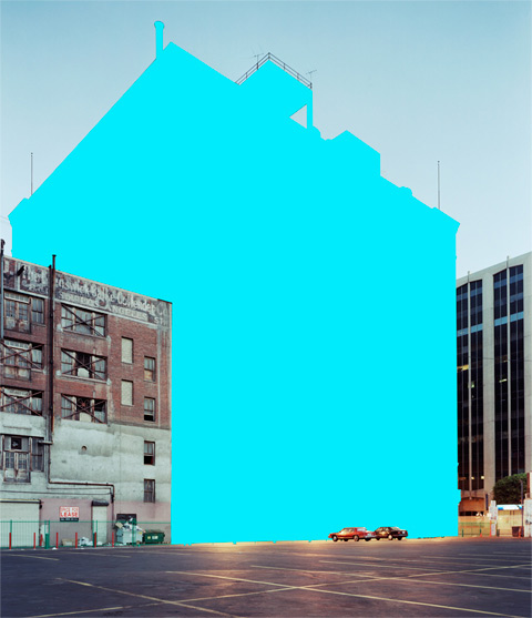
T A Y L O R J O N E S
Taylor Jones started 'Dear Photograph' as a nice nostalgic blog with six pictures of old family snaps lined up in their original setting, then it went viral and he now uploads one entry from around 200 a day. "It is a little crazy," he says, "but seeing all these photographs, and reading the stories, has given me a perspective on life. My parents are still around and I have grown a lot closer to them."
|
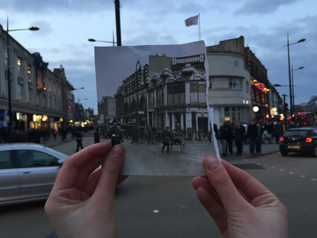
This photo consists of a small black and white picture of a child standing in front of a lamppost. Then main focal point is the image he is holding up because it is in the foreground and the background doesn't catch your attention. However both the foreground and background are important in this image as the purpose of the photograph is to compare the places in two different times - old and modern. The colour difference of the black and white photo and the background emphasises the time difference as the vibrant green colours appear more modern, and the black and white represents the olden days.
|
In this photo there is a little boy standing in front of a house, the main focal point is the boy because he is in the centre of the image and he is wearing black, which contrasts against the predominantly green background. The image is bright because of the natural light due to the picture being taken outside, there are two trees that have overgrown and no longer fit the images - this is due to the force of growth and demonstrates the effect time has on a location. However, the house lines up perfectly which allows the image to display a sense of completion.
|
This photograph contains Taylor Jones holding up a black and white image of a kid standing on a pavement. The main focal point is the image being held up as it is in black and white as it contrasts against the background and is in the foreground. The lamppost and pavement perfectly line up in the image which displays a sense of continuity, and there is distance to the photo as you can see the pavement trailing off into the distance. The main colour in this image is green in the background and the rest is black and white, Jones took this outside so the lighting is natural.
|
I N I T I A L R E S P O N S E
E X H I B I T I O N V I S I T
T A T E M O D E R N : P E R F O R M I N G F O R T H E C A M E R A
The exhibition explores the relationship between photography and performance, engaging with serious, provocative and sensational topics, as well as humour, improvisation and irony. By charting how performers and photographers have also worked collaboratively, the exhibition examines live events that happened solely for the camera.
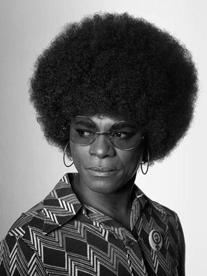
Y V E S K L E I N |
S A M U E L F O S S O |
A M A L I A U L M A N |

|
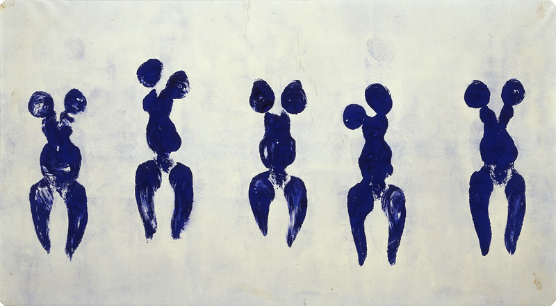
Yves Klein was a French artist considered an important figure in post-war European art; he is the leading member of the French artistic movement. He is remembered above all for his use of a single color, the rich shade of ultramarine that he made his own: International Klein Blue. The abstract painting that dominated French art in the 1950s was invariably premised on the notion that an artist could communicate with the viewer through the power of abstract form. He was genuinely fascinated by mystical ideas, by notions of the infinite, the undefinable, the absolute, and his use of a single rich and suggestive tone of blue might be seen as an attempt to free the viewer from all imposed ideas and let her mind soar. For, as Klein believed, lines in pictures were a form of "prison grating," and only color offered the path to freedom.
|
Samuel Fosso is a Cameroonian photographer who has worked for most of his career in the Central African Republic. His work uses self-portraits adopting a series of personas, often commenting on the history of Africa. In his latest series African Spirits Fosso steps into history and pays tribute to the figureheads of the Black movement in Africa and in the US. His discourse which was quite personal in the 70’s, shifted towards the sociological to now adopt a much more politically engaged stance. They are and can be a source of pride and inspiration for this generation of black people. This relates to past present and future, as this project represents everyone who has contributed to shaping the world the way it is today - historically, now, and how it will impact out future.
|
Amalia Ulman, is an Argentinian born Spanish artist, she works across mediums, including poetry, graphic design, video, iOS mobile uploads, painting, and installation. She started a project called "Excellences & Perfections" where she 'faked' her lifestyle by posting photos that made it seem like she was "living the life". She said “I spent a month researching the whole thing. There was a beginning, a climax and an end. I dyed my hair. I changed my wardrobe. I was acting: it wasn’t me.” This ultimately resulted in Ulman receiving many negative messages about how she "couldn't be taken seriously anymore" she said "people started hating me, suddenly I was this dumb b---- because I was showing my ass in pictures". I think that this relates to the theme as it shows the attitudes towards women and how their appearance and how they present themselves affect how they are seen by the world.
|
W A L K A L O N G T H E E M BA N K M E N T

T H R E E S T R A N D S
1 S T S T R A N D
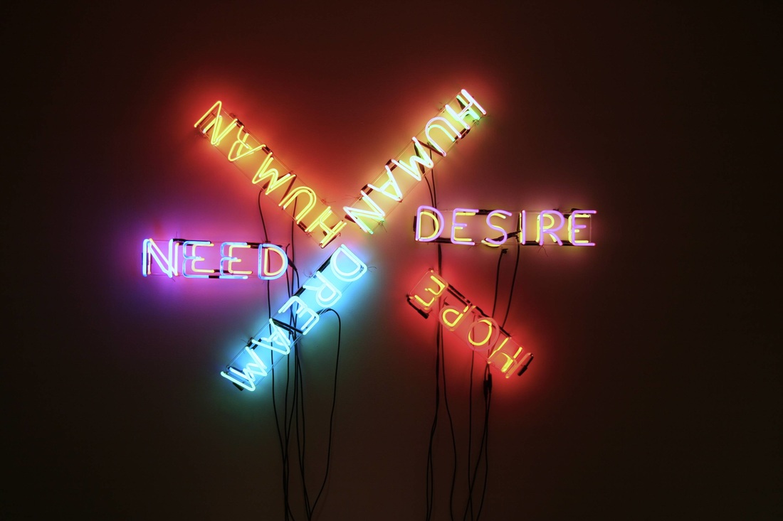
N E O N
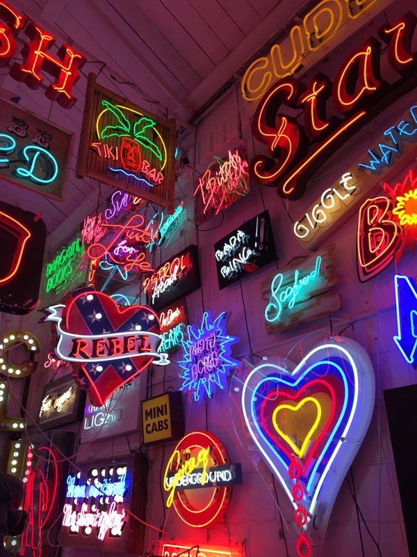
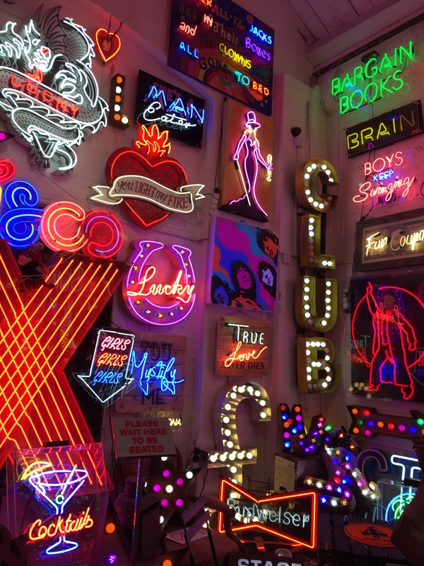
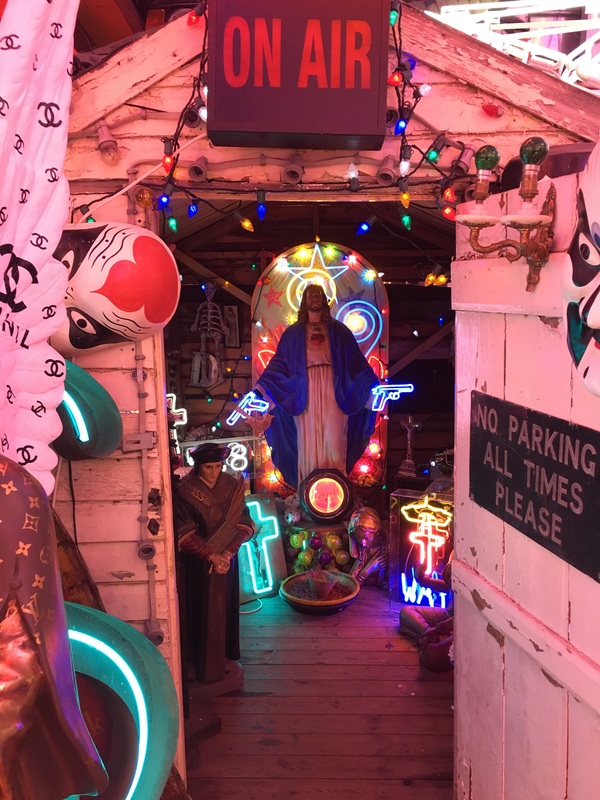
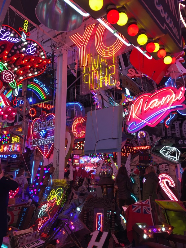
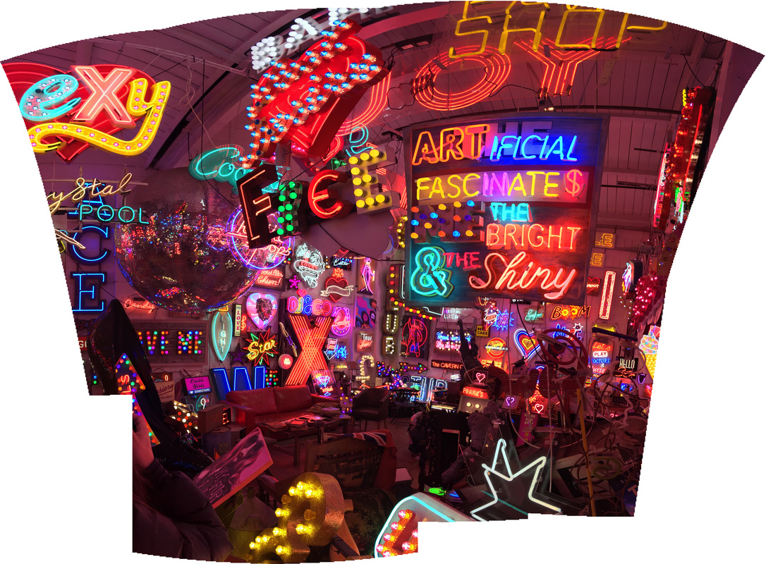
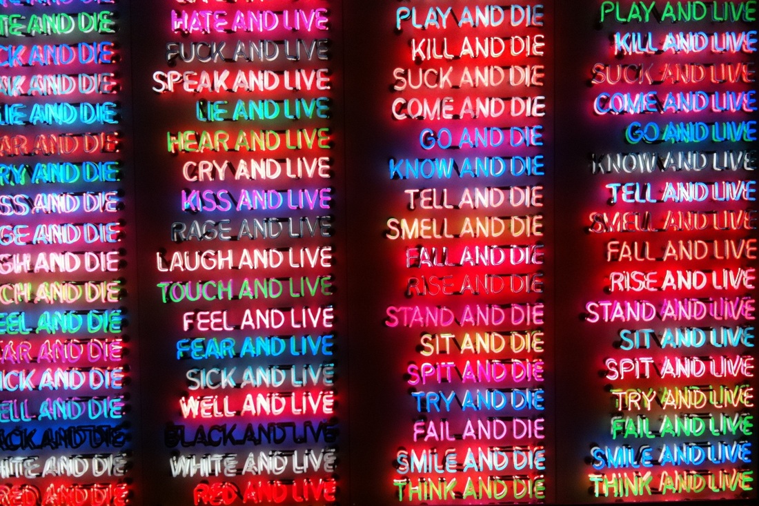
For this strand I will be focusing on the past present and future of neon. Historically neon has been around since it was discovered by Sir William Ramsay and Morris Travers in 1898 very shortly after their discovery of the element krypton. Both elements were discovered through work on liquid air. The largest use for neon gas is in advertising signs, in the past neon was widely used however it has now become a less common form of advertisement.
For my first strand I went to God's own Junkyard warehouse in Walthamstow. Chris Bracey owned one of the largest neon collections outside of the US and has variety of neon signs from different decades and shops. This relates to the theme of past, present and future as neon was widely used in the 70's.
For my first strand I went to God's own Junkyard warehouse in Walthamstow. Chris Bracey owned one of the largest neon collections outside of the US and has variety of neon signs from different decades and shops. This relates to the theme of past, present and future as neon was widely used in the 70's.
I N I T I A L R E S P O N S E
|
|
|
|
1 S T D E V E L O P M E N T
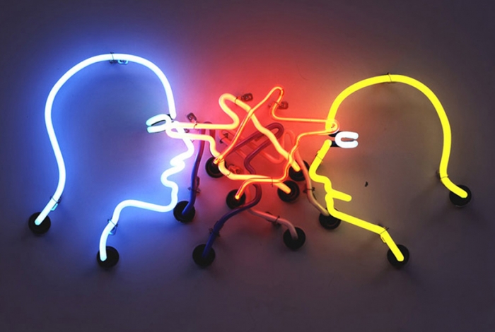
B R U C E N A U M A N
Bruce Nauman is an American artist. His practice spans a broad range of media including sculpture, photography, neon, video, drawing, printmaking, and performance. Nauman lives near Galisteo, New Mexico. Nauman was less focused on neon as an expressive medium than as a reference to American consumer culture and a vehicle for his bold statements, questioning the role and function of art in society.
2 N D D E V E L O P M E N T
When neon was first introduced into the UK, it was mainly used as a powerful form of advertising. Using neon attracted customers as it was new and abstract. The gif below can be interpreted as the emerging popularity as there was a sudden "boom" of neon signs in the UK.
The first colour photograph was made by the three-color method suggested by James Clerk Maxwell in 1855, and taken in 1861 by Thomas Sutton. The use of neon became popular 37 years after the first colour photograph was taken, this shows the popularity around this new colour that was able to be captured in images. If coloured photographs weren't discovered then neon wouldn't exist, and instead of there being an era surrounded by neon, all images and advertising would remain in black and white. This strand displays the importance of neon and how it came around in the past, how it is used today, in the present, while still being able to look futuristic and surreal.
The first colour photograph was made by the three-color method suggested by James Clerk Maxwell in 1855, and taken in 1861 by Thomas Sutton. The use of neon became popular 37 years after the first colour photograph was taken, this shows the popularity around this new colour that was able to be captured in images. If coloured photographs weren't discovered then neon wouldn't exist, and instead of there being an era surrounded by neon, all images and advertising would remain in black and white. This strand displays the importance of neon and how it came around in the past, how it is used today, in the present, while still being able to look futuristic and surreal.
2 N D S T R A N D
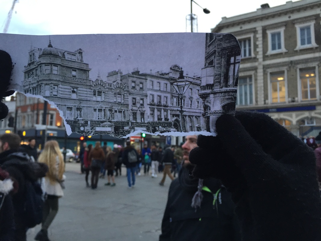
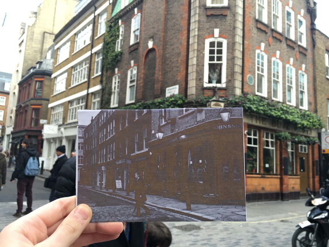
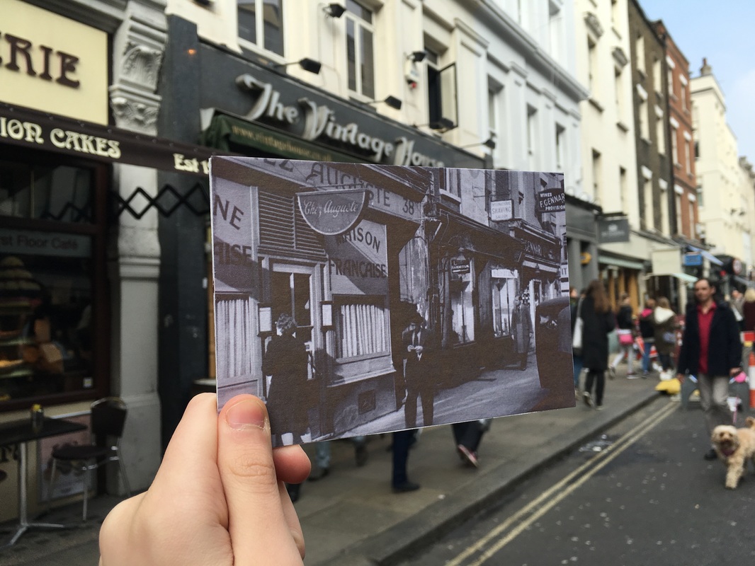
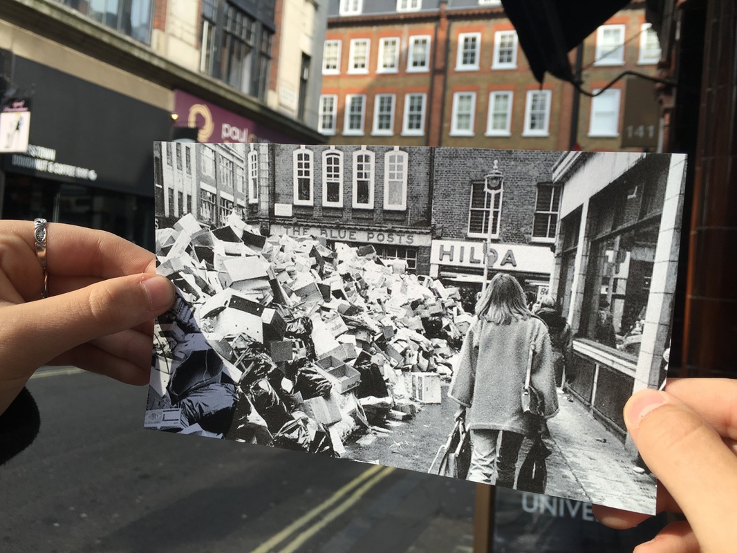
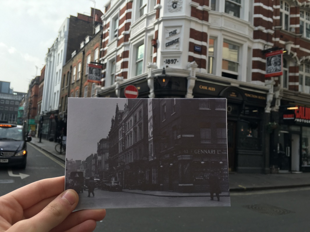
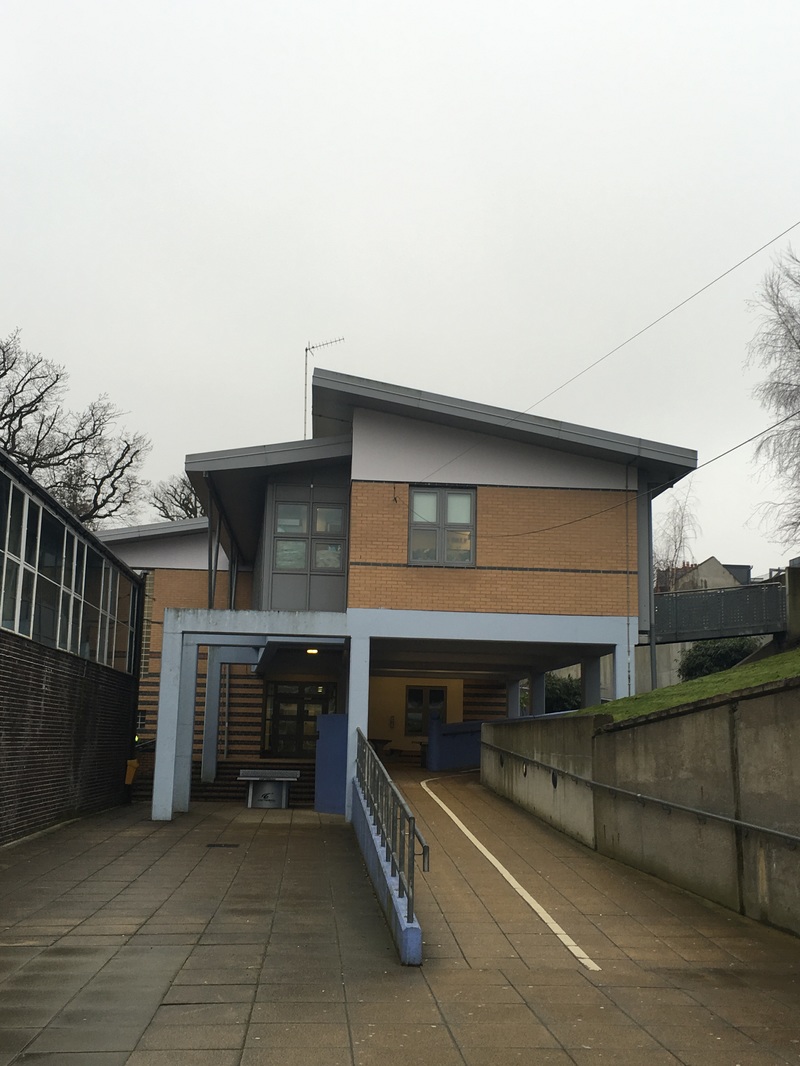
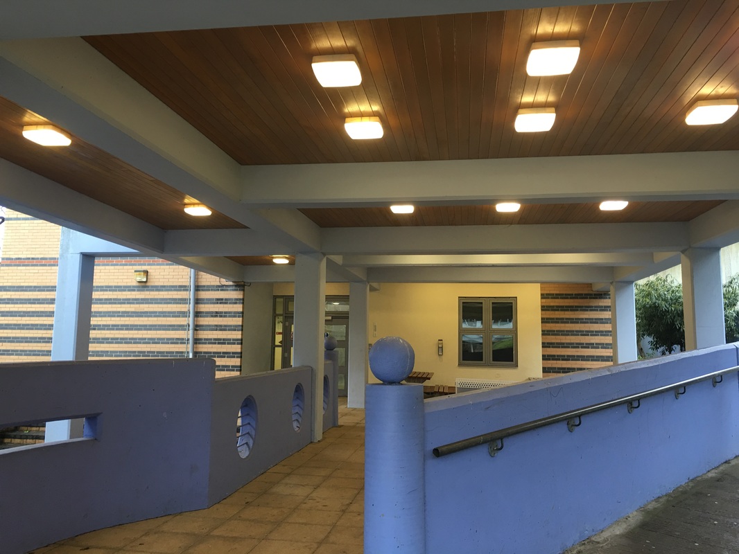
L O C A T I O N
This strand involves holding up pictures of a location in the past up against the same location in the present. The relates to the theme of past present and future as it compares the past and present in the same photo. For my initial response I found old pictures of the school and took pictures to compare them. This strand relates to the artist Taylor Jones seen in the set task.
I N I T I A L R E S P O N S E
D E V E L O P M E N T
For my development I went into Soho and took pictures comparing the past and present - however this was harder than my initial response as certain locations have changed a lot since the old photographs. Some aspects of Soho have stayed the same such as the market stalls but as London is an area that is always developing, the current locations of some of the old pictures I had to take pictures of were very hard to find and line up correctly.
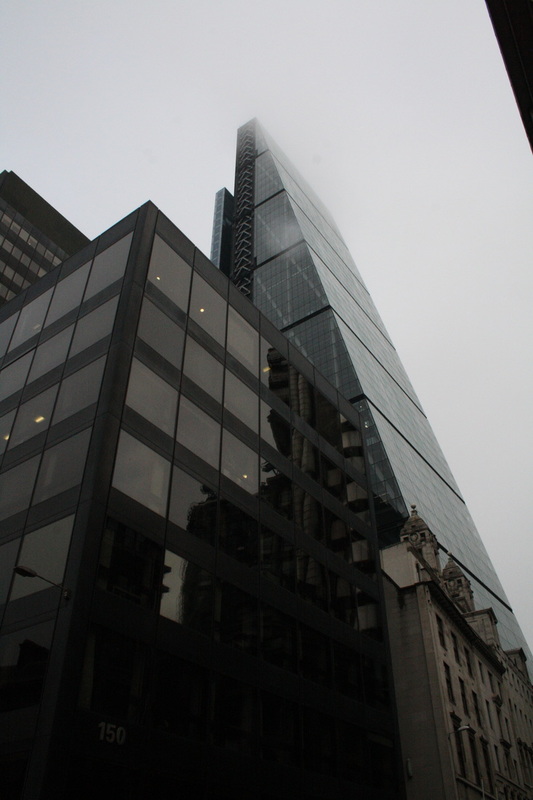
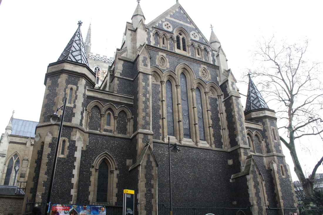
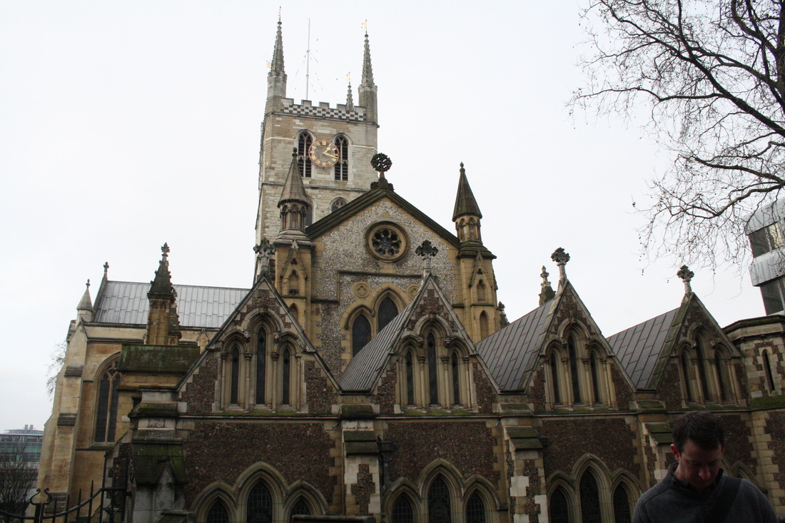
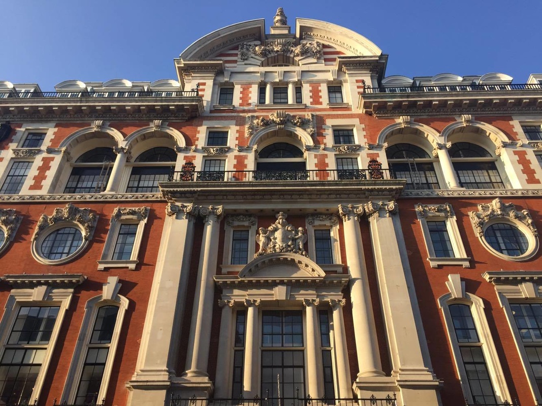
3 R D S T R A N D
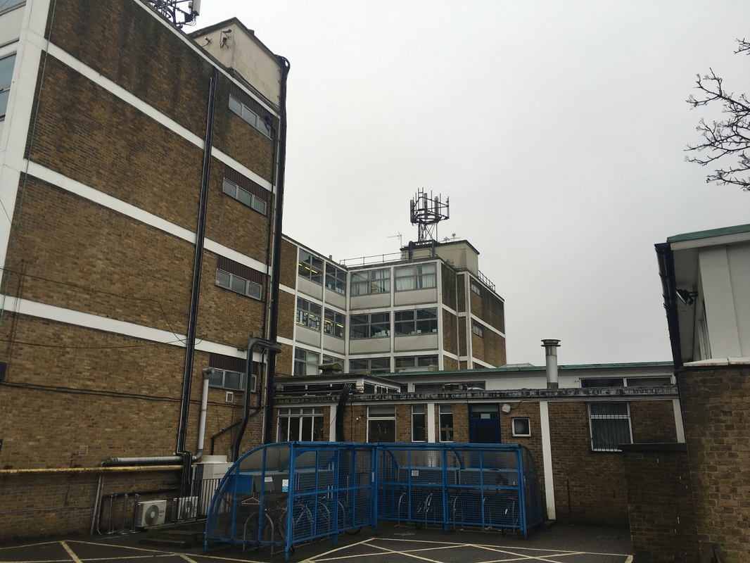
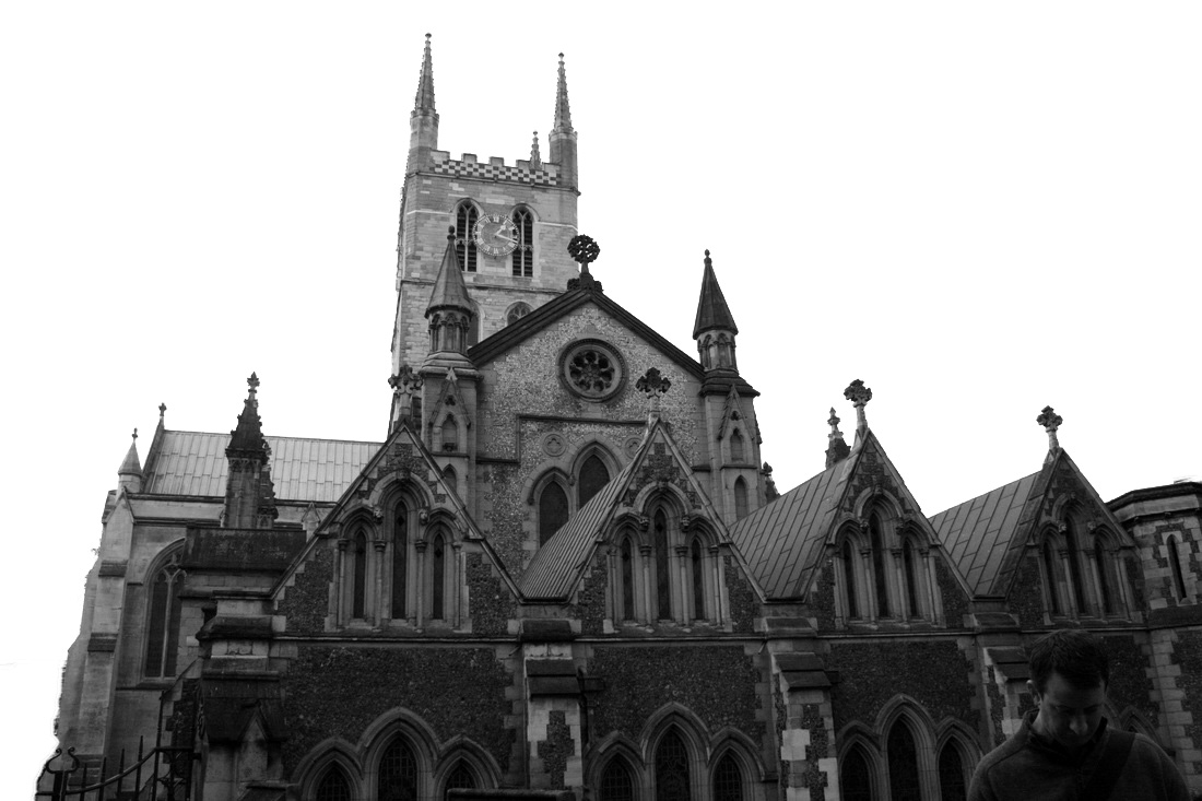
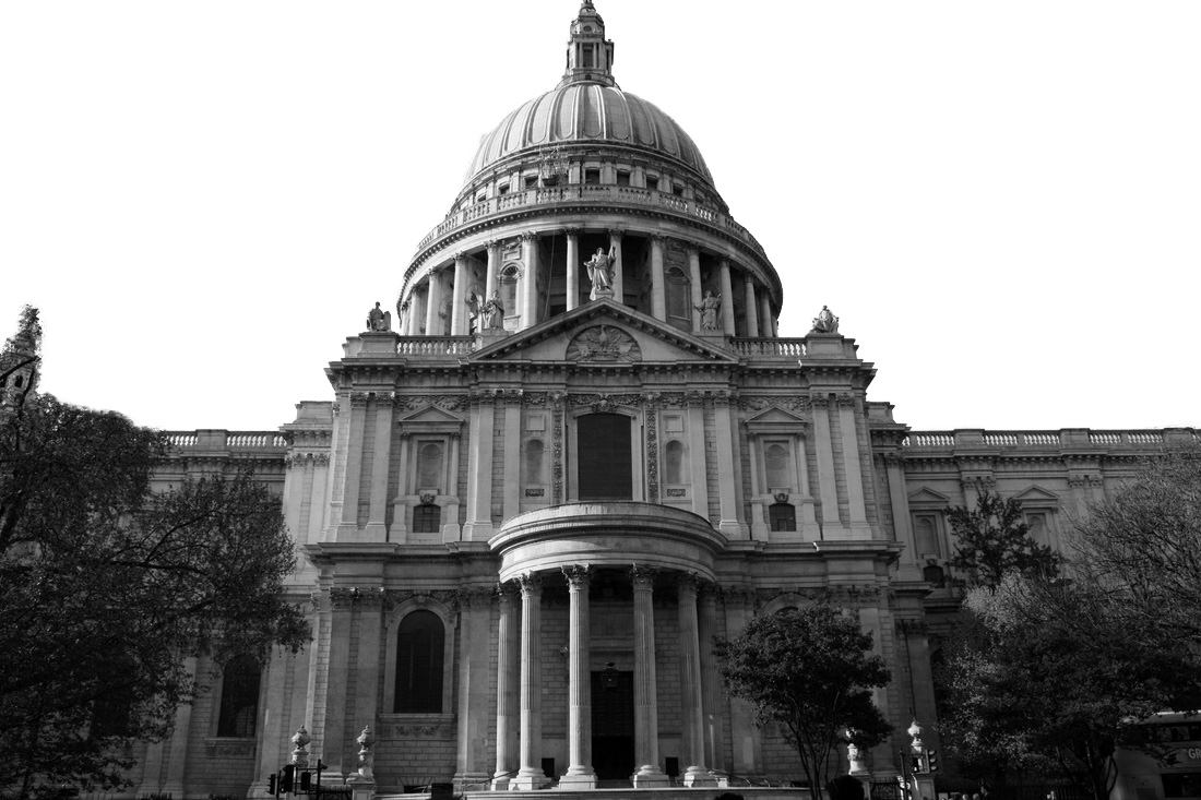
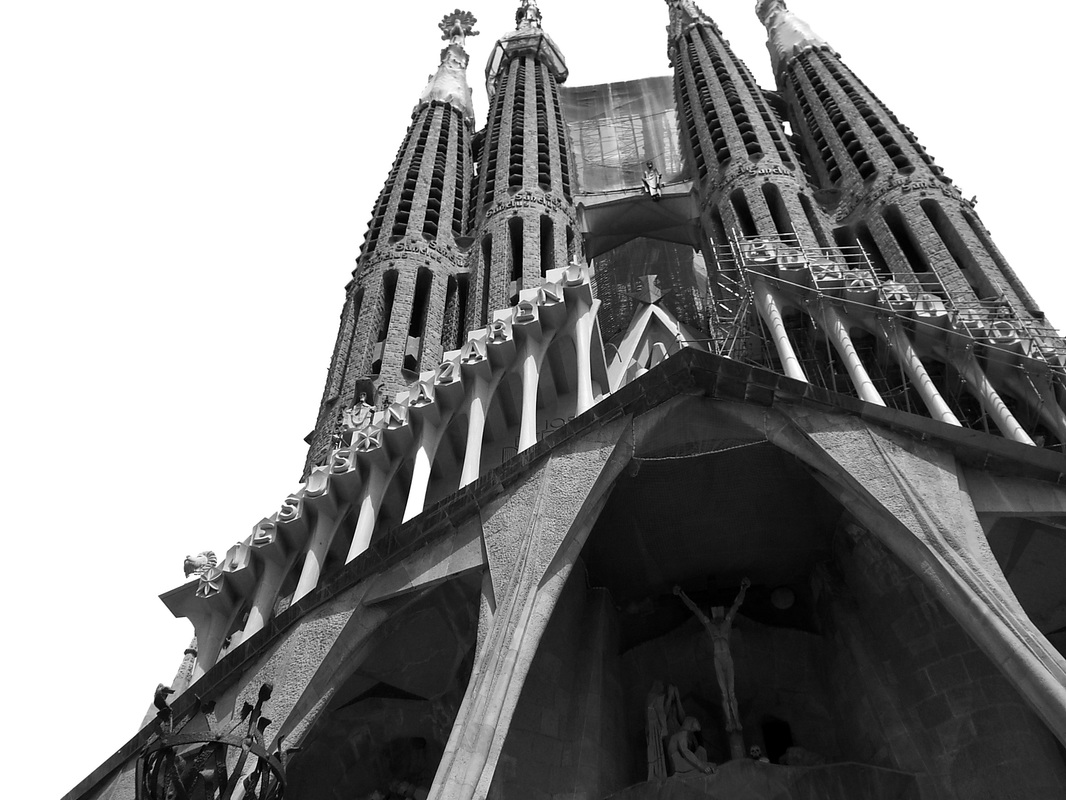
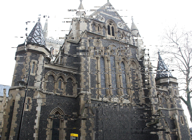
N E W A N D O L D
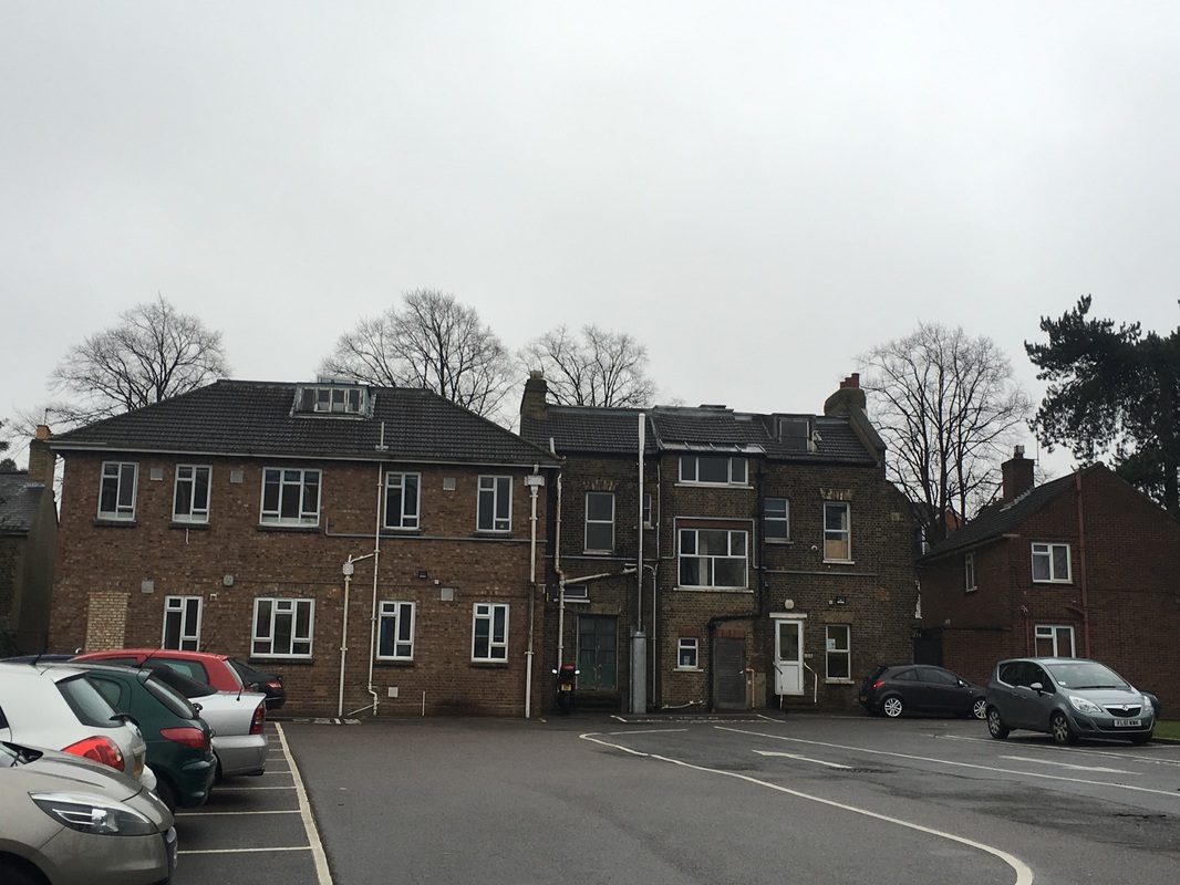
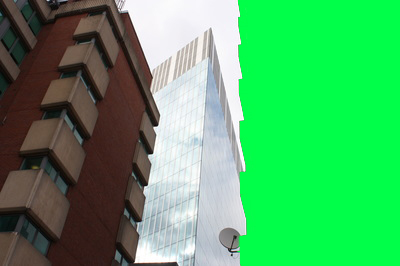
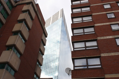
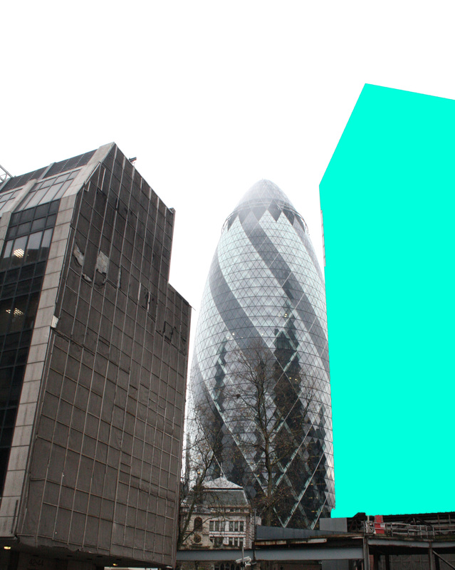
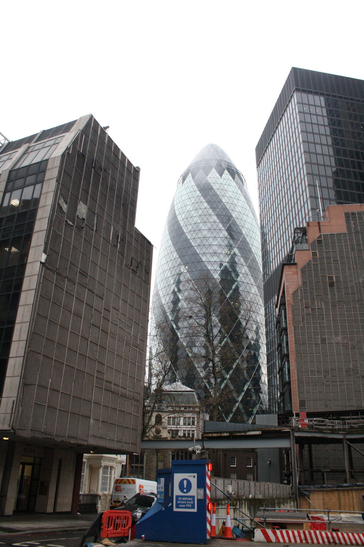
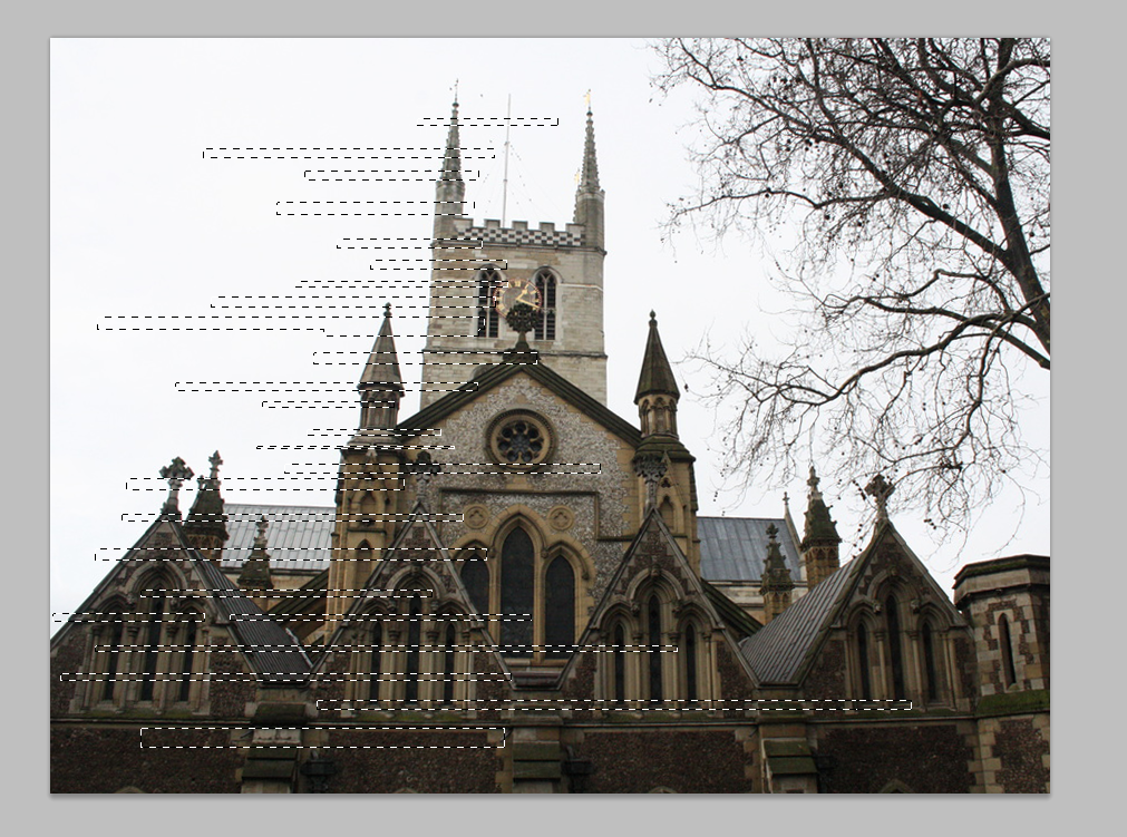
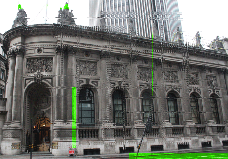
This strand consists of comparing old and new buildings. These include structures such as churches and the shard, the comparison between these historic and contemporary buildings highlights how time affects the appearance of them as there is a very distinct difference between them.
My initial response consisted of taking images of the buildings around the school, although there wasn't a massive difference seen, you can still make a distinction between the new and old.
My initial response consisted of taking images of the buildings around the school, although there wasn't a massive difference seen, you can still make a distinction between the new and old.
I N I T I A L R E S P O N S E
N E W
O L D
1 S T D E V E L O P M E N T
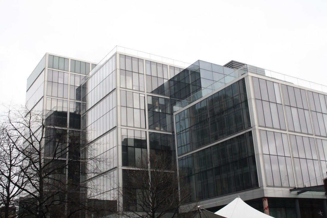
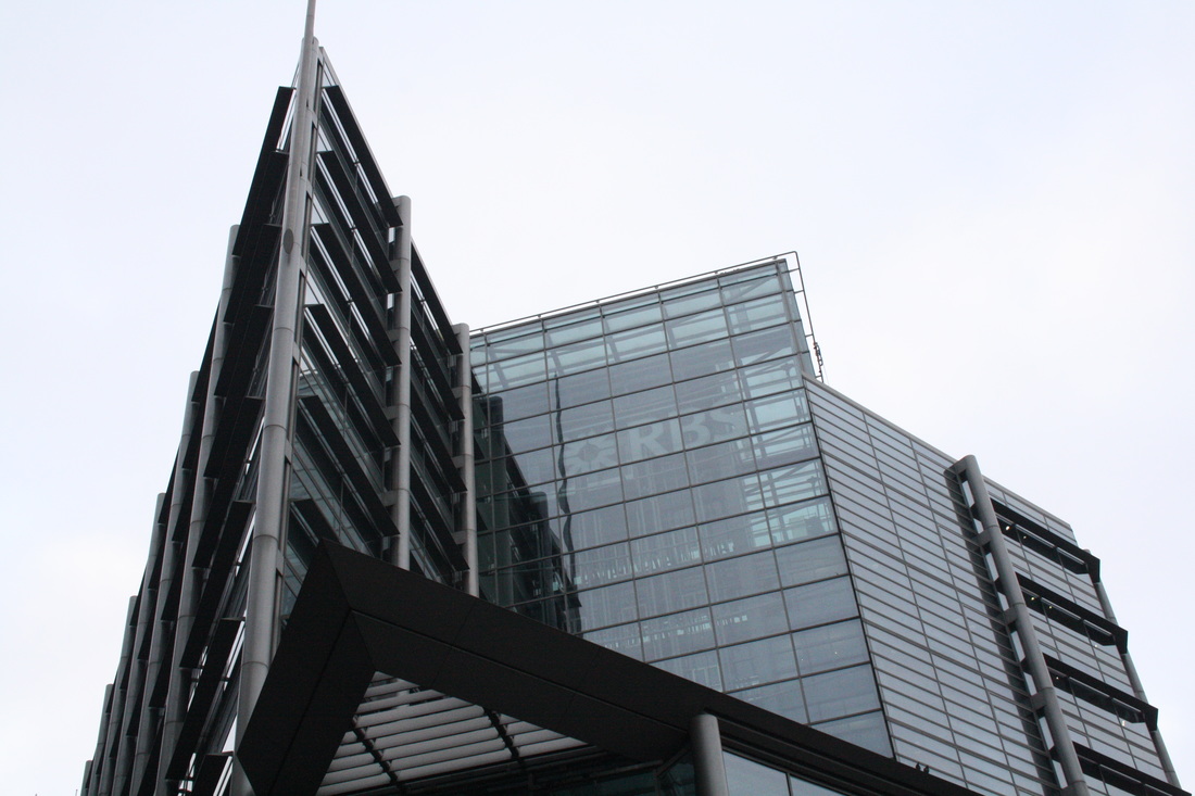
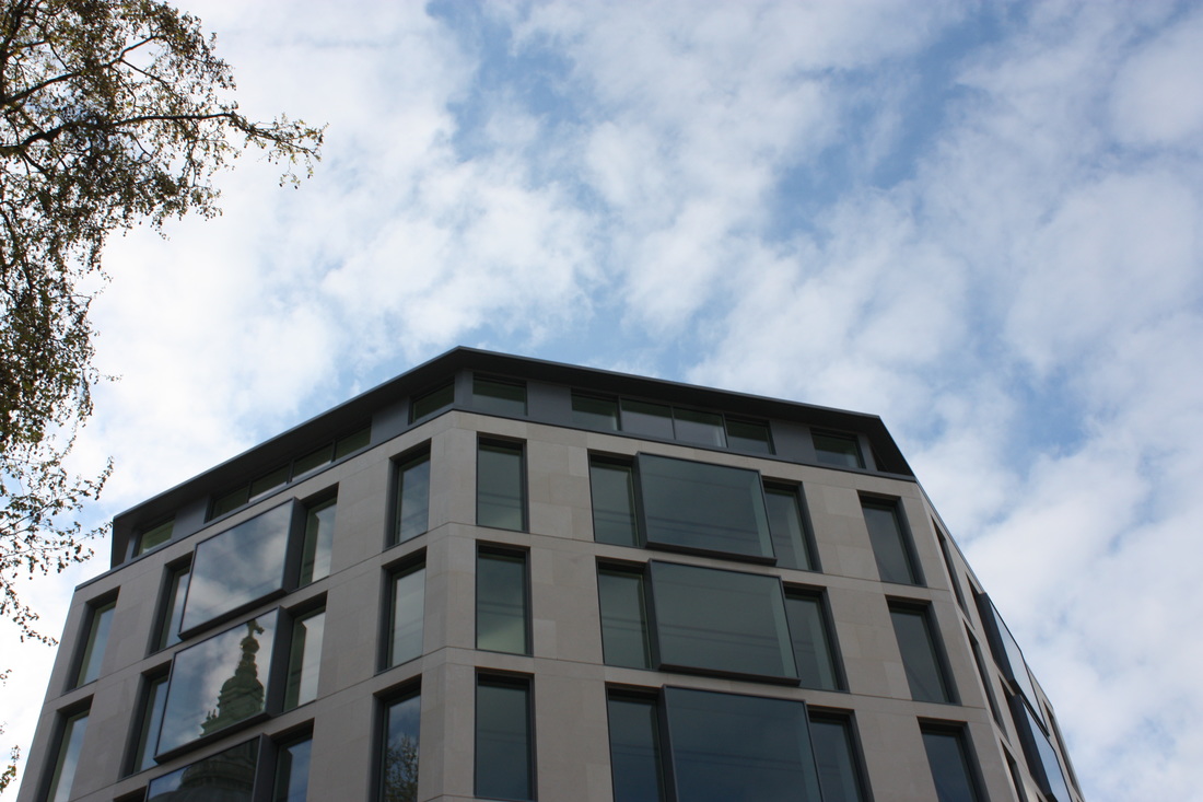
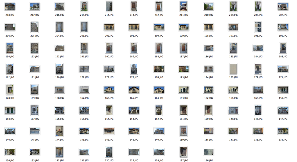
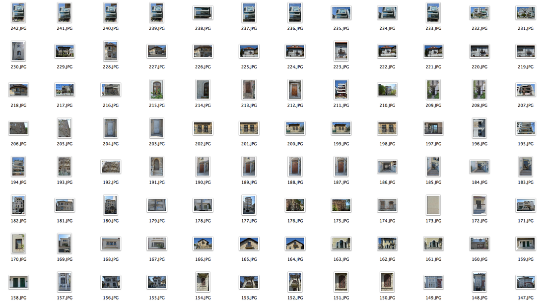
I developed my response from initial to second by taking more pictures in various places of central London, these included buildings that showed a difference between new and old, whereas in my initial response in school it was hard to tell a difference.
N E W
O L D
2 N D D E V E L O P M E N T
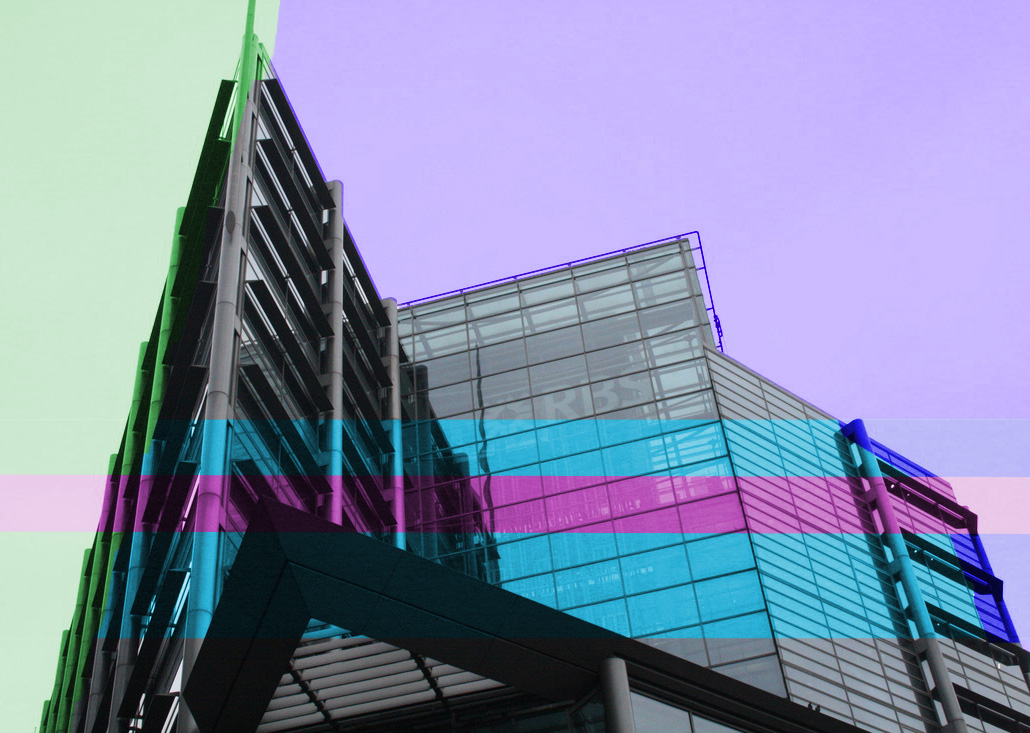
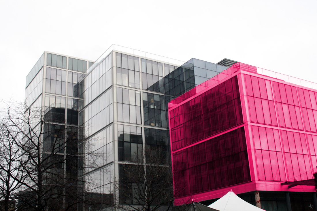
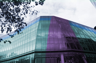
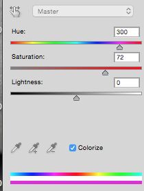
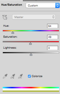
For my second development I used photoshop to add colour onto the "new" buildings. As mentioned in my neon theme, the colour development links into the theme of past, present & future as colour photography was not suggested until 1855. I used this with the pictures I took of new buildings as it emphasises the modernisation, contrasting with the more historic buildings. Below these I edited the pictures I took of old buildings, removed the backgrounds and changed them into black and white. This lack of colour emphasises the age of the old buildings, and when they're shown next to the photoshopped images of the new buildings, the difference in age is evident and emphasised in comparison.
3 R D D E V E L O P M E N T
M A U R E N B R O D B E C K
Mauren Brodbeck has, since her youngest years, been delivering an eclectic and multicolored body of work that calls into question ideas around "being" vs "appearing to be", working in a realm of expressive forms sublimated by colour. The buildings and parking lots in Mauren Brodbeck’s photographs occupy no space in the perceptions of passersby, they are so unimposing that their existence seems almost doubtful. Materially existent, they are so far removed from memory that they, through their reconstruction of a series of perceptions, leave behind a blank canvas, a classical mental blank.
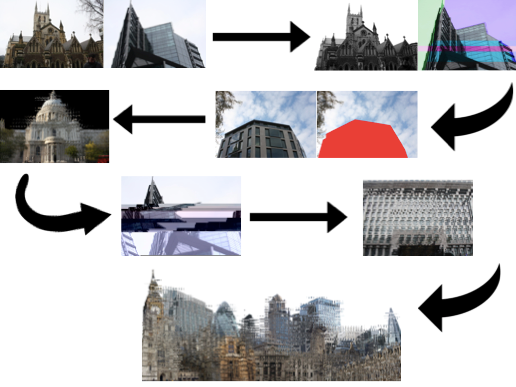
4 T H D E V E L O P M E N T
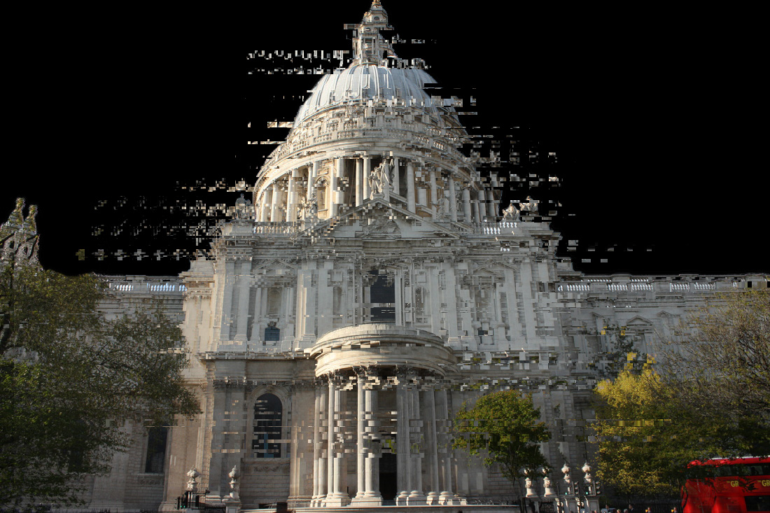
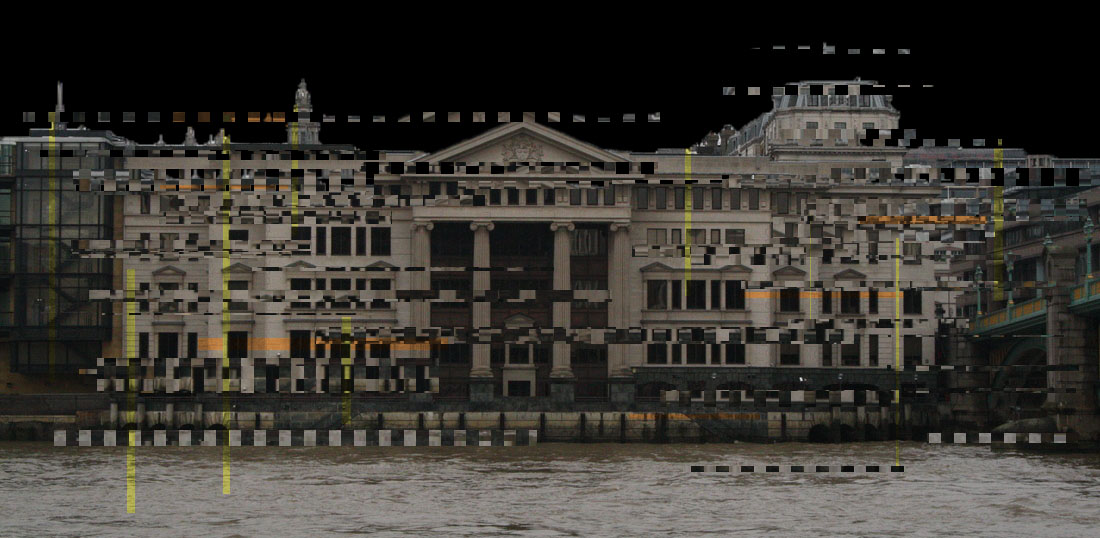
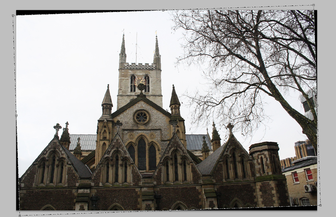
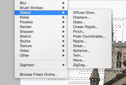
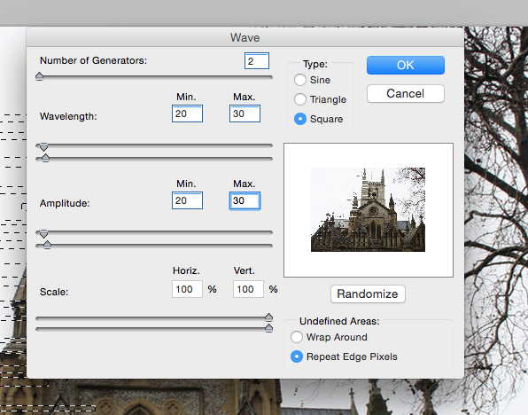
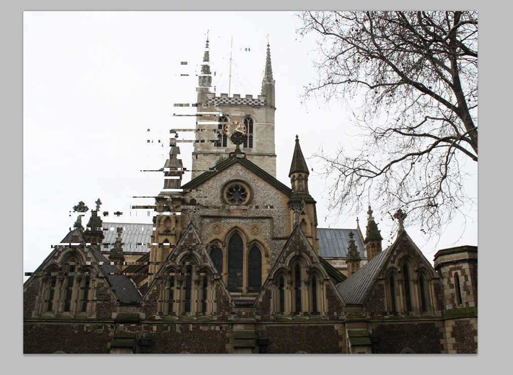
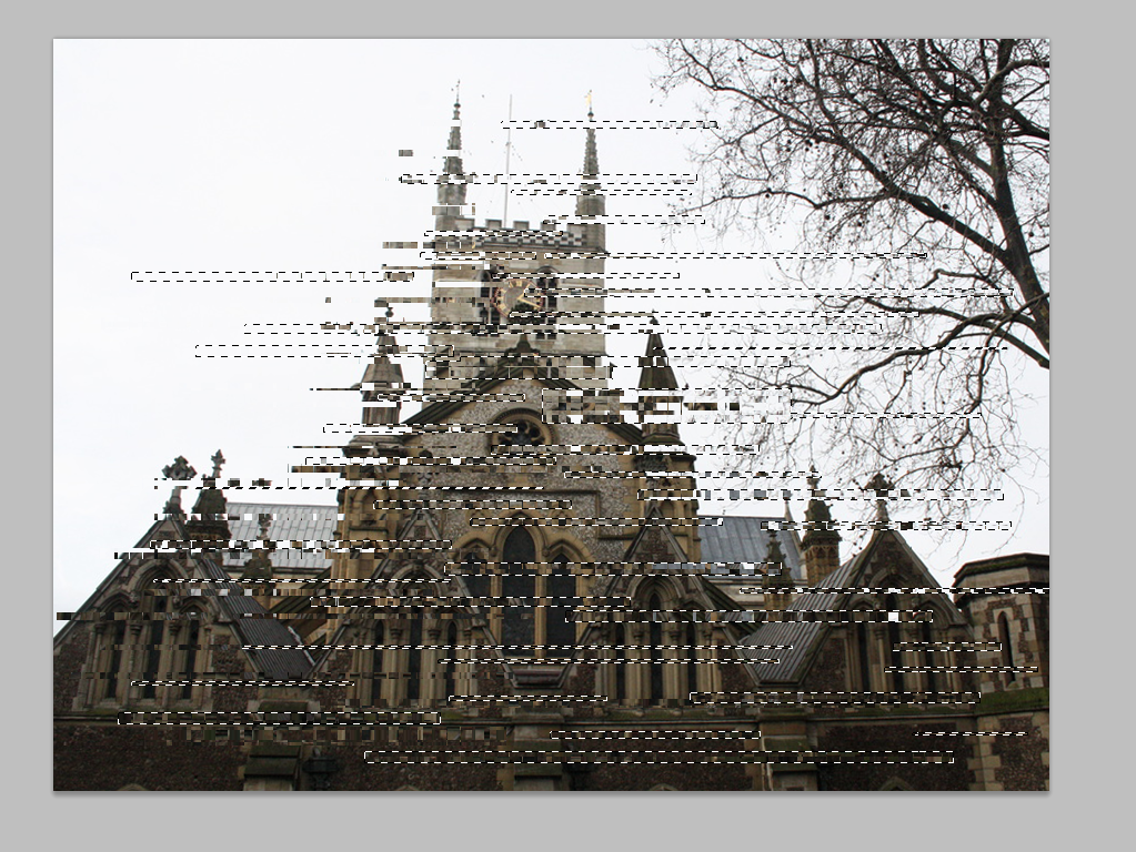
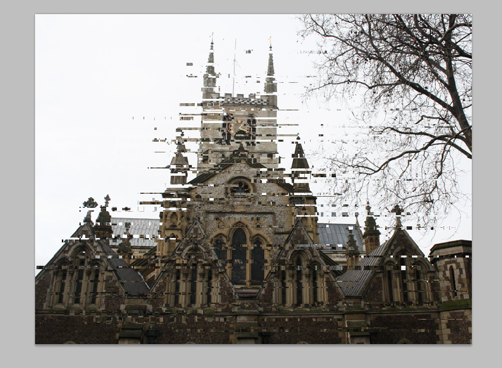
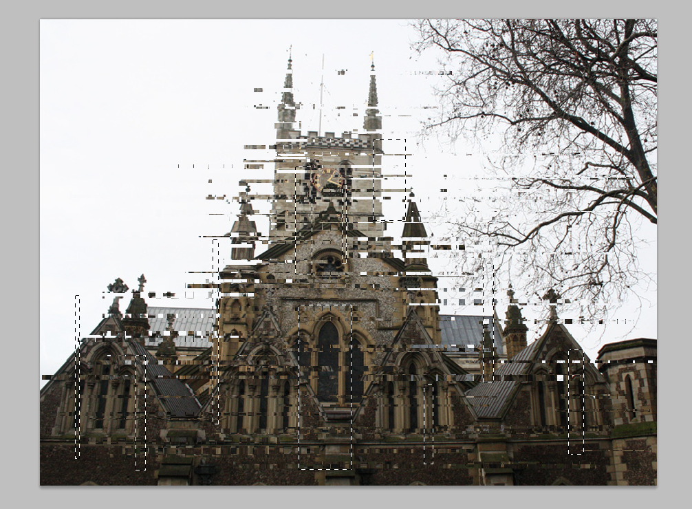
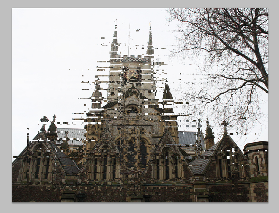
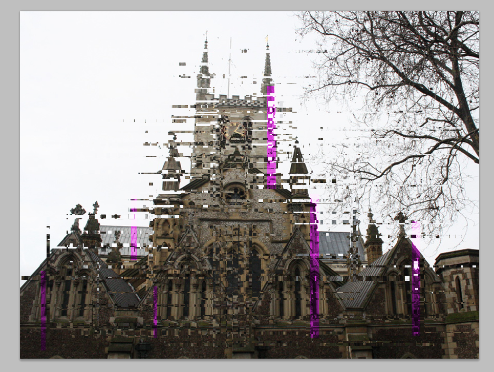
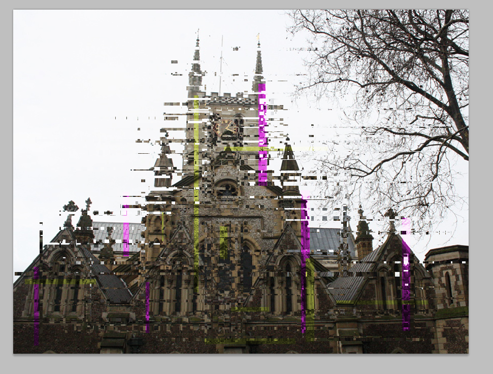
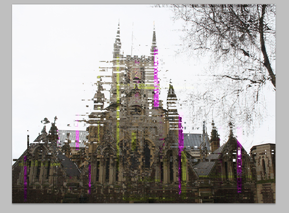
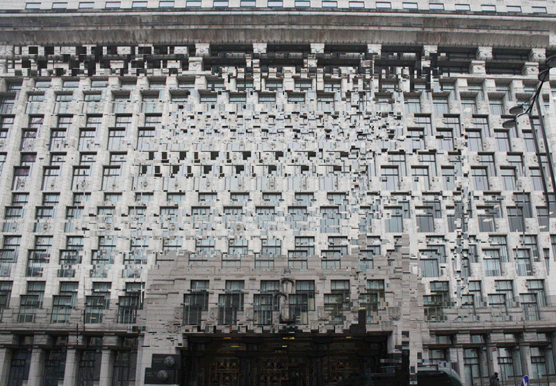
For my fourth development I chose to glitch my images. Glitching came about when the digital era started, this was the change from mechanical, and electronic technology to digital technology. The new transition meant that it hadn't completely been figured out and developed into the level of technology we use today. A glitch means "a problem affecting function", "an imperfection" or a "quirk", all of which happened when the shift to the digital era occurred. Although this development relates to the past, when the glitching was done intentionally the outcome of it looked very futuristic. I used photoshop to create these images, using old buildings to represent the past whilst glitching them to create a futuristic look, this compared two time periods in one image. I think that my third image came out best as it looks much more glitched than the others and also includes colours, whereas my first image doesn't have any colour in it and they both have black backgrounds which make them look less realistic.
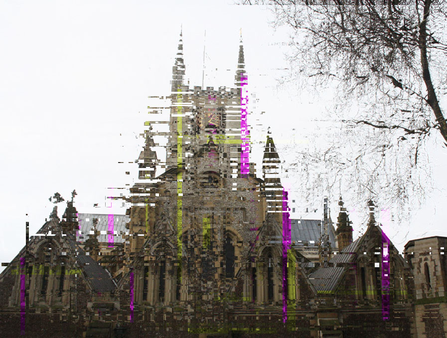
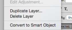
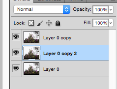
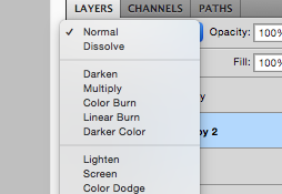
S T E P S O N P H O T O S H O P :

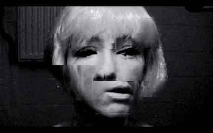
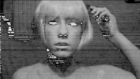
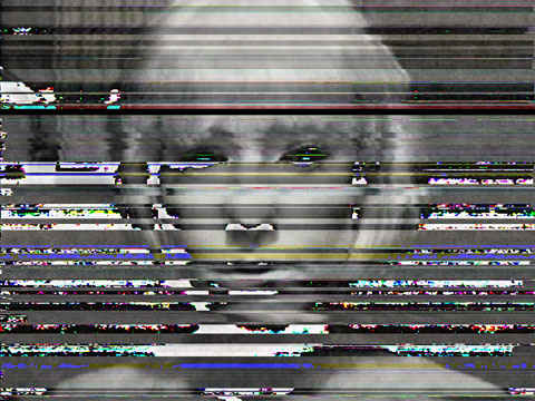
R O S A M E N K MA N
Rosa Menkman is a Dutch art theorist, curator, glitch artist and visual artist specialising in glitch art and resolution theory. She defines Glitch Art as a “wonderful interruption that shifts an object away from its ordinary form and discourse, towards the ruins of destroyed meaning.”
Menkman re-imagines her digital self. In her commentary, the glitch takes an unusual arrangement relative to noise, breakdown or coincidence. Menkman's research into the emerging form of glitch art was published as the book The Glitch Moment(um) at the University of Amsterdam, by the Institute of Network Cultures. It shifts between artefact and mesh; between breakages and object making processes. For my development I have been trying to recreate her images using buildings, using her images as inspiration.
5 T H D E V E L O P M E N T
I used TextEdit to delete and add random parts of code to get a glitched effect. I think that the images I created manually had a better outcome, however if I tried to do more glitching using TextEdit and learnt how to do it properly, the result would look more professional. For my next development I wanted to make a gif of buildings glitching and in order to made this I had to use the manual technique.
|
|
6 T H D E V E L O P M E N T
This development consists of the past present and future in a gif and image as time is seen to change the appearance of things. I moved on from editing old building to new buildings, the gif below shows a modern building decaying.
|
|
7 T H D E V E L O P M E N T
For my seventh development I continued making glitches, however this time made gifs to try and capture what a glitch looked like when it was occurring. I created these by using the same steps as the images, but saved the image each time, I also made the entire frame of the first and second gif glitch to emphasise the effect.
|
|
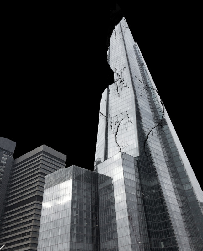
E X A M
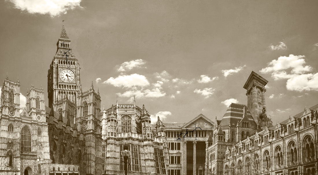
In the exam I experimented on photoshop with the skyline I created. I took photos of old buildings and layered them together on a skyline to emphasise their age. For my first response I made the photo look old using a technique on photoshop to decay the buildings, I added cracks on two of the buildings to try and convey this. I used this as one of my responses as it developed my photo and gif displaying decay for my 6th development. The end result is meant to replicate a vintage photograph displaying the past. It relates to the exam title as the buildings used are historic and the process used on photoshop tried to emphasise this - showing the impact of time.
1 S T R E S P O N S E
2 N D R E S P O N S E
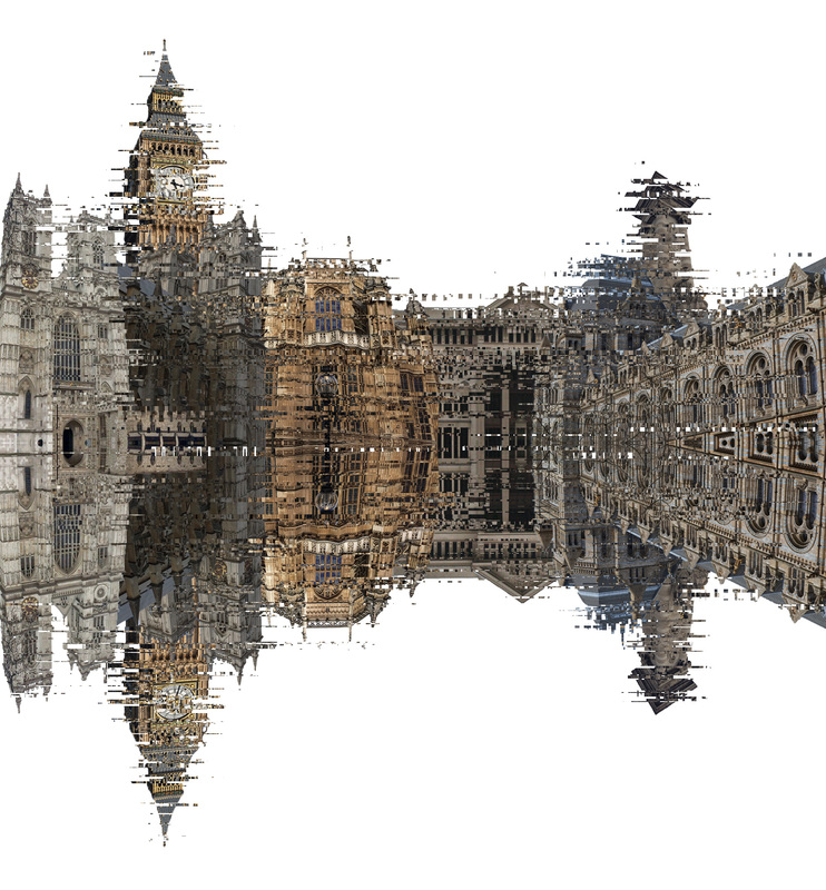
For my second and third response I continued my development of glitching. I glitched the skyline and used symmetry to add more depth, it incorporates the idea of glitching representing the change of era alongside the old buildings - presenting the past.
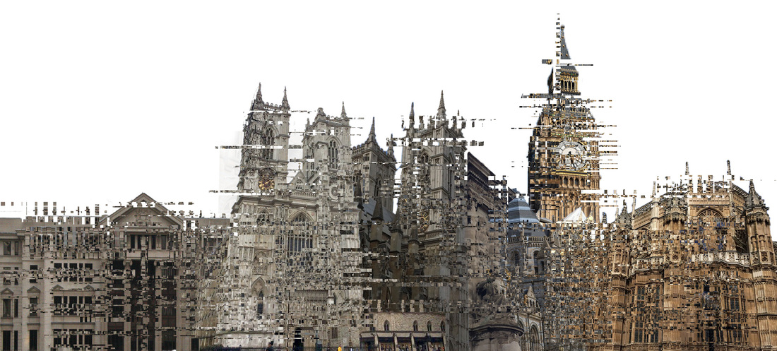
F I N A L P I E C E
O L I V I E R R A T S I
Olivier Ratsi is a french visual artist, he lives and works in Paris. Olivier Ratsi’s work presents objective reality, time, space and matter as a series of intangible informative notions. Focusing on the experience of reality and its representations, as well as the perception of space, he conceives works that encourage the viewer to question his or her own interpretation of what is real. As part of his work process, Olivier Ratsi creates systems that deconstruct our spatio-temporal reference points, often using the technique of anamorphosis, developed during his research. Making a break with objective reality, Olivier Ratsi’s works are not specifically aimed to unleash emotions or to perturb the senses, but rather to work as a catalyst for different points of view and cultural and psychological references.
Olivier's work was my inspiration for my final pieces, although the techniques used are slightly different, the concepts behind them are very similar.
Olivier's work was my inspiration for my final pieces, although the techniques used are slightly different, the concepts behind them are very similar.
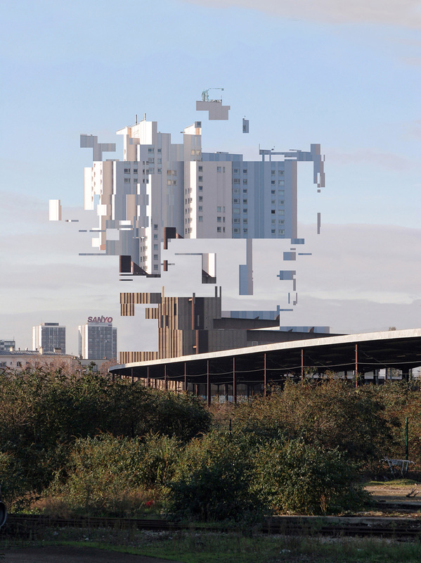
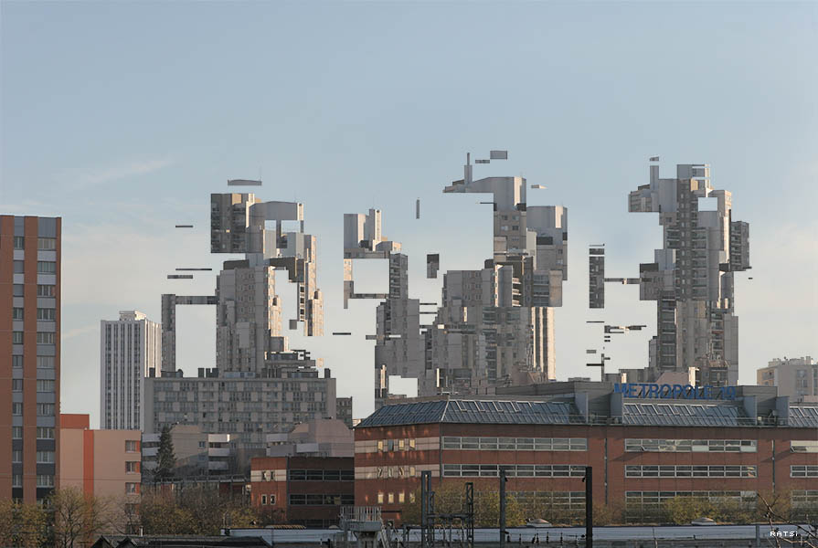
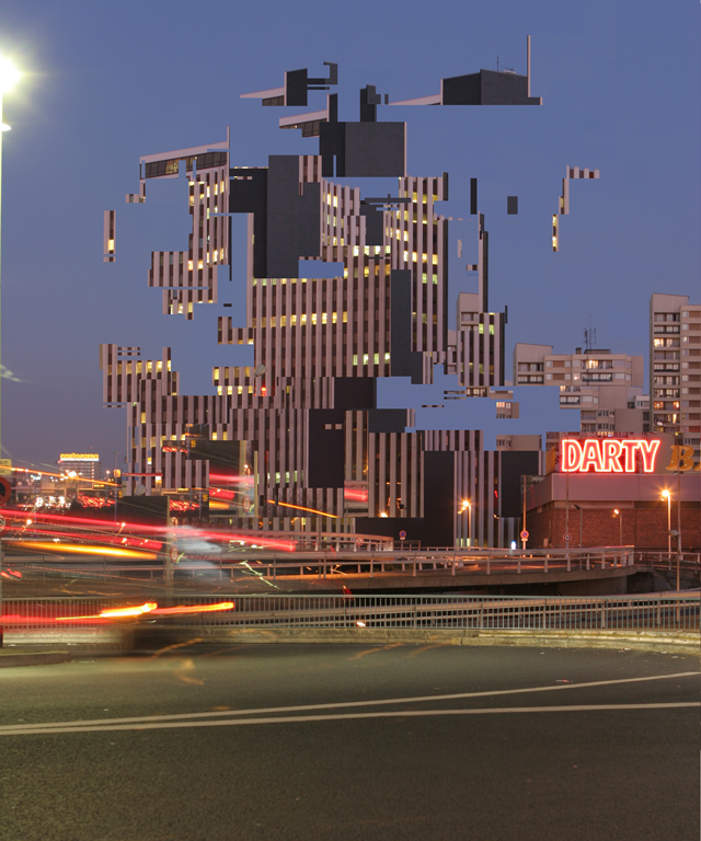
My three final pieces display glitching skylines. I created three skylines, one included modern day buildings (present), one included buildings from the past and present alongside each other, and the last one includes buildings from the past. These can be related to the exam title of past, present and/or future as there is a clear difference between the appearance of the modern and historic buildings. The first 'present' image consists of tall, glass buildings, their shape varies and tend to be used mainly as offices. This may represent the growth of corporations and modernisations within society. The 'past' image includes many churches and old buildings that were once used for more traditional purposes, the second image of 'past and present' displays the contrast between the time periods and appearance of these buildings. However they can be related in more than one way, as not only the appearance was considered when they were made. The images can also be linked to the exam title due to the technique used on photoshop. Glitching arose when the shift to the digital era occurred, this shift caused quirks within technology to appear, and this is reflected in my work as it was made with technology. Although the digital era and the time period in which the old buildings are from are different, it compares the past in two separate time frames. Additionally the glitching causes distortion in the images and this creates a futuristic outcome.
My most successful piece is my second one, as the mixture of the modern and historic buildings, and the number of buildings present gives the photo depth. My least successful image is of the 'past' skyline, there is a lot of white space seen which makes the photo seem quite empty, additionally some of the buildings are at the wrong angle, therefore the skyline doesn't look as realistic as my first two.
My most successful piece is my second one, as the mixture of the modern and historic buildings, and the number of buildings present gives the photo depth. My least successful image is of the 'past' skyline, there is a lot of white space seen which makes the photo seem quite empty, additionally some of the buildings are at the wrong angle, therefore the skyline doesn't look as realistic as my first two.
P R E S E N T
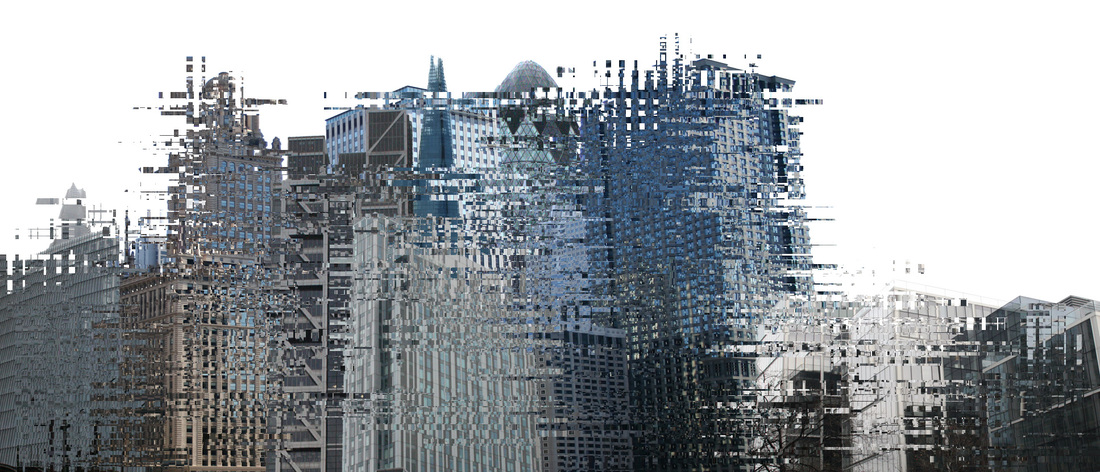
P A S T & P R E S E N T
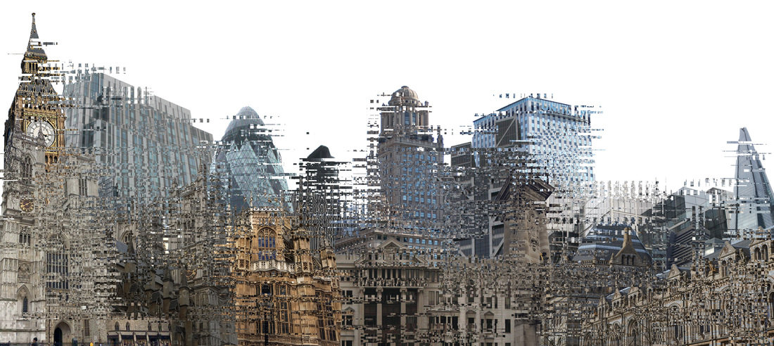
P A S T